

A strong TOK exhibition layout makes three things immediately clear: which objects you selected, where each exists in the real world, and how each helps answer your chosen prompt. It does not need elaborate graphics. It needs a visual hierarchy that lets the examiner concentrate on your thinking.
That distinction matters. New IB students sometimes treat the exhibition like an art project, spending hours on fonts and display boards. Yet assessment focuses on three objects, their specific contexts, their links to one prescribed IA prompt, and the justification for including each. Design supports that reasoning. It cannot replace it.
If you are still choosing material, begin with the complete TOK exhibition process before deciding how the page should look.
Your TOK exhibition layout checklist
Before adjusting a font, check that your document contains:
- The exact prescribed IA prompt you selected
- Three clearly identified, specific objects
- One clear image for each object
- A caption establishing each object's real-world context
- A distinct commentary section for each object
- Explicit links to the same prompt
- Justification of each object's individual contribution
- References for images, information, or ideas that are not yours
- A combined commentary within the 950-word maximum
The exhibition and TOK essay are different tasks. The exhibition explores TOK through three objects; the essay responds to a prescribed title within 1,600 words. RevisionDojo's overview of the TOK essay and exhibition requirements helps keep their structures separate.
Make the assessed thinking easy to find
The exhibition assessment instrument is holistic. It rewards clear identification of three objects and their specific contexts, well-explained prompt links, strong justification, and appropriate supporting evidence. There is no separate mark for an attractive color palette.
An examiner should not have to determine which object a paragraph discusses, search for your prompt, or guess whether a photograph shows your actual object rather than a generic example.
Three visibly separate object blocks offer a reliable structure. Each contains an image, identifying information, and commentary. Clear separation also helps you notice when one object receives substantially more analytical attention than another.
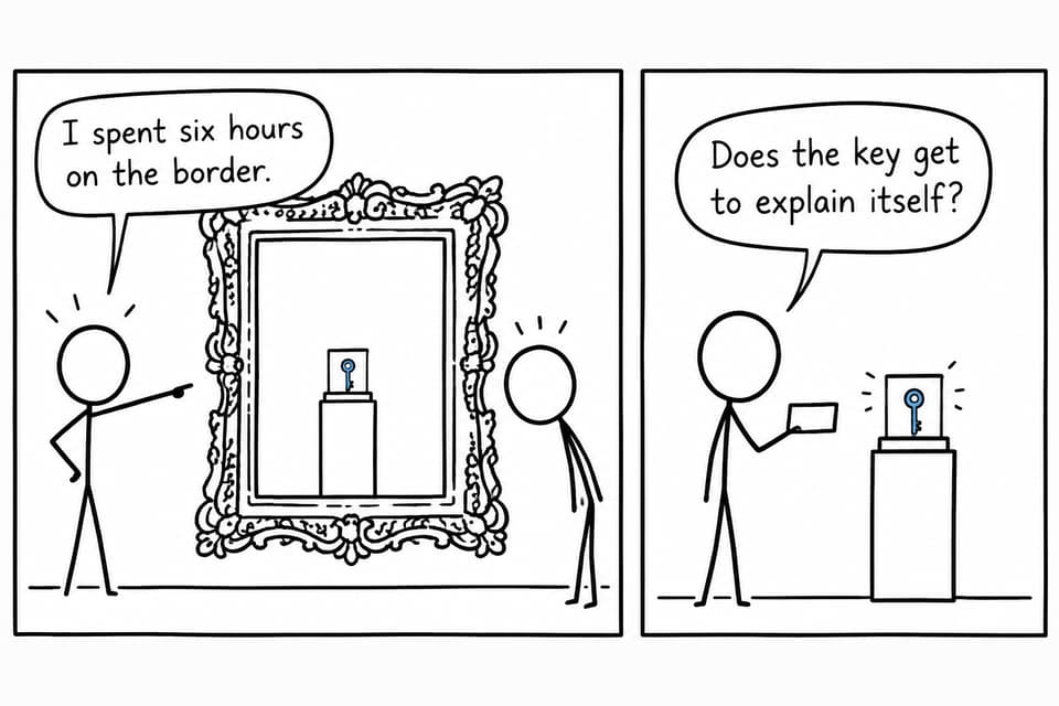
An oversized frame surrounds a tiny key while two students question whether the object has room to explain itself.
Give each object its own visual block
Repeat this sequence for all three objects:
| Element | What to include |
|---|---|
| Object heading | Object number and precise name |
| Image | A clear photograph or image of the specific object |
| Context label | Relevant creator, owner, date, location, use, or event |
| Commentary | Analysis linking this object to the selected prompt |
| Source note | Image or information source when required |
Avoid identifying an object as simply a map. A more useful hypothetical heading is Object 1: My annotated London Underground map used during the June 2025 school trip. This establishes what the object is and begins explaining its context.
Specificity separates a real-world object from a generic category. For more guidance, read about choosing real-world TOK exhibition objects.
Keep each image close to its matching commentary. Readers should not need to match pictures on one page with explanations several pages later. Follow your school's required template if it differs from this model.
Create a simple visual hierarchy
Use prominent text for the prescribed prompt, consistent headings for the objects, and a readable body font, usually around 11-12 points unless your school specifies otherwise. Reserve bold for object names or short labels.
Spacing should communicate relationships. A small gap connects the image, caption, and commentary; a larger gap or page break introduces the next object. Consistency matters more than boxes, shadows, or several accent colors.
A one-column arrangement is usually easiest to follow. Narrow columns can produce awkward line breaks and uncertain reading order. Keep commentary as selectable text rather than embedding it inside an image. These are readability recommendations, not additional assessment requirements.
Balance the commentaries without making them identical
Within the combined 950-word maximum, roughly 300 words per object offers a useful starting point. This is a planning guide, not a requirement. Some objects need more contextual explanation than others.
If Object 1 occupies two pages while Object 3 receives half a page, check whether the third object is sufficiently developed. Do not fix conceptual imbalance by shrinking the font.
Each section should identify the object and its context, explain a relevant feature, connect that feature explicitly to the prompt, and justify its distinctive contribution. A section can look finished while remaining mostly descriptive. RevisionDojo's guide to writing an engaging TOK exhibition commentary helps address that gap.
Let captions identify and commentary analyse
Consider this hypothetical caption: Screenshot of a weather warning sent to my phone by the UK Met Office at 07:42 on 8 January 2026. It establishes more context than Weather app screenshot.
The commentary can then examine how the warning's institutional source, predictive model, or language affects trust. The caption identifies; the commentary analyses.
Do not hide an argument in tiny caption text or spend the opening paragraph repeating everything the image already shows. Each element should have a distinct purpose. To strengthen contrast between sections, explore how to select TOK objects that make distinct contributions.
Test the structure with three objects
Imagine a student selects Who owns knowledge? These illustrative objects suggest different analytical directions:
- A specific handwritten recipe card kept by the student's grandmother
- A screenshot of a paywall encountered on a named academic journal article
- The student's photograph of a museum label explaining a ceremonial object's return
The recipe card could explore knowledge transmitted within a family. The paywall could raise questions about economic access and intellectual ownership. The museum label could examine institutional possession, cultural authority, and restitution.
Each object uses the same visual structure but contributes different thinking. If every section reaches the same conclusion, reconsider object selection rather than formatting. The guide to choosing a productive exhibition prompt helps test whether one prompt supports three meaningful perspectives.
Separate the submission from the room display
Your school may organize a physical or virtual exhibition using boards, stands, screens, or conversations with visitors. Arrangements vary.
The assessed submission must still communicate through its documented images and written commentary. Do not rely on something you intend to explain aloud. Relevant context and reasoning must survive on the page.
For a physical display, retain the same hierarchy: prompt first, three separated objects, and readable commentary beside each. Extras such as QR codes should not carry essential parts of the argument.
Check what the reader can actually see
Review each image at the size it will appear in the submitted document. If your argument depends on a handwritten annotation, a date, or a museum label, make sure that detail remains legible. Crop unnecessary background where helpful, but retain anything needed to establish the object's context. A beautiful photograph is less useful than a plain photograph that reveals the feature your analysis discusses.
Next, read only the headings and captions. Can you distinguish all three objects without consulting the commentary? Then read only the commentaries. Can you identify the specific feature each argument depends on? These two quick passes test different problems: unclear identification and analysis that has drifted away from the object.
Check source notes with the same care. Make it clear which reference supports an image and which supports a factual claim. Keep the reference style consistent with your school's guidance, and avoid leaving unexplained links scattered through the document.
Finally, inspect page boundaries. A heading stranded at the bottom of a page or a caption detached from its image creates unnecessary work for the reader. Adjust spacing before reducing text size or cutting useful analysis.
Avoid ordinary layout mistakes
Watch for generic stock images, vague captions, images separated from their commentaries, and prompts buried inside paragraphs. Several fonts and decorative elements can compete with the analysis rather than clarify it.
Do not shrink text to satisfy a page target your teacher never set. Likewise, an impressive display board cannot substitute for precise commentary, and matching section lengths cannot guarantee balanced reasoning.
The subtler mistake is choosing a layout before understanding the argument. Students can become attached to a polished page and force unsuitable objects into it. Start with prompt-object relationships. The guide to TOK exhibition prompts can help you begin in that order.
Build the document in manageable layers
First, save your prescribed prompt exactly as written. Collect possible objects and record where each exists, who created or used it, and why it matters. Choose three that support different analytical contributions, then draft their commentaries before formatting.
Once the reasoning is stable, assemble your object blocks. Check image quality, captions, heading consistency, references, and word count. Export the document and inspect that version, because spacing and page breaks can change.
Ask someone unfamiliar with your work to identify the prompt, the three objects, and each object's contribution. Their uncertainty can reveal missing context or confusing organization.
RevisionDojo brings support for this process into one IB study space. Study Notes, AI Chat, grading tools, the Coursework Library, and Tutors can support planning and feedback. Its Questionbank, Flashcards, Predicted Papers, and Mock Exams support preparation across the wider Diploma Programme.
The best exhibition layouts make strong thinking visible. Use RevisionDojo's TOK guidance to refine your choices, then let a clear, consistent page show why those particular objects belong together.