

The question behind the question: how many graphs does an IA need?
The night before you submit your IA, there's a particular kind of panic that doesn't feel like normal stress.
It's quieter.
You scroll through your document and start counting: Figure 1… Figure 2… Figure 3… and suddenly you're bargaining with the universe. Is seven graphs too many? Is three too few? You can almost hear the moderator sighing, as if they've seen your file before they even open it.
Here's the honest truth: your IA is not graded by graph count. It's graded by how well your evidence supports your thinking. Graphs are just one of the cleanest ways to make that support visible.
So the better question is this:
How many graphs does your IA need to make your argument feel inevitable?
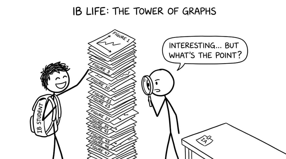
IA graphs checklist (use this before adding "just one more")
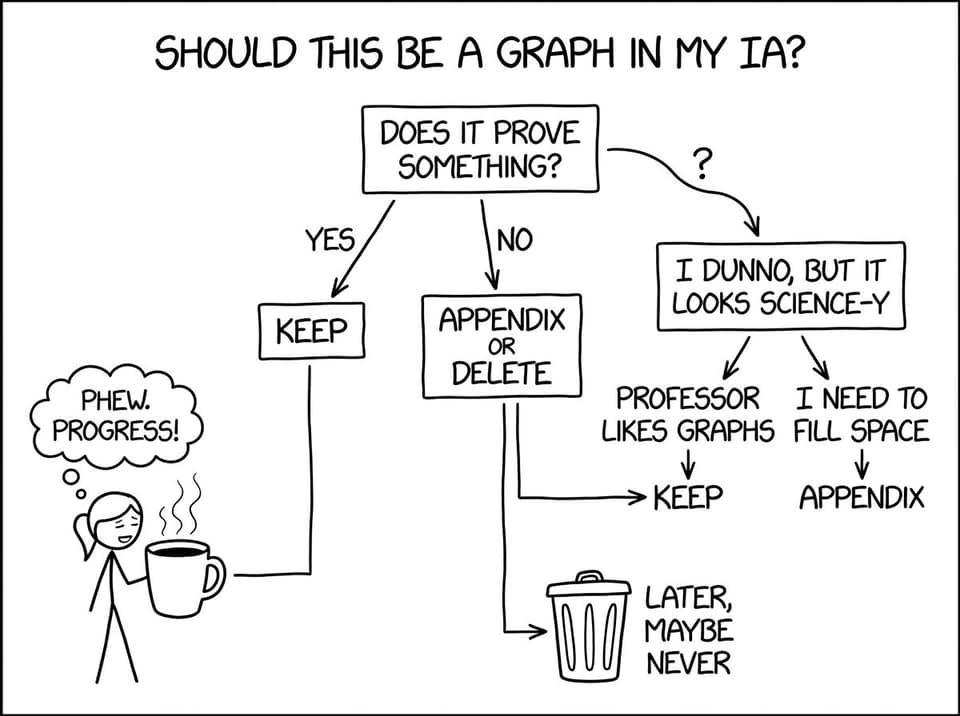
If you want the quick, high-scoring filter, use this checklist. In a strong IA, every graph should be able to answer "yes" to most of these.
- Does this graph reveal a pattern you discuss in the text?
- Does it help answer the research question (not just show raw data)?
- Do you refer to it directly ("Figure 2 shows… therefore…")?
- Does it include clear labels, units, and a meaningful caption?
- Does it support a step of your method: comparison, model fit, trend, anomaly, uncertainty?
- Would removing it make your argument weaker?
If you're unsure, keep the graph out of the main body and move it to an appendix, or cut it entirely.
For more on making visuals do real work (not decoration), this guide is worth reading alongside your draft: Tips for Organizing Graphs and Tables in Your IA.
The real answer: typical ranges for graphs in an IA
There isn't a universal IB rule that says "your IA must have X graphs." Different subjects and research designs naturally create different visual needs.
But in practice, most high-scoring IAs land in a sensible range:
A practical benchmark
- Math IA: often 4-8 graphs (sometimes more, but only when each one advances the modeling or interpretation)
- Sciences (Bio/Chem/Physics/ESS): often 3-6 graphs, plus supporting tables and uncertainty analysis
- Humanities/Business/Psychology (where applicable): often 2-5 graphs, used strategically (distributions, comparisons, correlations)
Those ranges are not targets. They're just what happens when a student uses visuals as proof rather than padding.
If you want to see what "normal" looks like across many real examples, browse RevisionDojo's IA/EE/TOK exemplars (examiner-verified). When you scan high scorers, you'll notice something calm: they don't look obsessed with quantity.
What examiners actually want from graphs in an IA
A graph in an IA is not an art asset. It's a compressed argument.
Examiners are usually asking:
- Is the student communicating clearly?
- Is there a defensible relationship between variables?
- Is the student interpreting the graph rather than letting it sit there?
- Do they understand uncertainty, limitations, and fit?
This is why two students can both include five graphs, and one IA feels persuasive while the other feels like a scrapbook.
If you're specifically doing Math, read this alongside your edits: How to Use Graphs Effectively in Your IB Math IA.
A simple rule: one graph per "claim" (not per dataset)
Here's a reliable way to decide how many graphs your IA should include.
In your IA, you usually make a small number of major claims, such as:
- There is a relationship between X and Y.
- The relationship is best modeled by a linear or exponential function.
- The model fits well (or doesn't) based on residuals or R².
- Outliers exist and can be explained.
- Uncertainty affects the strength of the conclusion.
A strong IA often needs one main graph per major claim.
That usually produces a natural number of graphs: not too many, not too few.
What this looks like in practice
A typical "graph set" in an IA might be:
- Graph 1: the core relationship (scatter plot, line graph, etc.)
- Graph 2: model fit or transformation (regression, log transform, etc.)
- Graph 3: residual plot or error bars to evaluate reliability
That's three graphs that are genuinely doing something. If you add a fourth, it should earn its place.
When graphs become a problem (and how to fix it)
Too many graphs rarely fail because they're "too many." They fail because they create three hidden costs.
They dilute attention
When every page contains a new figure, none of them feel important. Your examiner stops reading visuals as evidence and starts skimming them as wallpaper.
They replace explanation
A graph without interpretation is a silent witness. It might be truthful, but it isn't testimony.
They increase presentation risk
Every additional graph is another chance to:
- forget units
- mislabel axes
- use an unreadable scale
- include an unreferenced figure
Those are easy marks to lose.
If presentation is where you tend to leak marks, use this as your polish guide: How to Present a Professional Math IA with Confidence.
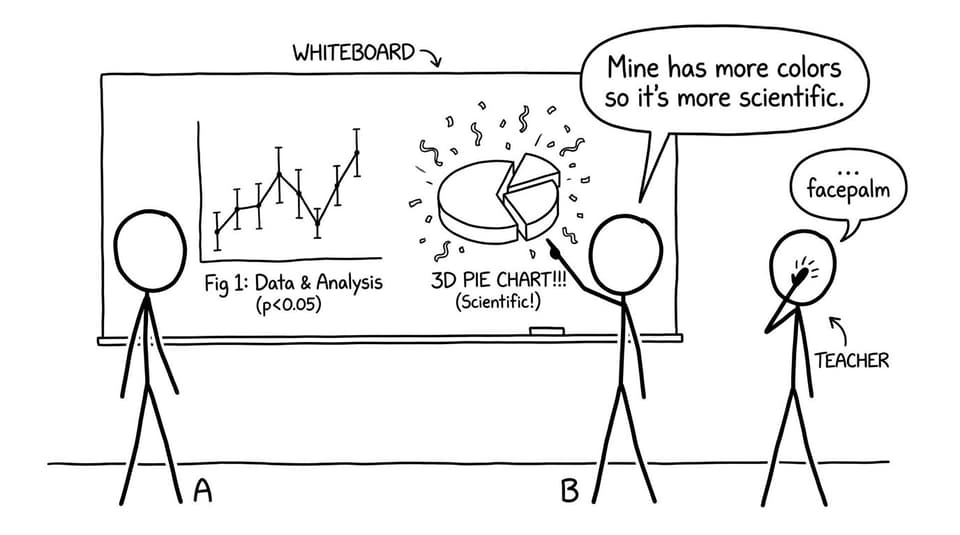
The "graph hierarchy" that keeps your IA lean
Try organizing your IA visuals into a hierarchy. It helps you decide what belongs in the main body.
Must-have graphs (main body)
These are graphs you directly use to answer your research question.
- The primary trend/relationship graph
- The model or comparison graph you analyze in detail
- The uncertainty/residual/error visualization you reference when evaluating reliability
Nice-to-have graphs (appendix or trimmed)
These can be valid, but they're often supportive rather than central.
- Extra trials that show the same pattern
- Intermediate graphs you used while exploring
- Alternative graph types that do not change your conclusion
Red-flag graphs (delete)
- Graphs you never refer to
- Graphs with no caption or unclear variables
- Graphs that exist because "I thought I needed more graphs in my IA"
If you want a broader set of visual best practices, this is the cleanest summary: How to Use Visuals Effectively in Your IB Math IA.
How to decide if a graph belongs: the 15-second test
Open your IA and pick any graph.
Now do this test:
- Cover the text.
- Look at the graph alone.
- Ask: What conclusion is this supposed to support?
If you cannot answer in 15 seconds, the graph is either:
- missing context (caption, labels),
- the wrong graph type, or
- not necessary.
This test is brutal, but it's fair.
The subject-specific trap: Math vs Sciences vs Business
The "right" number of graphs in an IA often depends on what the subject rewards.
Math IA: graphs should show thinking
In a Math IA, graphs often serve as:
- modeling tools
- justification for assumptions
- evidence of fit and refinement
So more graphs can be justified, but only if each one changes the reasoning.
A common weak move is repeating similar graphs with slightly different settings, hoping the volume looks sophisticated. Examiners typically reward the opposite: fewer visuals, sharper reflection.
RevisionDojo's IB Internal Assessment Guides can help you align your choices to what your subject actually assesses.
Sciences: graphs should show reliability
In sciences, graphs earn trust when they make uncertainty and method visible.
A smaller number of graphs can score very well if they include:
- correct processing
- appropriate best-fit
- uncertainty and/or error bars when relevant
- discussion of anomalies
If you're doing Chemistry, the data analysis expectations (including graphs and error bars) are laid out clearly here: Chemistry IA data analysis guidance.
Business/Psychology: graphs should support decision-making
In these IAs, graphs can be powerful, but they must connect directly to:
- evaluation of options
- strength of evidence
- limits of inference
If a graph doesn't change the decision or evaluation, it's often clutter.
If you're in Business, this complete guide helps you see where visuals tend to matter most: IB Business IA HL: Complete Student Guide.
How RevisionDojo helps you get the graph count "right"
The hardest part of an IA is not creating graphs. It's choosing which ones deserve space.
RevisionDojo is built for that exact decision-making.
- Use the IB Coursework Grader to spot where your IA is descriptive and where graphs need interpretation.
- Compare against real student work in the Coursework Library via Using IA/EE Exemplars to Improve Your IB Math IA.
- Ask Jojo in AI Chat to critique a figure caption or to suggest the single most informative visualization for your data.
- If you're balancing coursework with exam prep, keep your momentum with the Questionbank, Study Notes, and Flashcards so your IA doesn't consume your entire semester.
That last point matters. Your IA is important, but you are also an IB student preparing for exams. A good system respects both.
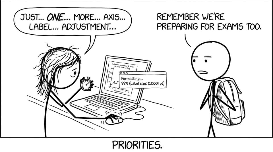
Closing: the best IA graphs feel inevitable
The best IA doesn't feel like it's trying to impress.
It feels like it's trying to be understood.
So when you ask, "How many graphs should my IA include?" aim for the number that makes your reasoning unavoidable. Enough to show the relationship, the method, and the reliability. Not so many that your reader loses the thread.
If you want to lock this in quickly, do two things today:
- Compare your draft with real high-scoring work in RevisionDojo's Coursework Library and exemplars.
- Run your IA through RevisionDojo's Grading tools, then use AI Chat to tighten captions and interpretation until every graph earns its place.
Your IA should not be a gallery. It should be a proof.
And when your IA is solid, your exam prep gets calmer too: Study Notes, Flashcards, Questionbank drills, Mock Exams, Predicted Papers, and Tutors are all there in RevisionDojo when you're ready to switch gears.