

A graph can be the most honest part of your Math IA.
It doesn’t care how long you spent typing, or how elegant your equation looks in LaTeX. It simply shows what happened: the relationship, the mess, the pattern you hoped was there, and the outlier you wish wasn’t.
In the IB, that honesty is powerful, but only if you use it well. A clean, purposeful graph can make your reasoning feel inevitable. A cluttered, unlabeled one can make strong mathematics look uncertain.
This guide shows how to use graphs effectively in your IB Math IA so each visual earns marks for communication, interpretation, and mathematical thinking. Along the way, you’ll see how RevisionDojo helps you practice the exact skills examiners reward.
A quick checklist for IB graph quality
Before you insert a figure into your IA draft, check these in under two minutes:
-
Does the graph answer a specific question in your investigation (not just “show data”)?
-
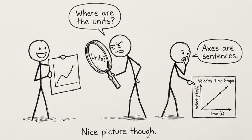
Are both axes labeled with variables and units?
-
Is the scale appropriate (not hiding variation, not exaggerating noise)?
-
Can the graph stand alone with a short caption?
-
Do you interpret it in words immediately after the figure?
-
Is the formatting consistent across all graphs (font, style, decimal places)?
If you want a broader visuals overview first, use 8 Best Practices for Using Visuals Effectively in Your IB Math IA.
Graphs in the IB Math IA are arguments, not decorations
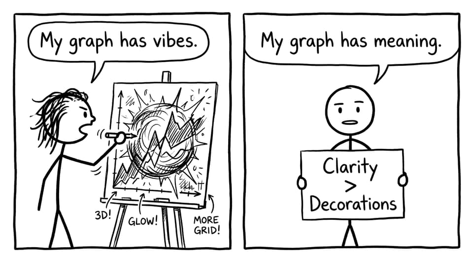
Many students treat graphs like receipts: proof that data exists. But in a high-scoring IB exploration, graphs function more like paragraphs. They make claims.
A scatter plot claims there’s a relationship worth modeling. A residual plot claims your model is trustworthy (or that it isn’t). A box plot claims your spread is meaningful.
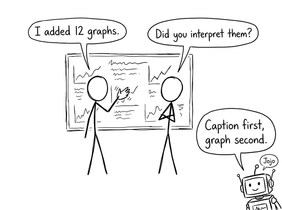
A simple habit changes everything: write the caption first.
Before you generate the graph, draft a one-sentence caption that begins with “This graph shows…” and ends with “which suggests…”. If you can’t finish that sentence, the graph probably belongs in your working, not your final IA.
To see how strong IAs build that narrative flow, compare your draft with Using IA/EE Exemplars to Improve Your IB Math IA.
Choose the right graph type (and know what it’s supposed to reveal)
In the IB, the wrong graph type doesn’t just look odd; it changes meaning.
Scatter plots for relationships and modeling
Use scatter plots when you plan to talk about correlation, regression, or fitting a model. If your goal is to justify a function choice, this is usually your “main stage” graph.
Line graphs for change and comparison over a continuous variable
Line graphs work best when the x-variable is naturally ordered and continuous (time, distance, angle). But don’t connect dots just because software can. If measurements are discrete and noisy, a scatter plot with a model line is often clearer.
Histograms and box plots for distributions
If your IA involves variability (reaction times, repeated trials, different samples), distribution visuals help you discuss spread, skew, and outliers with real mathematical language.
When you want help deciding, RevisionDojo’s tools and guides on graph choice pair well with How to Use Graphs and Diagrams to Strengthen Mathematical Communication in the IB Math IA.
Labeling is not formatting; it’s communication (and IB examiners notice)
In an IB Math IA, a graph should be readable even if it’s separated from your paragraph. That’s the test.
A strong graph includes:
-
A descriptive title (what relationship is shown, not “Graph 2”)
-
Axes labeled with variables and units
-
A legible scale and consistent intervals
-
A legend if multiple data sets or models appear
If you’re unsure what “professional” looks like, model it with How to Format and Label Graphs Professionally in the IB Math IA and How to Format and Label Graphs in Your IA.
Use graphs to support modeling (show fit, not just formulas)
A model written in symbols can feel abstract. A model plotted against your data feels accountable.
When you build a regression or theoretical function, show:
-
the raw data points
-
the model curve or line
-
any key parameters you estimate
Then do what many students forget: explain where the model fits well and where it fails.
Even one sentence like “The model overestimates values after x = 8, suggesting a second factor affects the trend” signals judgment, not just procedure. In IB terms, that’s you thinking mathematically.
If you want a process for turning graphs into analysis paragraphs, use How to Analyze Graphs and Results in the IB Math IA.
Annotate key features so your insight can’t be missed
Examiners read fast. If your best idea is hidden in the curve, it may not get credit.
Light, purposeful annotation helps:
-
mark intercepts and turning points
-
label maxima/minima or intersections
-
highlight an outlier you will discuss
-
point to an interval where behavior changes
This is especially helpful in IB investigations involving calculus, transformations, or piecewise behavior, where the “why” often sits in one small region of the graph.
For outlier decisions specifically, see How to Handle Outliers and Anomalies in the IB Math IA.
Interpret every graph in words (this is where the marks are)
A graph by itself earns very little. Your explanation is what converts it into assessment evidence.
A reliable IB structure is:
-
Describe what the graph shows (trend, shape, general relationship).
-
Identify one or two key features (rate of change, curvature, clusters, anomalies).
-
Interpret what that means for your research question or model choice.
-
Evaluate limitations (measurement error, sample size, domain restrictions).
If you want your written commentary to sound clear rather than robotic, pair this with IB Math: 10 Tips for a Strong IA Commentary.
Keep your graphs consistent across the whole IB exploration
A quiet detail that makes an IA feel “top band” is consistency.
Choose a formatting style and stick to it:
-
same font size and type
-
same decimal place conventions
-
similar axis ranges when comparing graphs
-
consistent color meanings (e.g., data points always blue, model always black)
This is where RevisionDojo becomes more than a blog; it becomes a workflow. Students use RevisionDojo’s Study Notes to learn the math, then practice with Flashcards, then pressure-test their understanding with the Questionbank and Mock Exams. When it’s time to refine the IA, AI Chat helps tighten captions and interpretations, and the Grading tools flag where graphs are shown but not explained. Predicted Papers then keep exam revision moving in parallel, so your IA doesn’t swallow your entire term.
If you’re still deciding how many visuals is “enough,” use How Many Graphs Should an IA Include?.
Conclusion: make every IB graph earn its space
In an IB Math IA, graphs are not a decoration layer you add at the end. They are part of the thinking. The best graphs don’t just show what you did; they make your conclusion feel deserved.
If you want your graphs to look professional and read like evidence, build a simple routine: caption first, label everything, choose the right graph type, and interpret immediately in words. Then use RevisionDojo to tighten the loop: learn the math with Study Notes, drill techniques with Questionbank and Flashcards, get instant feedback with AI Chat and Grading tools, and stay exam-ready with Mock Exams and Predicted Papers. When your visuals and your explanations work together, your IB exploration stops feeling like a document and starts feeling like a story the examiner can follow.