
A quick hook: the graph that tells a country’s life story
In IB Geography, few diagrams feel as “quietly powerful” as the Demographic Transition Model (DTM). It looks simple: two lines (birth rate and death rate) and a widening or shrinking gap. But that gap is where exam answers live. It holds the story of cleaner water, new vaccines, women’s education, urban jobs, ageing populations, and sometimes policy shocks that push a country off the neat path.
If you can explain why the lines move the way they do, you can explain population change with confidence.
The DTM in one exam-ready checklist
Use this quick structure when you write any DTM response in IB Geography:
-
Define the DTM: changes in birth/death rates as development changes
-
Identify the stage (1 to 5)
-
Explain what happens to CBR and CDR
-
Link to drivers: healthcare, sanitation, education, contraception, urbanisation, costs
-
Add one limitation: migration, policy, culture, or shocks
For more structured practice, start with IB Geography Resources and the unit hub 1 Changing Population.
How each DTM stage explains population change
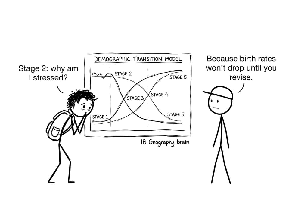
Stage 1: high birth rate, high death rate (low growth)
Stage 1 is the “survival era.” Families may have many children, but disease, poor sanitation, and unstable food supply keep death rates high. The population stays low and fairly stable because births and deaths cancel out.
No country is fully in Stage 1 today, but in IB Geography it matters because it explains historical population patterns and sets up the logic of the transition.
Stage 2: death rate drops first (rapid growth)
Stage 2 is where population growth accelerates. The key idea: births don’t suddenly spike; deaths fall. Improvements in clean water, sanitation, basic healthcare, and food distribution reduce mortality quickly, while birth rates remain high.
In exams, connect Stage 2 to pressure on schools, housing, and jobs. That “youth bulge” becomes a planning challenge.
Stage 3: birth rate falls (growth slows)
Stage 3 is a shift in choices and opportunities. Birth rates start to decline due to access to contraception, urban living, higher living costs, reduced child mortality, and increased education (especially for girls). Death rates keep falling, but more slowly.
A strong IB Geography response links Stage 3 to changing family norms and economic structure, not just “development happens.”
Stage 4: low birth rate, low death rate (stable population)
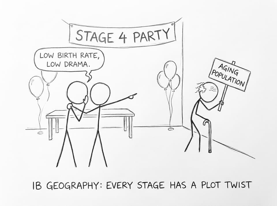
Stage 4 is typical of many high-income countries. Birth and death rates are both low, so natural increase is small. Life expectancy is high, and ageing becomes a major demographic issue.
If you’re revising population distribution and development links alongside the DTM, this post pairs well with How Does Population Distribution Vary by Level of Economic Development?.
Stage 5: births below deaths (population decline)
Some versions include Stage 5, where birth rates fall below death rates. The result can be population decline, rising dependency ratios, and labour shortages. Countries may use immigration, pro-natalist policies, or pension reforms to manage the impacts.
What the DTM does not explain (and why examiners love this)
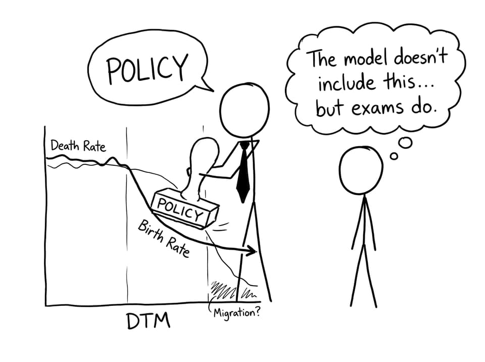
The DTM is a model, not a rule. In IB Geography, that’s your opening to evaluation.
-
Migration can change population size even when natural increase is low
-
Government policy can push birth rates up or down faster than the model suggests
-
Cultural and religious factors may shape fertility independent of income
-
Shocks (war, pandemics, disasters) can disrupt death rates suddenly
To practise writing balanced evaluation paragraphs, use the 1.2 Changing populations and places Questionbank and compare with broader skills guidance like How to Analyze IB Geography Data Effectively.
How to revise the DTM using RevisionDojo (fast, but deep)
RevisionDojo works well for IB Geography because it turns the model into exam performance:
-
Build definition accuracy with Demographic Transition flashcards
-
Train exam technique with the Questionbank feature
-
Strengthen evaluation using 1.3 Population challenges and opportunities Questionbank
And when you want to simulate the pressure of the real thing, RevisionDojo’s Mock Exams, Predicted Papers, AI Chat, Grading tools, Study Notes, Flashcards, and Tutors help you close the gap between “I understand it” and “I can write it under timed conditions.”
Conclusion: turn a model into marks
The Demographic Transition Model explains population change by turning messy history into a readable pattern: death rates fall first, birth rates fall later, and the gap between them shapes growth. In IB Geography, your advantage comes from adding the “because” behind every line movement, plus one clear limitation.
If you want to practise that skill the way examiners reward it, use RevisionDojo’s Questionbank, Study Notes, Flashcards, AI Chat, Grading tools, Predicted Papers, Mock Exams, Coursework Library, and Tutors to turn the DTM from a diagram you recognise into a paragraph that scores.