


Your IB Visual Arts exhibition has a strange power: it can make strong work feel scattered, or make quiet work feel inevitable.
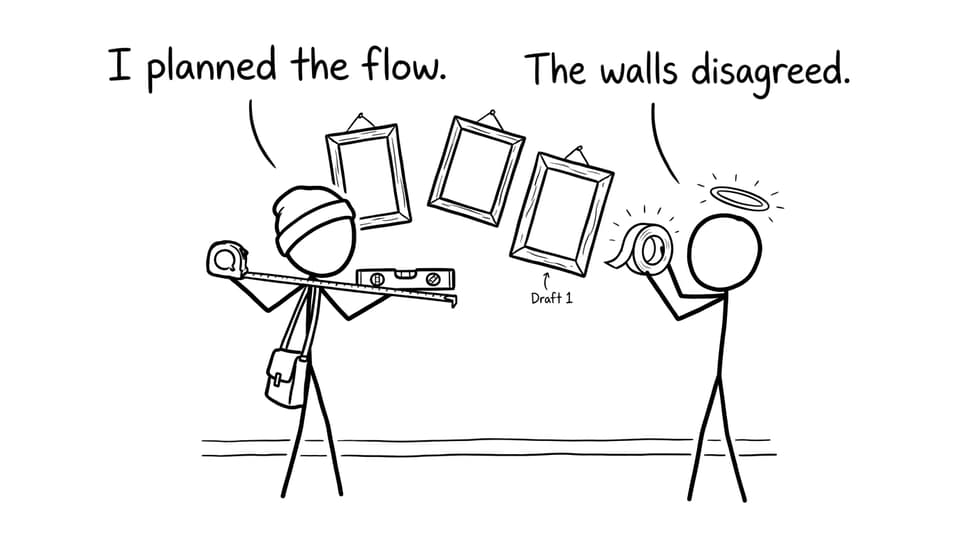
A student once told me they “lost marks to the wall.” Their pieces were solid. Their ideas were thoughtful. But on the day, the spacing was cramped, labels were inconsistent, and the viewing order felt like a shuffled playlist. Nothing was wrong exactly. It just didn’t read like a clear argument.
That’s the mindset shift for IB Visual Arts: the exhibition setup isn’t decoration. It’s communication. And communication is what gets graded.
The examiner-friendly IB Visual Arts setup checklist
Use this quick checklist the day before your final install:
-
Can I explain my exhibition theme in one sentence?
-
Does the viewer experience a clear flow (beginning, development, ending)?
-
Is there enough breathing room between works?
-
Is lighting consistent and does it support each artwork’s intention?
-
Are labels readable, consistent, and placed logically?
-
Does my curatorial rationale justify selection and placement?
If you want to cross-check what “high-scoring” looks like overall, keep How Examiners Grade the Exhibition open while you plan.
Why setup matters in IB Visual Arts (more than you think)
In IB Visual Arts, examiners aren’t grading your taste. They’re grading evidence of intention: selection, coherence, technical control, and meaning.
Your setup is where those signals become visible. When spacing is deliberate, the work feels curated. When the order makes sense, your theme feels real. When labels are clear, your thinking becomes easy to follow.
If you’re still mapping the course components, it helps to revisit What is IB Visual Arts? and Requirements for IB Visual Arts so you’re not guessing what the exhibition is meant to prove.
IB Visual Arts exhibition layout tips that earn marks
Plan the wall like it’s a storyboard
Start with a rough floor plan (paper is fine). Sketch the walls, corners, plinths, and entry point. Then storyboard the viewer’s path.
A good IB Visual Arts layout usually does one of these:
-
Chronological development: early investigations to resolved works
-
Thematic chapters: one wall = one sub-question of the theme
-
Contrast and release: intense pieces followed by quieter works for pacing
If you’re still selecting pieces, use How to Choose Artworks for Your Exhibition to pressure-test coherence before you touch the Blu Tack.
Use spacing to show confidence
Crowding reads like panic. Space reads like intention.
Aim for consistent gaps between works, and let your strongest pieces have room. If you’re forced into a small space, reduce visual noise: simpler mounts, fewer competing background colors, and a tighter selection.
Control eye level and sight lines
Hang 2D works near eye level whenever possible. For 3D works, make sure viewers can step back. Watch for awkward bottlenecks where people can’t comfortably stand and look.
This is also where your Process Portfolio can help: if your exhibition shows decisions clearly, your documentation should match that clarity. RevisionDojo’s Study Notes and Flashcards can keep key rubric language in your head while you set up, so your choices stay aligned.
Lighting tips for IB Visual Arts (and the traps)
Lighting should support meaning, not accidentally rewrite it.
-
Check color accuracy: warm bulbs can shift skin tones, blues, and neutrals.
-
Avoid glare on glossy surfaces and framed works.
-
Use consistent intensity so no piece disappears.
-
Test from multiple angles (your viewer will move).
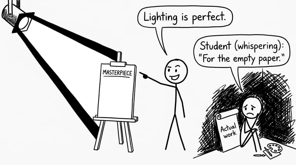
The easiest mistake is spotlighting the wrong “hero” because it’s closest to the lamp. Your lighting plan should follow your curatorial plan.
If you want to build the thinking behind these decisions, The Exhibition in IB Visual Arts: What You Need to Know is a useful refresher.
Labels and rationale: the quiet way to gain marks in IB Visual Arts
A label is small, but it signals professionalism. Keep it consistent across the show.
Typical label essentials:
-
Title
-
Medium
-
Year
-
Dimensions (if your school expects it)
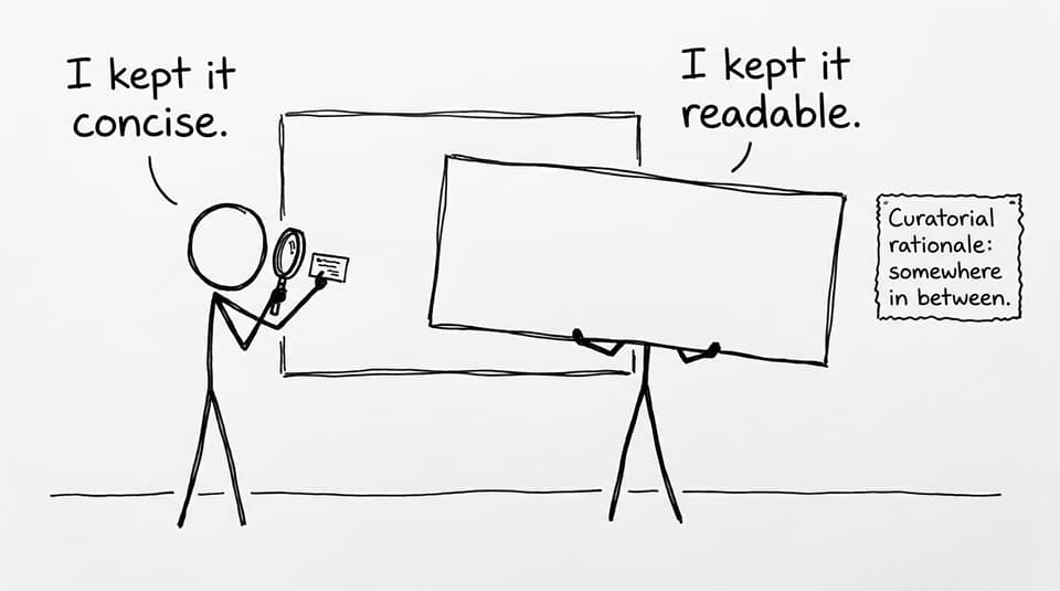
Then there’s the bigger piece of writing: your curatorial rationale. In IB Visual Arts, it’s not a poem. It’s a clear explanation of your theme, selection, and curatorial choices.
Use these guides while drafting:
RevisionDojo’s AI Chat is also handy here: paste a draft rationale and ask for “clearer justification of placement and sequence,” then refine in your own voice. Pair it with the Grading tools (especially rubric-based feedback) to see whether your writing actually answers what examiners reward.
Common IB Visual Arts exhibition setup mistakes (fast fixes)
-
Overcrowding: remove one work, or regroup into clearer clusters.
-
Inconsistent presentation: standardize mounts, borders, label placement.
-
Random order: write a one-sentence reason for each adjacency (why this next to that).
-
Lighting chaos: photograph the wall, mark glare zones, adjust angles.
If you want a bigger “quality control” routine, How to “Study” IB Visual Arts Effectively offers a calmer weekly system so setup doesn’t become a last-night sprint.
FAQ
How many works should I include in my IB Visual Arts exhibition?
Start by checking the official expectations your teacher is following, because schools sometimes set internal deadlines and checks. As a general guide, many IB Visual Arts students plan around a smaller, curated body of resolved works rather than “everything good.” The real scoring question is whether the selection reads as a coherent argument, not whether you hit a maximum. If adding a piece makes your theme fuzzier, it usually costs more than it gives. If removing a piece makes the exhibition clearer, removal is often the highest-mark decision you can make. When in doubt, compare your shortlist against How to Choose Artworks for Your Exhibition and justify every piece in one sentence.
Do I need to frame every artwork for a high mark?
No, and in IB Visual Arts, framing isn’t a substitute for clarity. A clean mount, a consistent border, or a well-finished edge can look just as professional when done deliberately. The goal is to reduce distractions so the examiner’s attention stays on your visual decisions. Framing can also introduce glare problems, which can lower the viewing experience if lighting is limited. If you do frame, keep it consistent across the exhibition unless contrast is a curatorial choice you can defend in your rationale. Whatever you choose, make sure your presentation matches the “intentional body of work” standard described in How Examiners Grade the Exhibition.
How can I tell if my exhibition flow makes sense?
Walk it like a visitor who knows nothing about your theme. Start at the entrance point, follow the natural path, and notice where your eyes pause or get confused. Then ask a friend to do the same and tell you what they think the theme is after 30 seconds and again after two minutes. If their guess changes wildly, your sequence might be fighting your intention. In IB Visual Arts, flow is often created by repeated visual “anchors” (a motif, a color logic, a material choice) that evolve across the show. Finally, read your curatorial rationale and check if the wall actually matches what you claim. If you need models, compare with What Makes a Level 7 IB Visual Arts Exhibition.
A closing thought (and a practical next step)
In IB Visual Arts, the exhibition is the moment your private studio logic becomes public. The setup is how you show that your choices were deliberate, not accidental.
If you want to make that deliberateness easy to prove, use RevisionDojo as your control panel: review criteria with Study Notes, refine writing with AI Chat, pressure-test coherence with Grading tools, and calm your nerves with Mock Exams and targeted feedback from Tutors. Then curate like a storyteller, not a collector.
Your work already has meaning. Your setup is how you let the examiner see it.


