



A week before you photograph your final pieces, the same quiet panic shows up in most studios: you look at your work and wonder if you picked the “wrong” medium.
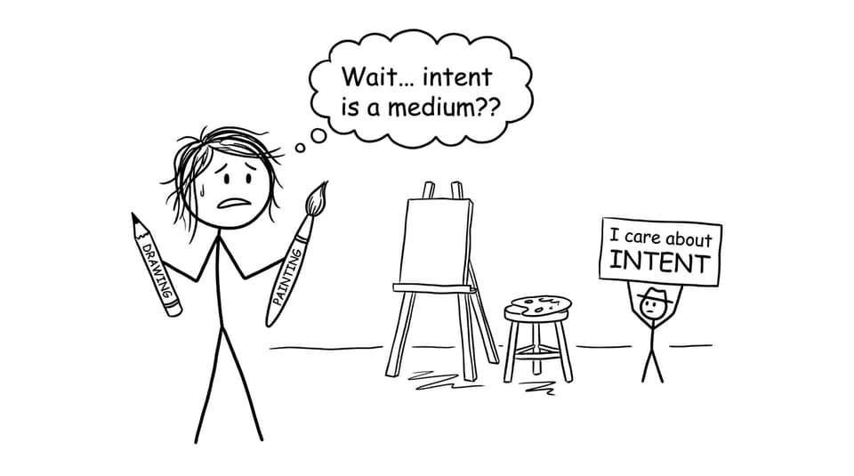
If you are in IB Visual Arts, that worry is understandable. Drawing can feel like preparation, painting can feel like the “real” artwork, and both can feel risky when marks are on the line. But IB doesn’t grade mediums. IB Visual Arts grades decisions: experimentation, technical growth, and the clarity of what you are trying to say.
The quick answer: what “works better” in IB Visual Arts?
Here’s a simple checklist you can use today:
-
Choose drawing when you need speed, iteration, and evidence of thinking.
-
Choose painting when you need color, scale, layering, and emotional punch.
-
Combine both when you want the strongest IB Visual Arts signal: variety + intention + reflection.
-
Document why you chose each medium, because in IB Visual Arts your annotations and rationale turn skill into marks.
If you need a refresher on what the course is actually assessing, start with What is IB Visual Arts? and then skim IB Visual Arts Assessment Criteria Explained Simply.
Drawing in IB Visual Arts: the “thinking on paper” advantage
Drawing is the most honest medium in IB Visual Arts because it exposes your process. You can’t hide behind gloss. That’s exactly why it scores well when used intentionally.
When drawing is the stronger choice for IB Visual Arts
-
Idea generation and experimentation: Drawing lets you test composition, distortion, symbolism, and perspective quickly.
-
Clear technical development: Improvements in proportion, line control, and tonal range are easy for moderators to see.
-
Annotation-friendly pages: Drawings naturally invite arrows, notes, and comparisons that strengthen the process portfolio.
To push drawing beyond “sketchbook filler,” borrow the structure from How to Structure Your IB Visual Arts Process Portfolio and the experimentation tactics in How to Show Experimentation in Your IB Visual Arts Process Portfolio.
Painting in IB Visual Arts: where decisions become visible
Painting can feel like the moment you “commit.” In IB Visual Arts, that commitment is valuable when it reflects clear intent: why these colors, why this surface, why this scale, why this mood.
When painting is the stronger choice for IB Visual Arts
-
Color as meaning: Painting makes mood and symbolism legible fast. A limited palette can communicate restraint; clashing hues can communicate tension.
-
Layering and revision: Glazes, overpainting, and texture can show development inside one piece.
-
Exhibition presence: A resolved painting (traditional or digital) can anchor your selection and create coherence across the show.
If your concern is presentation and curating, these help: IB Visual Arts Exhibition Setup Tips for High Marks and Best IB Visual Arts Exhibition Layouts for Small Spaces.
What examiners actually reward in IB Visual Arts (not the medium)
Students sometimes assume IB Visual Arts moderators have a secret preference for painting. They don’t. They reward patterns:
-
Variety with purpose: not random medium-hopping, but choices that serve your theme.
-
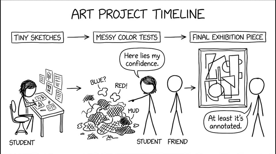
Growth over time: early attempts, visible mistakes, refined solutions.
-
Conceptual depth: your work says something, and your writing proves you know what it is.
-
Connections: research influences the work, and the work feeds back into reflection.
A useful read here is How to Meet Examiner Expectations in IB Visual Arts, especially if you are unsure what “conceptual depth” looks like on the page.
The best strategy: use drawing and painting like a relay team
In strong IB Visual Arts portfolios, drawing and painting are rarely rivals. They are stages.
A practical workflow that signals “top student”
-
Start with drawing studies (composition thumbnails, tonal tests, material experiments).
-
Move into small painted tests (palette trials, brushwork experiments, surface changes).
-
Resolve into final works that clearly relate back to those earlier decisions.
-
Write short reflections that explain the pivot points: what you learned, what you changed, what you kept.
For theme planning that makes this easier, browse Best IB Visual Arts Themes for Process Portfolios and consider how each theme could demand different media.
Common mistakes (and the simple fixes)
-
Mistake: treating drawing as “just prep.”
Fix: include at least one drawing series where each step answers a question (composition, tone, symbolism, scale). -
Mistake: repeating one painting style without evolution.
Fix: change one variable per experiment (tool, palette, surface, scale) and reflect on the result. -
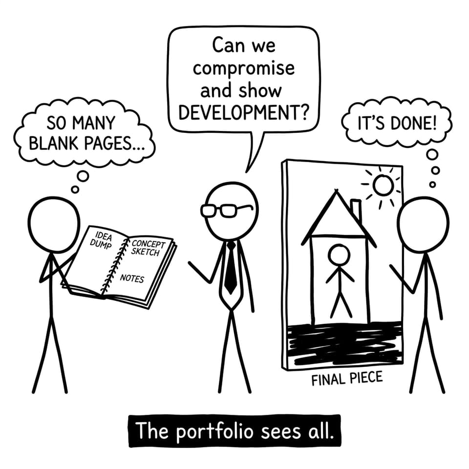
Mistake: no written reasoning.
Fix: use a consistent annotation habit. Even 2-3 sentences per screen can transform how your IB Visual Arts choices read.
Conclusion: what works better is what works with intention
In IB Visual Arts, drawing and painting are not competing for the “better” label. They are tools that reveal how you think. Use drawing to explore quickly, painting to commit boldly, and both to prove growth.
If you want a single place to tighten your portfolio decisions, use RevisionDojo to build structure: explore the Coursework Library for models (IB Visual Arts Examples), sharpen reflection with AI Chat, and sanity-check criteria with the Grading tools (for example, the IB Visual Arts Comparative Study (HL) Grader). Then reinforce your overall IB routine with RevisionDojo features like Study Notes, Flashcards, Questionbank, Mock Exams, Predicted Papers, and Tutors when you need targeted feedback.
Because the medium isn’t the message in IB Visual Arts. Your choices are.