


If you have ever stood in front of your own work and felt a strange mismatch between what you meant and what the wall is saying, you already understand the risk of an exhibition. In IB Visual Arts, the exhibition is not just a finale. It is a translation. And translation errors are expensive.
The painful part is that many lost marks in IB Visual Arts do not come from weak ideas. They come from avoidable choices: too many pieces, unclear intent, inconsistent presentation, or a curatorial rationale that reads like fog. This guide walks through the most common exhibition mistakes and how to fix them with calm, practical steps.
Quick checklist before you install anything
Use this as your 20-minute pre-flight check for IB Visual Arts:
-
Can you explain your exhibition theme in one sharp sentence?
-
Does each artwork earn its place (conceptually, technically, or developmentally)?
-
Is there space for each piece to breathe?
-
Are labels, mounts, and formatting consistent?
-
Have you tested lighting at the same time of day as the final setup?
-
Does your curatorial rationale name specific choices and reasons?
If you want the rubric perspective first, read IB Visual Arts Assessment Criteria Explained Simply.
Common IB Visual Arts exhibition mistakes (and how to avoid them)
Trying to show everything
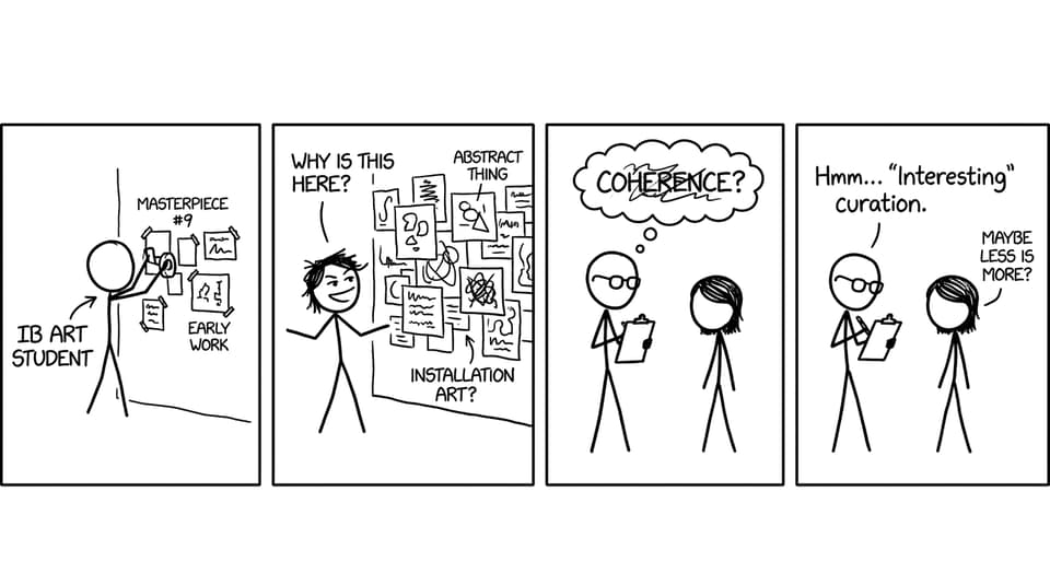
In IB Visual Arts, students often treat the exhibition like a storage unit: if it was made, it must be shown. The result is a crowded wall where nothing feels intentional. Examiners are not counting pieces. They are reading decisions.
Fix: Curate like a poet, not a historian. Choose works that build a coherent body, not a timeline. If you are unsure what to cut, use a simple rule: remove the piece you cannot defend in two sentences.
A theme that is too broad to guide selection
Themes like “identity” or “society” can work, but only if they are narrowed into something you can actually curate. In IB Visual Arts, a theme should function like a magnet. It should pull consistent choices in materials, composition, references, and intent.
Fix: Write your theme as a claim, not a topic. Instead of “memory,” try “how unreliable memory edits family narratives.” Then check whether each work supports that claim.
To sharpen your wider course strategy, see How to "Study" IB Visual Arts Effectively.
Lighting that changes the artwork’s meaning
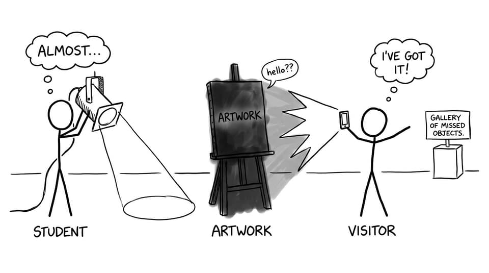
Bad lighting does not just make work harder to see. It can flatten texture, shift color temperature, and erase subtle contrasts. In IB Visual Arts, lighting becomes part of presentation, and presentation affects how your technical and conceptual decisions are understood.
Fix: Test lighting with your phone camera and with your eyes. Photograph each piece from the expected viewing point. If the photo looks wrong, the lighting is probably wrong.
Inconsistent presentation that looks rushed
Handwritten labels next to clean prints. Uneven borders. Random font sizes. These details quietly suggest a lack of control, even when the art is strong. IB Visual Arts rewards clarity and professionalism because it signals intentional communication.
Fix: Standardize everything you can: label format, font, spacing, mounting style, and alignment. Consistency acts like a frame for your thinking.
Only choosing “pretty” works and hiding risk
A polished piece can be impressive, but a whole exhibition of safe choices can feel flat. In IB Visual Arts, examiners want evidence of exploration: varied media, conceptual development, and moments where you pushed beyond your comfort zone.
Fix: Balance resolved works with pieces that show conceptual ambition or experimentation. If you are worried a risk looks imperfect, explain the purpose in the curatorial rationale.
For ideas on showing growth without apologizing, use How to Show Experimentation in Your IB Visual Arts Process Portfolio.
Ignoring the viewer’s path (space and flow)
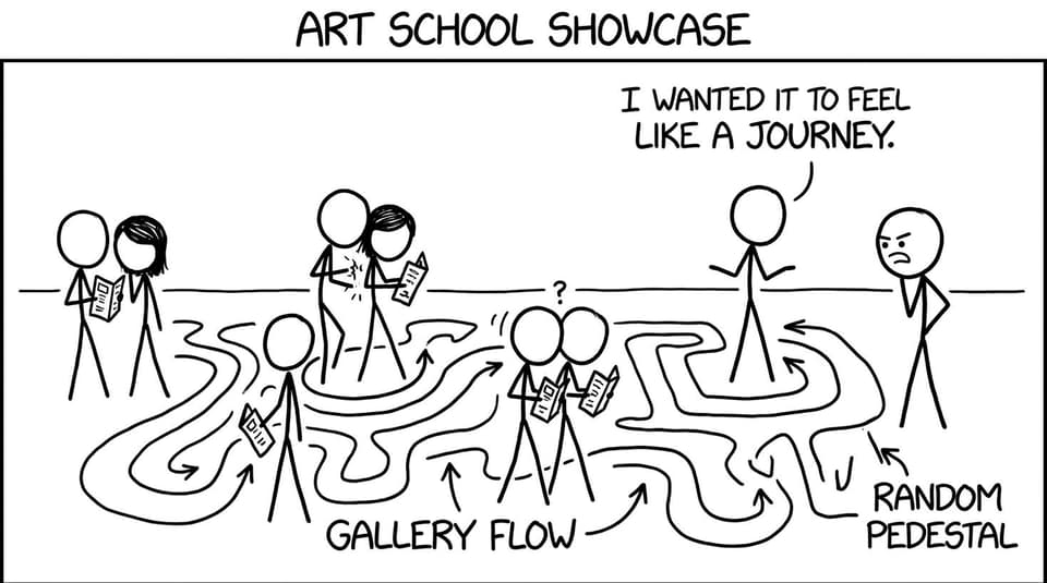
Even strong artworks can feel disconnected if the viewer has no guidance. A random order forces the examiner to build your narrative for you, and that is rarely a good trade.
Fix: Sketch a floor plan. Decide what you want the viewer to feel first, then what you want them to understand last. Create visual bridges: repeated motifs, evolving materials, or intentional contrasts.
A curatorial rationale that says nothing specific
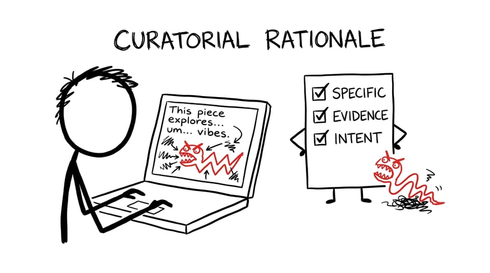
The curatorial rationale is where many IB Visual Arts marks quietly disappear. The problem is rarely grammar. It is vagueness: “This explores emotions” or “This shows my journey.” Those lines do not prove curatorial decisions.
Fix: Name choices and reasons. Mention material, scale, placement, influences, and what you want the viewer to notice. If you changed direction mid-course, explain what prompted it and what it unlocked.
To pressure-test your writing, you can use RevisionDojo’s rubric tools like the IB Visual Arts Process Portfolio Grader and the IB Visual Arts Comparative Study (HL) Grader for feedback style and criterion language that transfers well into rationale drafting.
Forgetting to connect research and influences
In IB Visual Arts, research is not a name-drop. It is evidence that you understand contexts and can position your practice within a wider conversation. When those links are missing, your work can look ungrounded.
Fix: Make influences visible in choices: composition, palette, process, subject framing, or installation approach. Then state the connection clearly in your text.
For deeper support, browse All IB Visual Arts Posts and compare your own direction with broader approaches like Best Marked Art Styles in IB Visual Arts.
How RevisionDojo helps you clean up these mistakes fast
When exhibition stress rises, your brain starts bargaining. RevisionDojo is built to stop that spiral with structure: Study Notes for criteria clarity, Flashcards to lock in key vocabulary for rationale writing, and AI Chat when you need to sanity-check a curatorial decision at 11:40 p.m. If you are revising across subjects too, the platform’s Questionbank, Mock Exams, Predicted Papers, and Tutors keep the rest of your timetable from collapsing while you install your show.
If you have not explored it yet, start with Study Notes and the free Questionbank, then map your tasks using the workflow in RevisionDojo App: The Smarter Way to Prep for IB Exams.
Final thought: make the exhibition feel inevitable
The best IB Visual Arts exhibitions feel like the only honest way the work could have been shown. Not because everything is perfect, but because every decision is defensible: selection, spacing, lighting, and language.
If you want to tighten your exhibition quickly, use RevisionDojo to anchor your choices to criteria, refine your writing with clear feedback, and keep your overall IB prep steady with tools like Flashcards, AI Chat, Grading tools, and support from Tutors. Your art already has a voice. The exhibition is where you stop it being misunderstood.