



If your IB Visual Arts comparative study feels “good” but the marks don’t match, it’s rarely because you chose the wrong artists. It’s usually because of small, fixable habits: you describe instead of argue, you compare without a purpose, you write like a textbook but forget you’re an artist.
In IB Visual Arts, examiners reward clarity: clear analysis, clear context, clear comparisons, and a clear voice that shows how your thinking changed.
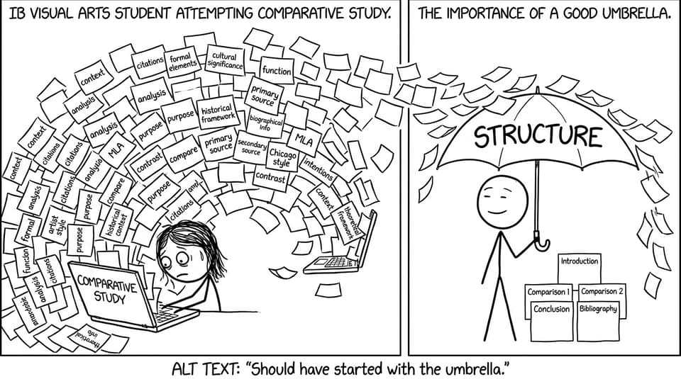
A quick checklist before you edit
Use this mini checklist to spot the most common IB Visual Arts comparative study issues fast:
-
Do you explain why choices were made, not only what is visible?
-
Does each artwork have cultural and historical context that supports your interpretation?
-
Are your artworks meaningfully comparable (shared theme, different approaches)?
-
Can a reader follow your structure without rereading?
-
Is your personal reflection specific and visual, not generic?
-
Is your layout balanced with images, labels, and citations?
For deeper requirement reminders, keep this open: Requirements for IB Visual Arts.
Mistake: You only describe what you see
A comparative study can quietly turn into a museum audio guide: color, line, texture, composition. That’s necessary, but in IB Visual Arts, description is the floor, not the ceiling.
How to fix it
Move from features to function:
-
What does the technique do emotionally or symbolically?
-
What is emphasized, and what is hidden?
-
How does the formal language support the artwork’s purpose?
If you need a repeatable method, borrow a simple analysis routine from: How to Analyze Artists in IB Visual Arts.
Mistake: Context is missing or treated like trivia
Context isn’t a paragraph you “add.” In IB Visual Arts, cultural context is part of the argument. Without it, your interpretation often becomes vague because it floats free of the world the artwork came from.
How to fix it
Use context as evidence:
-
Link one contextual detail to one visual choice.
-
Show how context shifts meaning (audience, function, symbolism, patronage, identity).
-
Compare how different contexts produce different solutions to the same theme.
A step-by-step approach is here: How to Integrate Cultural Context into Your IB Visual Arts Comparative Study.
Mistake: Your artworks don’t “argue” with each other
If the artworks are almost identical, your comparisons become repetitive. If they’re completely unrelated, the connections feel forced. Strong IB Visual Arts work sits in the middle: enough overlap to compare, enough difference to think.
How to fix it
Choose a shared thread (identity, ritual, power, memory, the body, technology) and build contrasts:
-
Same theme, different medium
-
Same subject, different purpose
-
Same technique, different cultural meaning
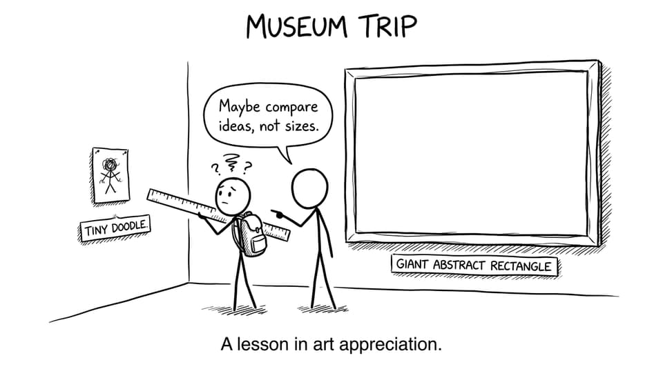
Mistake: Your structure makes the examiner work too hard
Examiners read quickly. When your IB Visual Arts comparative study jumps between artworks without signposting, you lose easy marks because your best thinking is hard to find.
How to fix it
Use a predictable flow and stick to it:
-
Short intro: focus, artworks, and what you will compare
-
Formal analysis (each artwork)
-
Context (each artwork)
-
Direct comparisons (theme-by-theme, not artwork-by-artwork)
-
Personal reflection (what changed in your practice)
-
Brief conclusion
If you want a clear template, use: Comparative Study Structure Explained for IB Visual Arts.
Mistake: Personal reflection is generic
“Studying this inspired me” doesn’t show how. In IB Visual Arts, reflection is strongest when it sounds like studio practice: materials, experiments, decisions, revisions.
How to fix it
Write reflection like a process portfolio note:
-
What did you try in your own work because of this research?
-
What failed, and what did you adjust?
-
What will you do differently in your next piece?
To strengthen the connection to your wider course work, see: What to Include in an IB Visual Arts Portfolio.
Mistake: Too much text, not enough visual guidance
A comparative study is visual thinking. Walls of text bury your argument and make it harder to compare artworks quickly.
How to fix it
Aim for “scan-friendly” pages:
-
Put artworks side-by-side when you compare
-
Use short labels and arrows for visual points
-
Add tiny diagrams (composition thumbnails, timelines, material tests)
For ideas that still look academic, use: Visual IB Study Materials: Diagrams, Charts, and Graphics.
Mistake: Citations are weak or missing
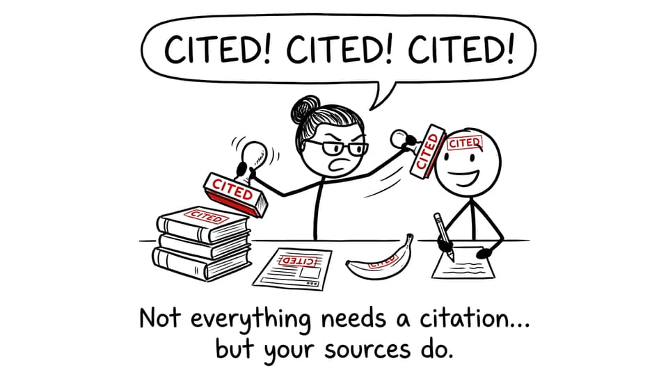
In IB Visual Arts, missing citations can make solid research look careless. It also weakens trust: the examiner can’t tell what’s your interpretation and what comes from a source.
How to fix it
-
Cite every artwork image (museum/collection source)
-
Cite key claims about context and artist intent
-
Keep a consistent format and do it as you go, not at the end
How RevisionDojo helps you fix these faster
When you’re revising IB Visual Arts, the fastest improvement comes from feedback loops. RevisionDojo is built for that.
-
Use the IB Visual Arts Comparative Study (SL) Grader to check whether your analysis, context, and comparisons actually hit the rubric.
-
If you’re building coursework alongside it, the IB Visual Arts Process Portfolio Grader helps you keep reflection specific.
-
Explore models in the IB Visual Arts Exemplars and borrow their clarity (not their content).
-
Use RevisionDojo’s Study Notes, Flashcards, and AI Chat to tighten art vocabulary, and its Grading tools to stress-test structure.
-
If you’re aiming high, Predicted Papers and Mock Exams can help you practice under time pressure, and Tutors can give targeted feedback when you’re stuck.
If you want a curated set of related guides, browse: All IB Visual Arts posts.
Closing: turn fixes into marks
The best IB Visual Arts comparative studies aren’t louder or longer. They’re cleaner: fewer descriptions, more reasons. Fewer facts, more relevance. Fewer pages that wander, more pages that compare with purpose.
If you want to tighten your study quickly, run it through RevisionDojo’s Grading tools, borrow structure from the Visual Arts guides, and use AI Chat to sharpen your analysis paragraphs into arguments. Your ideas are probably already strong. The next marks come from making them easy to see.