


Small rooms have a way of telling the truth.
You pin one more piece on the wall and suddenly your IB Visual Arts exhibition stops feeling like a curated idea and starts feeling like a storage closet with good intentions. The good news is that small spaces can actually help you: they force decisions, and decisions are what examiners can read as curatorial intent.
This guide breaks down the best IB Visual Arts exhibition layouts for small spaces, plus the tiny details (flow, spacing, lighting, labels) that make a compact setup feel confident.
Quick checklist before you move anything
-
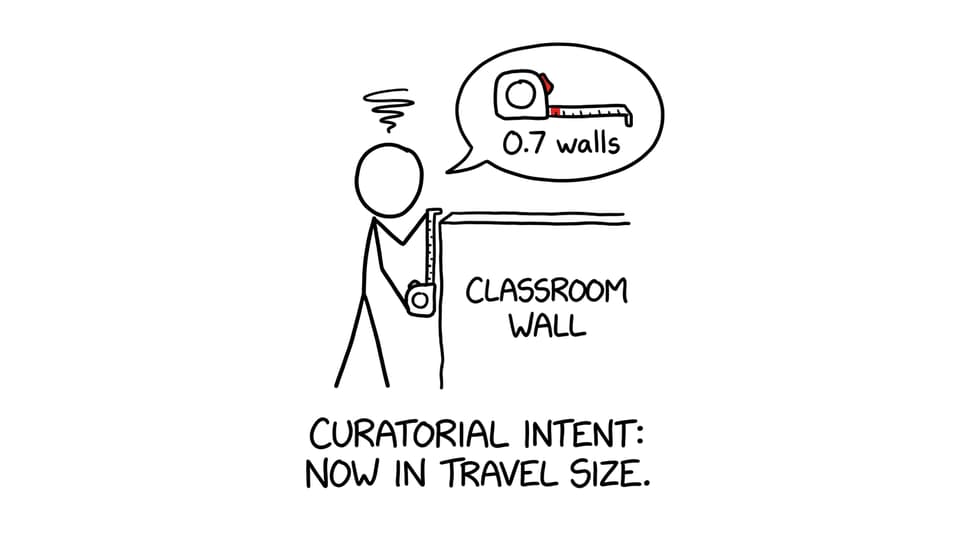
Measure walls, floor area, and pinch points (doors, radiators, windows).
-
Pick one layout logic: thematic, chronological, or media-based.
-
Choose your “anchor” work (the piece that sets the tone).
-
Decide where 3D work can sit without becoming a trip hazard.
-
Test lighting at the time of day your exhibition will be viewed.
-
Write labels in one consistent format and place them consistently.
If you want a bigger step-by-step plan, use How to Plan Your IB Visual Arts Exhibition Layout alongside this small-space guide.
Why small spaces are tricky in IB Visual Arts (and how to flip them)
Small spaces compress everything: viewing distance, traffic flow, and the time someone spends with each piece. The common problems are predictable: overcrowded walls, blocked walkways, harsh glare, and labels that look like an afterthought.
But in IB Visual Arts, a smaller room can create an intimate “conversation distance” between viewer and work. When you intentionally control spacing and movement, the exhibition feels like a designed experience, not a compromise.
For a rubric-focused reminder of what matters most, keep IB Visual Arts Assessment Criteria Explained Simply open while you plan.
Best IB Visual Arts exhibition layouts for small spaces
Minimalist layout: fewer works, louder impact
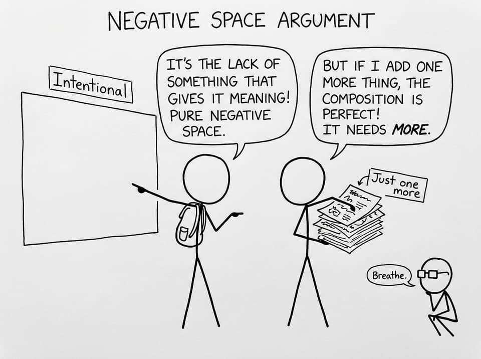
In a tight room, restraint reads as confidence. Select fewer resolved pieces and give each one breathing room. Make negative space part of the display instead of apologising for it.
A useful trick: put your anchor work where the eye naturally lands when someone enters, then let the rest support it. For exhibition planning details, pair this with IB Visual Arts Exhibition Setup Tips for High Marks.
Vertical hanging: use height like an extra wall
When wall width is limited, height becomes your second canvas. Stack smaller works above or below a larger focal piece, or create a controlled “column” of related studies.
Keep it balanced: vertical hanging works when the spacing is consistent and the grouping feels deliberate. If you’re unsure what “deliberate” looks like, scan examples and standards in Mastering Your IB Art Exhibition Style.
Grid/series grouping: make small works feel intentional
Small works scattered across a cramped room can look unfinished. But a tight grid or a clear series turns many small pieces into one strong statement.
Aim for one unifying rule (same frame size, equal gaps, aligned baselines). This is especially effective when your theme is clear, so use Strong IB Visual Arts Exhibition Themes to tighten the concept so the grid feels like a message, not a collage.
Rotational flow: guide the viewer in a loop
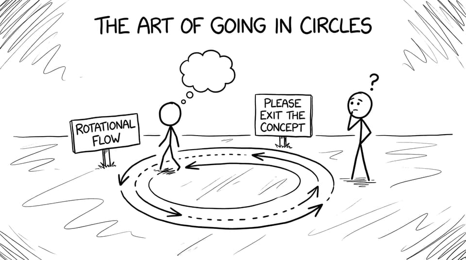
In narrow classrooms or hallways, “traffic jams” happen fast. Create a loop: place works so the viewer naturally moves around the perimeter and ends near the exit. In IB Visual Arts, a good flow quietly supports your curatorial rationale because the viewer experiences the logic.
Focused corners + mixed media balance
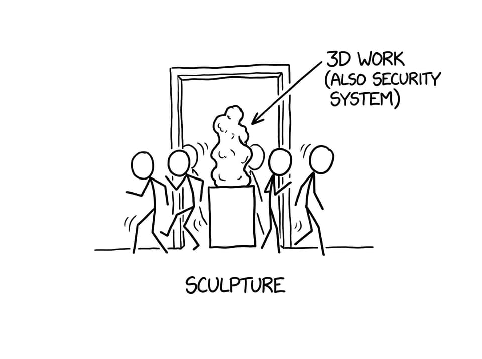
Corners can become mini-chapters: one corner for a sub-theme, one for a different material, one for a key turning point in your process. Add a small pedestal or table for 3D work to break up wall density, but never block pathways.
If you want a fast list of what not to do, bookmark Mistakes to Avoid in IB Visual Arts Exhibition Layout.
Lighting and labels: small-space multipliers
Lighting in small rooms is often too close, too harsh, or too uneven. Use soft spot lighting where possible, and test for glare on glossy surfaces from multiple viewing angles. Avoid turning the room into a spotlight maze.
Labels matter more in small spaces because they’re closer to the viewer. Keep formatting consistent (title, medium, size, year), place them at a predictable height, and proofread like it’s an exam.
To strengthen the writing that supports your exhibition, practice clarity with How to Write Strong Annotations in IB Visual Arts Portfolio.
Conclusion: make small feel deliberate
A small room doesn’t shrink your IB Visual Arts exhibition, it sharpens it. Use minimalism to protect impact, vertical hanging to “add” wall space, grids to unify small works, and rotational flow to prevent bottlenecks. Then polish the multipliers: lighting, labels, and a rationale that explains why the layout makes sense.
When you’re ready to tighten the rest of your course (process portfolio, comparative study, and exam preparation), RevisionDojo is built for it: Study Notes and Flashcards to reinforce concepts, an exam-style Questionbank with feedback, AI Chat for quick clarifications, Grading tools to check against criteria, Predicted Papers and Mock Exams for timed practice, Coursework Library plus Tutors when you want examples and expert guidance. Keep the exhibition simple, intentional, and readable, and let RevisionDojo help you make it examiner-proof.