

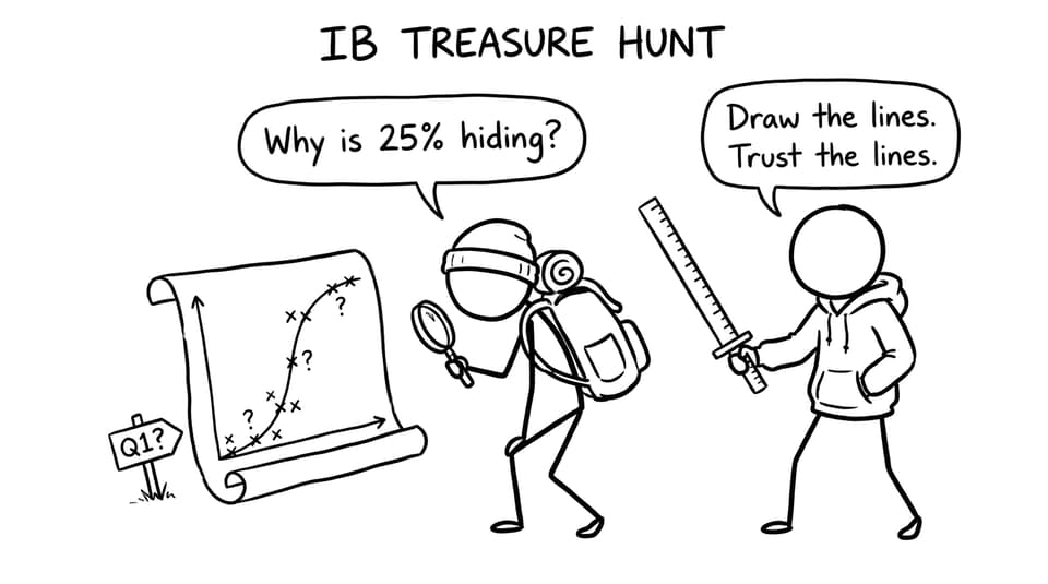
If you have ever looked at a cumulative frequency curve and felt oddly confident -- then instantly wrong -- you are in good company. In IB Math, quartile questions can feel “easy” because the definitions are familiar. But the marks are rarely lost on definitions. They are lost in the reading.
The curve is calm. The exam clock is not. And under pressure, small habits (like skipping a line or glancing at the wrong axis) quietly turn Q1 into a random number that only looks reasonable.
The IB Math quartile checklist (the 20-second routine)
Use this every time you read quartiles from a cumulative frequency curve:
-
Find the total frequency (the final cumulative frequency).
-
Compute the positions: 0.25n, 0.50n, 0.75n.
-
On the y-axis, locate the position (not the quartile value).
-
Draw a faint horizontal line to the curve.
-
Drop a faint vertical line to the x-axis.
-
Read the x-value as the quartile.
If you want the same routine drilled through exam-style repetition, RevisionDojo’s SL 4.2.b Working with the cumulative frequency lessons and practice are built exactly for this.
Quartiles are positional, not “visible”
A common IB Math mental trap is to treat Q1 and Q3 like landmarks you can spot on the curve. But quartiles are positions in the ordered data, not features that naturally stand out.
On a cumulative frequency curve, the first step is not “look for Q1.” The first step is: How many data points exist? Only after you have the total frequency can you place 25%, 50%, and 75% on the cumulative frequency scale.
Students who skip this step often default to “about a quarter of the way up the axis,” which sounds similar but is not the same thing. Your axis might not start at 0, might be scaled strangely, or might have an uneven grid. In IB Math, method beats vibes.
For targeted practice on quartiles and IQR beyond graphs, the Quartiles, IQR questionbank is a clean way to make the process automatic.
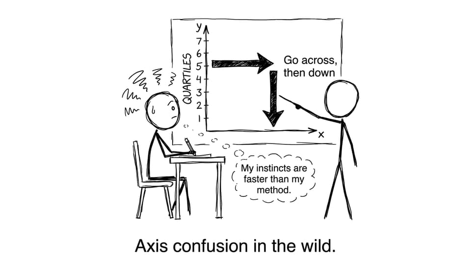
Axis confusion: the fastest way to donate marks
The most common misread is painfully simple: reading the quartile from the y-axis.
Remember what the axes represent:
-
y-axis = cumulative frequency (how many values are at or below x)
-
x-axis = the data value (what you actually want for Q1/Q2/Q3)
So your movement matters: go from y-position across to the curve, then down to x.
If cumulative frequency curves feel unintuitive in general, it helps to read a deeper explanation of why your brain resists them: Why Cumulative Frequency Graphs Feel Hard to Read.
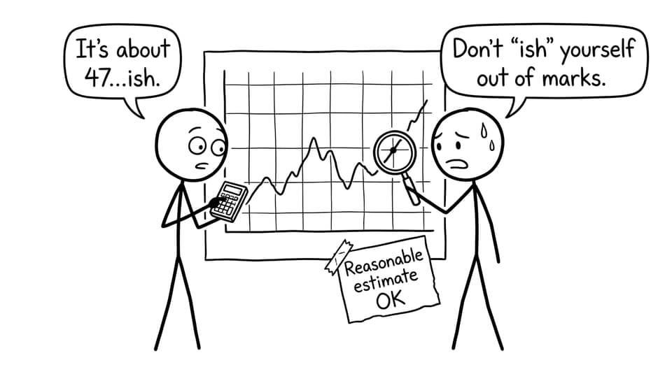
Interpolation anxiety (and why it makes answers worse)
Quartiles often land between gridlines, which means you must estimate. Many IB Math students get uncomfortable right here: they find an estimate, then “adjust” it because it doesn’t look neat.
But IB examiners expect sensible interpolation. What they reward is:
-
correct positioning (0.25n etc.),
-
clear construction lines,
-
and a reasonable reading.
RevisionDojo’s Questionbank and Grading tools help here because you get immediate feedback on whether your estimate is within an acceptable range -- and, more importantly, whether your method would earn method marks.
Confusing quartiles with “starts” and “ranges”
Another subtle mistake is treating the lower quartile as “where the data begins” or treating Q3 as “near the top.” In IB Math language, quartiles are values below which a percentage of the data lies.
So Q1 is not the first chunk of the data. It is the x-value with 25% of observations at or below it. That phrasing matters when you interpret spread, compare two distributions, or justify an interquartile range.
If you are moving between curve reading and box plots, Box and whisker diagram bootcamp practice helps you connect quartiles across representations.
The “messy lines” myth: neatness costs marks
Some students avoid drawing construction lines because they think it looks untidy. But in IB Math, faint lines are not mess -- they are evidence.
A good examiner can see what you did. A rushed examiner can also see what you did. Construction lines make both outcomes safer.
If you want a single home base for this whole statistics area, start at SL 4.2--Presentation of data and work outward with Notes, Flashcards, and timed sets.
Closing: make the curve predictable
Quartile mistakes in IB Math rarely come from weak understanding. They come from a process that is slightly too loose when the clock gets loud.
So make it tight: total frequency, 0.25n/0.50n/0.75n, across, down, read x. Draw the lines. Trust the lines.
When you are ready to turn that routine into reflex, RevisionDojo is built for it: Study Notes for the method, Flashcards for the language, Questionbank for repetition, Grading tools for feedback, AI Chat for quick clarification, plus Tutors when you want a human walkthrough. That is how cumulative frequency curves stop being risky and start being reliable in IB Math.