
The one number that can wreck your “spread”
In IB Math, there’s a moment almost everyone has: you see a dataset, you’re asked about spread, and your hand moves automatically toward range because it feels clean and fast. Max minus min. Done.
Then you read the markscheme comment or your teacher’s feedback and realise something annoying: the examiner wanted the interquartile range, not because the range is “wrong,” but because it’s often not believable.
That’s the quiet lesson in IB statistics: the best measure isn’t the easiest to compute. It’s the one that stays truthful when the data gets messy.
Quick checklist: Range or IQR?
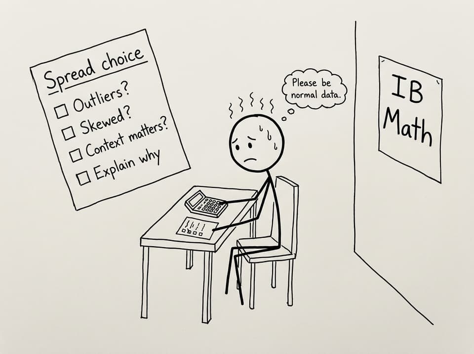
Use this mini-checklist in IB Math whenever you’re interpreting spread:
-
Are there outliers or extreme values? If yes, lean toward IQR.
-
Is the distribution skewed? If yes, median + IQR usually tells a fairer story.
-
Do the extremes matter in context? If yes, range can be worth mentioning.
-
Are you looking at a box plot? The box length is IQR, so talk IQR first.
-
Can you justify your choice in words? Interpretation marks come from explanation, not arithmetic.
For targeted practice on quartiles and IQR, the IB Math AA notes on quartiles are a strong refresher: Quartiles and IQR (AA SL 4.3).
What the range really measures (and why that’s risky)
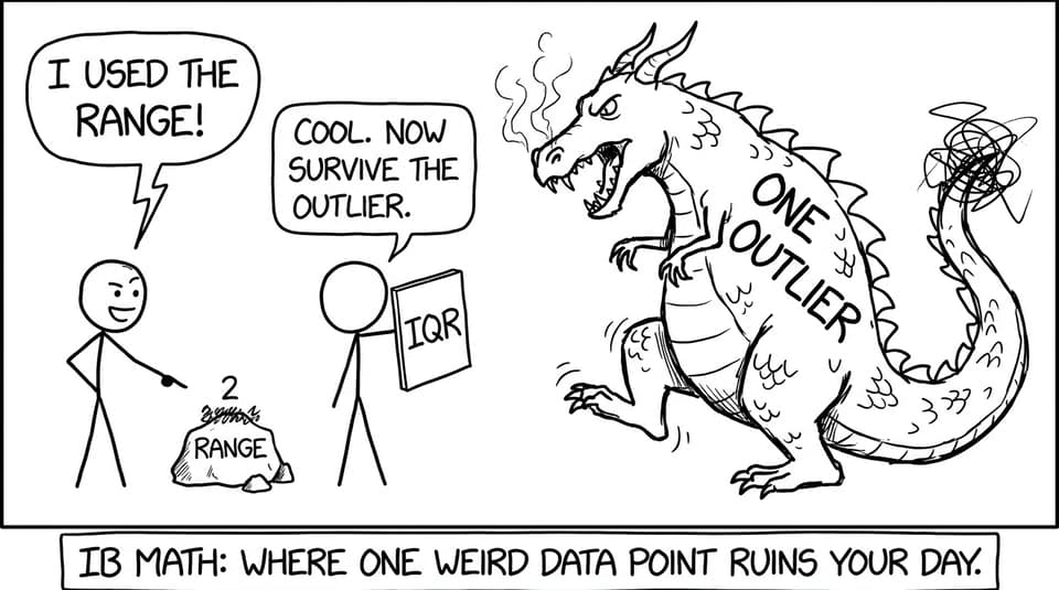
The range measures the distance between the smallest and largest values. That sounds sensible, but in IB Math terms it’s a red flag: it depends entirely on two data points.
So if one value is unusually high (a recording error, a rare event, a weird day), the range inflates dramatically. The dataset might be tightly clustered, but the range will shout, “Huge spread!” even if that’s not what most values are doing.
That’s why range is described as sensitive to outliers. It’s not that it’s useless. It’s that it’s fragile.
If you want exam-style questions where this exact trap appears, practise with: Histograms, CF graphs, box plots (AA SL 4.2 Questionbank).
What the interquartile range represents (why examiners trust it)
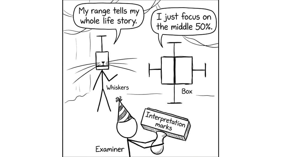
The interquartile range (IQR) measures the spread of the middle 50% of the data. In plain language: it describes how varied the typical values are, without letting the extremes dominate the narrative.
Because IQR focuses on Q1 to Q3, it ignores the lowest 25% and highest 25% of values. That “ignoring” is a feature, not a flaw, especially when the question is asking you to comment on what’s typical.
This is also why, in IB Math AI, IQR pairs naturally with the median. Both are resistant measures that stay steady when a dataset is skewed.
To build the bigger picture of how IB wants you to interpret messy real data, read: Why Do Outliers Matter So Much in IB Math AI?.
Why the IQR matters more than the range in IB Statistics
IB exam questions are rarely asking, “Can you subtract?” They’re asking, “Can you judge whether your statistic is telling the truth?”
Here’s the key difference:
-
Range reacts wildly to one unusual minimum or maximum.
-
IQR usually stays stable unless the middle of the data changes.
That stability earns marks because it supports a more reliable interpretation. If you write, “The IQR is more representative because it reflects the spread of the middle 50% and is less affected by outliers,” you’re speaking the examiner’s language.
And if you want a broader workflow for interpretation questions in IB Math, this guide helps you structure answers like an examiner: How to Interpret Data in IB Math AI Using Technology.
How IQR shows up in box plots (and why that matters)
In a box-and-whisker plot, the box length equals the IQR. The whiskers help you see overall spread, but the box is the “typical spread” zone.
So when IB gives you box plots to compare two groups, they often want you to compare:
-
medians (center)
-
IQRs (typical spread)
-
skewness (median position and whisker imbalance)
-
potential outliers
If box plots feel like a weak spot, use: Box and Whisker Plot in IB Math and the AI practice set: Box-and-whisker diagrams Bootcamp (AI SL 4.23).
Common mistakes that lose interpretation marks
In IB Math, most lost marks come from missing interpretation:
-
Calculating the range without checking whether an outlier is present
-
Stating IQR but not explaining what “middle 50%” means
-
Comparing two datasets using only one statistic (spread without center, or vice versa)
-
Forgetting context (what do these numbers represent in real life?)
A good habit is to write one extra sentence: “This is more representative because…” That sentence is often worth more than the calculation.
Bring it home with RevisionDojo
The interquartile range matters more than the range in IB Math because it stays honest when data includes outliers, skewness, and real-world noise. And that’s exactly the kind of data IB likes.
If you want to turn that understanding into marks, use RevisionDojo as your practice engine: drill IQR and box plot questions in the Questionbank, lock in definitions with Flashcards, and tighten your explanations with AI Chat and Grading tools. When exam season gets close, the Predicted Papers, Mock Exams, and targeted Study Notes help you practise the interpretations IB actually rewards. If you want extra guidance, the Tutors and Coursework Library can help you connect statistics to clear communication.
For a strong starting hub, go to: IB Math AI Statistics and Probability and keep IQR at the center of your spread discussions in IB Math.