
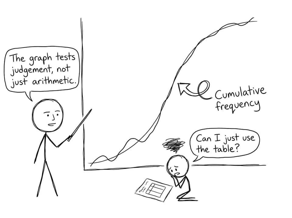
When you first meet a cumulative frequency curve in IB Math, it can feel like the exam is playing a quiet trick on you. A neat frequency table sits there, polite and exact. The curve, meanwhile, looks like a smudged promise: about here, roughly there, maybe this value.
But that “smudginess” is the point. IB questions lean toward cumulative frequency graphs over raw tables because they reward the kind of thinking real data demands: interpretation, judgement, and clear communication under uncertainty.
Quick checklist: what IB is really testing
In IB Math, cumulative frequency questions usually measure whether you can:
-
Read position in a data set (not just counts)
-
Estimate medians, quartiles, and percentiles sensibly
-
Compare distributions visually (shape, spread, and relative location)
-
Justify conclusions with cautious language and correct units
-
Show method marks via construction lines and clear reasoning
If you want targeted practice, RevisionDojo’s IB Mathematics Applications & Interpretation Resources connect these skills to exam-style questions and feedback.
Why IB Math prefers cumulative frequency over raw tables
A raw frequency table is precise, but it often turns your brain into a lookup machine. You find a number, insert it into a routine, and move on. That’s competence, but it’s not always understanding.
A cumulative frequency graph forces you to think in terms of rank and position: where the halfway point lies, where the “top quarter” begins, how quickly the data accumulates, and what that implies about spread. That’s why IB Math (especially Applications & Interpretation) uses these graphs to push you toward statistical reasoning instead of purely procedural steps.
To sharpen the foundations behind these questions, it helps to revisit the underlying statistical language in SL 4.1--Introduction to Statistics Notes.
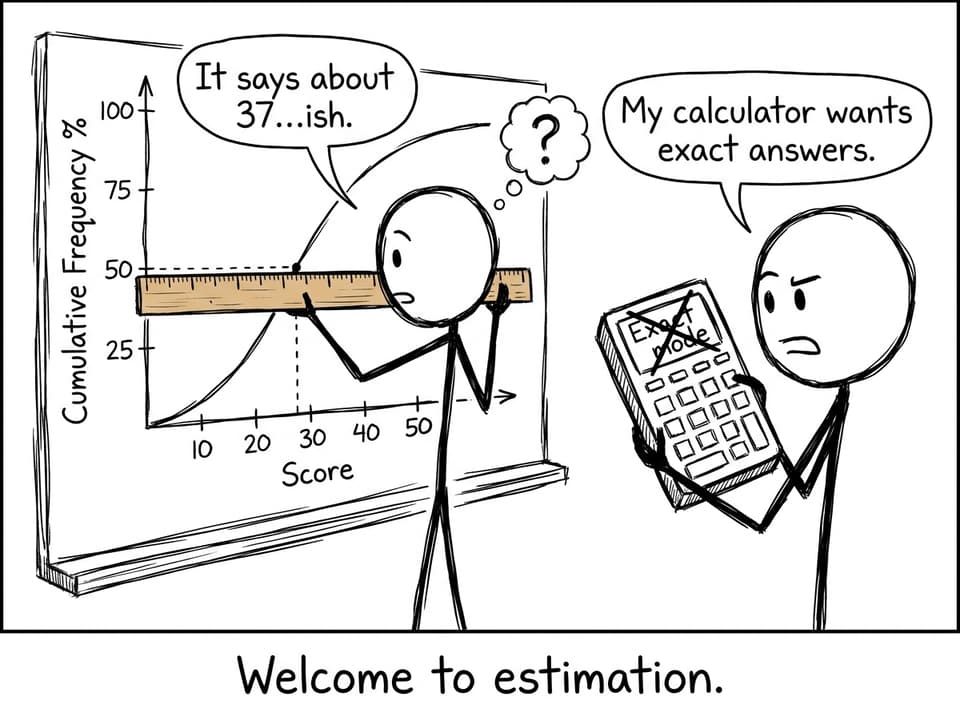
Estimation is a feature, not a flaw
One uncomfortable truth about exam data: it’s often designed so you can’t get a perfectly exact answer.
Cumulative frequency graphs naturally introduce estimation. You draw a horizontal line from (say) 50% of the total frequency, meet the curve, then drop vertically to read the median. The value you get depends on careful scale reading and sensible interpolation. Examiners can see whether you understand what you’re doing, not just whether you can press the right calculator buttons.
This is also why medians tend to feel “friendly” on ogives while means don’t. If that’s been your experience, Why Medians Are Easier Than Means on Cumulative Frequency Graphs explains the logic in a way that matches how IB Math questions are built.
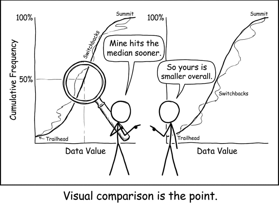
Comparison questions become clearer on one set of axes
Put two cumulative frequency curves on the same grid and suddenly you can talk about the data:
-
Which group tends to have larger values (curve shifted right)?
-
Which group has more spread (steeper vs flatter sections)?
-
Where are the quartiles relative to each other?
A table can hold the same information, but it hides the story. A graph makes the story visible, and IB loves questions where you must interpret that story in words.
For practice constructing and reading these curves the way marks are awarded, use SL 4.2.b Working with the cumulative frequency and the step-by-step training in Histograms and cumulative frequency (Bootcamp).
More room for method marks and real reasoning
From an assessment design perspective, tables often create “binary” answers: right or wrong.
Cumulative frequency graphs create space for partial credit: correct setup lines, correct quartile positions, reasonable estimates, and conclusions that match the graph. In IB Math, that matters because your communication is part of the grade. The curve is not just a picture; it’s an invitation to show your thinking.
If quartiles keep going wrong, it’s rarely because you “don’t know quartiles.” It’s usually axis confusion, skipping construction lines, or rushing totals. Why Students Misread Quartiles on Cumulative Frequency Curves breaks those mistakes down with the examiner mindset.
Bring it home: use the graph like the examiner does
Cumulative frequency graphs in IB Math aren’t harder by accident. They’re harder by design, because they measure the skills that tables politely avoid: estimation, comparison, and judgement.
If you want that skill to feel normal, build repetition the smart way: practise exam-style items in RevisionDojo’s Questionbank, lock in the language with Study Notes and Flashcards, test yourself with Mock Exams and Predicted Papers, and use AI Chat plus Grading tools to refine how you explain what the curve is saying. Start at the RevisionDojo home page and make cumulative frequency a scoring topic, not a stressful one.
