



A histogram can lie (politely)
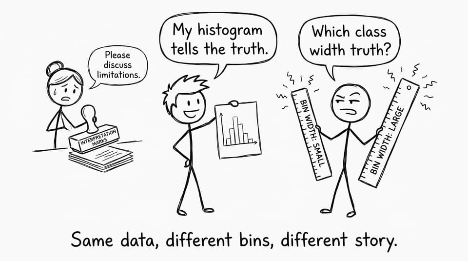
You spend ten minutes making a clean histogram. The bars touch. The axes are labelled. It looks official. And then you read the markscheme comment: “interpretation depends on class width.” In IB Math, that single sentence is a quiet warning: the graph you drew isn’t reality. It’s a summary of reality, shaped by choices.
That’s why two histograms made from the same dataset can tell two different stories. One looks neatly unimodal and “normal-ish.” Another looks bumpy, even bimodal. Nothing changed in the data. Only the class width did.
Quick checklist before you interpret any IB Math histogram
Before you write anything about skewness, clusters, or outliers, run this fast check:
-
Are the classes equal width or unequal width?
-
If unequal, are you using frequency density (area matters, not height)?
-
Are there too few bins (over-smoothing) or too many bins (noisy spikes)?
-
Would a different class width plausibly change the “shape” you’re describing?
-
Can you add one cautious limitation sentence to protect interpretation marks?
If you want targeted practice on this exact skill, RevisionDojo’s SL 4.2 topic hub for histograms and CF graphs is built around examiner-style judgement, not just drawing bars.
What class width really controls
Class width is the size of each interval on the horizontal axis. In IB Math, it controls how much detail gets compressed into each bar.
Wide class widths smooth the story
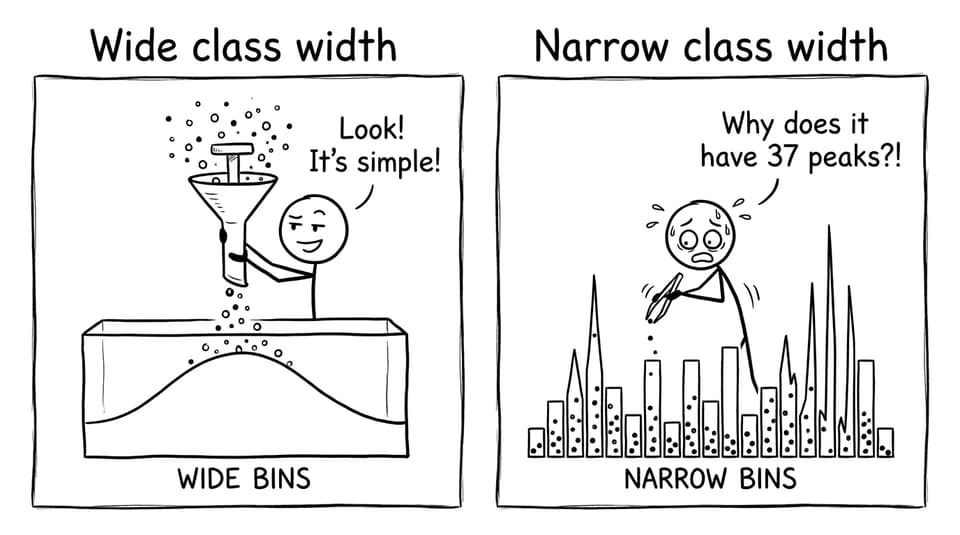
Wide bins combine many values into fewer bars. The histogram looks calmer and simpler.
-
Small gaps disappear
-
Minor peaks merge
-
Skew can look weaker than it is
This is great for a quick overview, but risky if the question asks about features like clustering or modality.
Narrow class widths amplify the story
Narrow bins create many bars. The histogram becomes sensitive to random variation.
-
Tiny changes look like “patterns”
-
The distribution can look multi-peaked
-
Students start narrating noise as if it’s signal
Why the wrong class width distorts interpretation
Distortion happens because your eyes interpret shape first, and your brain assigns meaning second.
In IB Math, examiners don’t just test whether you can read a graph. They test whether you understand that graphs are designed. When class width changes, three big interpretation claims become unstable:
Modality (one peak vs two peaks)
Two nearby clusters can merge into one hump with wide bins. With narrow bins, one cluster can fracture into several bumps. Either way, you can accidentally “prove” a peak that isn’t robust.
Skewness (tail direction)
A long right tail can look shorter when grouped into broad intervals. Conversely, narrow bins can create isolated bars that make the tail feel dramatic.
Spread and unusual values
Grouping can hide gaps or make extreme values look more common than they are. This matters when you compare datasets, especially in Applications & Interpretation contexts.
If you’re revising this as part of AI, RevisionDojo’s SL 4.2 Presentation of data notes keep the focus on interpretation language that earns marks.
Why IB Math rewards students who doubt the picture
Most students treat a histogram like a photograph. But it’s closer to a painting: the artist chooses the brush size.
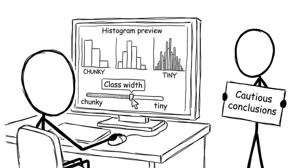
That’s why the safest exam habit is to build one sentence of humility into your interpretation:
“The apparent shape may be affected by the chosen class width, so features such as modality or clustering should be interpreted cautiously.”
That single line can separate a confident-but-fragile answer from a high-mark, statistically literate one.
Where this shows up in exam questions
Class width issues appear in IB Math when you’re asked to:
-
Compare two histograms (especially if their binning differs)
-
Comment on “shape” (skewness, modality, clusters, gaps)
-
Interpret grouped data alongside other visuals
-
Explain a limitation of the representation
For extra exam-style drills, use RevisionDojo’s SL 4.2 Questionbank or AI practice like frequency distribution bootcamps and histograms and cumulative frequency bootcamps.
Common mistakes that lose marks
-
Describing the histogram as if it is the “true” distribution
-
Ignoring unequal class widths (forgetting frequency density)
-
Over-claiming: “The data is clearly bimodal” based on one bin choice
-
Failing to mention limitations when prompted to interpret
If you’re mixing representations, it helps to revise how visuals disagree. RevisionDojo’s article on why box plots and histograms tell different stories makes that comparison feel intuitive.
A closing thought (and a practical next step)
In IB Math, histograms aren’t just about bars. They’re about judgement. Class width decides what gets blurred and what gets sharpened, and your marks often depend on whether you notice that trade-off.
If you want to turn that judgement into muscle memory, RevisionDojo is built for it: the Questionbank trains exam-style interpretation, Study Notes and Flashcards lock in definitions like frequency density, AI Chat helps you refine cautious wording, and Mock Exams and Predicted Papers build confidence under time pressure. When the histogram tries to “tell the truth,” you’ll know to ask: which class width truth?