
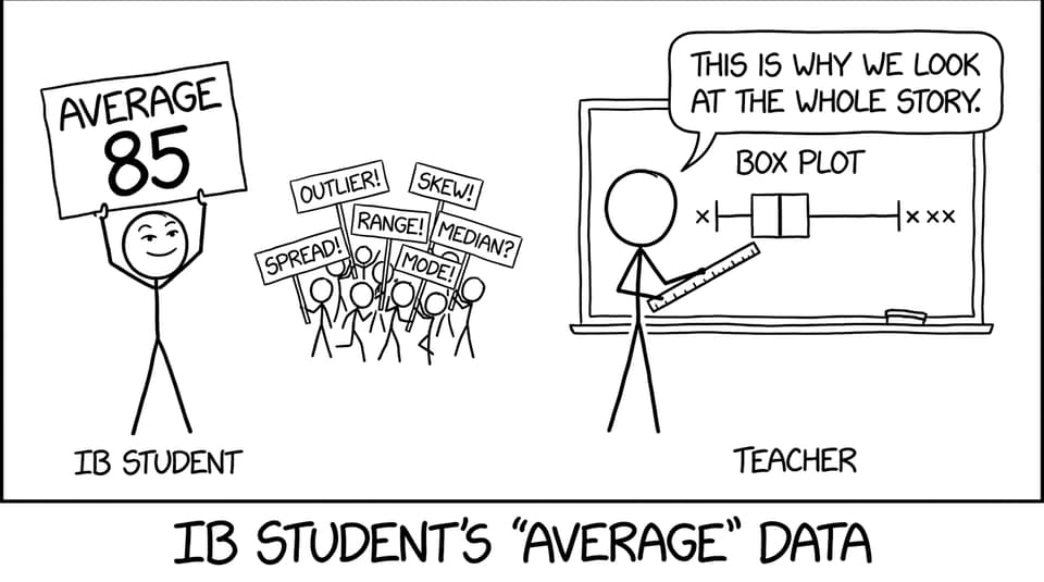
Averages are comforting. They’re one clean number you can circle, underline, and carry into your answer like a lucky charm.
But in IB Math, that comfort is often exactly what costs marks.
Because real datasets have personalities. Some are calm and consistent. Others are chaotic, pulled by outliers, or quietly skewed. A mean or median can’t confess any of that. A box plot can.
What a box plot gives you that an average never will (IB Math)
A box plot is a compact story of distribution. In IB Math, it’s valued because it turns “one statistic” into “a picture of the data’s behavior.”
It’s built from the five-number summary:
-
Minimum
-
Lower quartile (Q1)
-
Median
-
Upper quartile (Q3)
-
Maximum
From that, you immediately get:
-
Center (median)
-
Typical spread (interquartile range, IQR = Q3 - Q1)
-
Overall spread (range)
-
Skewness clues (median position and whisker lengths)
-
Potential outliers (depending on how the question frames them)
If you want a quick refresher while staying aligned to examiner expectations, use RevisionDojo’s breakdown of the Box and Whisker Plot in IB Math.
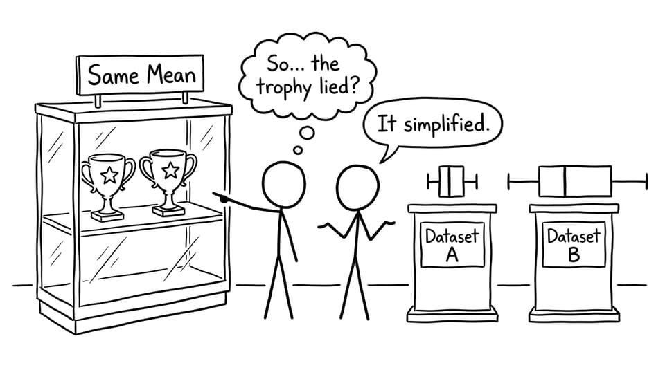
Why averages hide the interesting (and testable) parts
Here’s the quiet trap: two datasets can share the same mean or median and still behave completely differently.
In IB Math, that difference is where interpretation marks live.
Imagine two classes with the same median test score. One class is consistent, clustered around the middle. The other has a wide spread with a few extreme scores pulling the story apart. If you only report an average, you’re basically saying, “Nothing to see here.”
A box plot forces you to notice what the mean politely ignores:
-
A long whisker that suggests extreme values
-
A narrow box that suggests consistency
-
A shifted median that suggests skew
And if you want to understand why IB keeps pushing you toward IQR instead of range, this is the companion idea: Why Does the Interquartile Range Matter More Than the Range in IB Statistics.
The comparison advantage: why box plots are an IB favorite
Box plots shine when you compare two groups. That’s why they show up so often across IB Math courses, especially when the command term is compare or comment.
A strong comparison usually hits three layers:
Median (typical value)
State which dataset has the higher median and what that implies in context.
IQR (consistency of the middle 50%)
Compare box widths. Smaller IQR usually means more consistency for “typical” values.
Skewness and extremes
Use the median position and whiskers. If the median is closer to Q1 and the upper whisker is longer, that often suggests right skew.
This is also where outliers become worth real marks. If you tend to forget them under exam pressure, pair box plot practice with: Why Do Outliers Matter So Much in IB Math AI?.
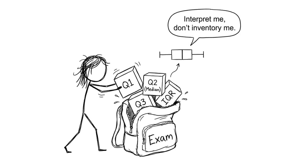
A quick examiner-ready checklist (save this for IB Math)
When a box plot appears, aim to write 4-6 sentences that include:
-
The median comparison (higher/lower)
-
The IQR comparison (more/less spread in the middle)
-
The range/whiskers comparison (more/less overall spread)
-
A note on skewness (if visible)
-
A note on outliers or extreme values (if relevant)
-
A final line that links back to the context
For targeted practice, RevisionDojo’s topic pages help you drill exactly this skill: SL 4.2--Histograms, CF graphs, box plots and the supporting SL 4.2 notes.
How RevisionDojo helps you turn box plots into marks
The hardest part of box plots isn’t reading them. It’s saying something meaningful fast.
RevisionDojo is built for that exact gap:
-
Questionbank to practice comparison prompts under time pressure
-
Study Notes to keep quartiles, IQR, and skewness language clear
-
Flashcards for quick recall of interpretation phrases
-
AI Chat when a box plot feels “obvious” but you can’t phrase it
-
Grading tools to check whether your comments earn interpretation marks
-
Predicted Papers and Mock Exams to simulate real exam pacing
-
Coursework Library and Tutors when you want extra guidance or feedback loops
If your statistics work lives inside the AI course, start from the hub: IB Mathematics Applications & Interpretation Resources and the focused area: Math AI Statistics and Probability.
Closing: the point of a box plot in IB Math
Averages are a headline. A box plot is the full article.
If you want to score consistently in IB Math statistics, train yourself to describe center and spread, then add one thoughtful sentence about what the shape suggests. That’s what turns a diagram into marks.
Build that habit with RevisionDojo’s Questionbank, Notes, Flashcards, and AI feedback loops, and box plots stop feeling like decoration and start feeling like an advantage.
