

If you have ever stared at your IB Math IA draft and thought, “My math is correct, but it still feels… unconvincing,” you are not alone. In IB, marks often rise or fall on communication, not brilliance. And nothing reveals your thinking faster than a clean graph or a diagram that earns its place.
A good visual is not decoration. It is a claim you can point to. It shows the reader what changes, what stays stable, and what your equation is really doing when it meets data.
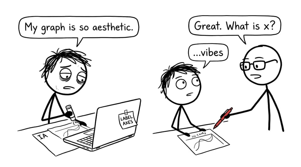
A quick checklist before you add any IB graph
Use this mini-checklist each time you paste a graph or diagram into an IB exploration:
-
Does the visual answer a specific question in your IA (not just “show the data”)?
-
Are axes labeled with variables and units?
-
Is the scale sensible and consistent with other figures?
-
Is there a caption and figure number you refer to in the text?
-
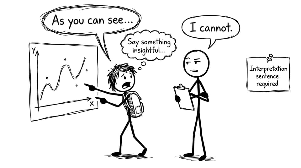
Have you written an interpretation sentence that explains what the reader should notice?
When you need a rubric-aligned reference for formatting and expectations, keep the IB Math AA IA essentials guide open as you edit.
Why IB examiners trust graphs more than paragraphs
An IB examiner reads quickly. They are trained to look for structure, mathematical communication, and reflection. A graph helps them verify all three in seconds.
A well-built scatter plot can show correlation and outliers without you begging the reader to believe you. A function plot can show asymptotes and turning points without a wall of calculus. A diagram can explain your setup so your algebra feels motivated instead of random.
If you want your whole IA to feel logical, pair your visuals with a clear structure. The guide How to structure the IB Math IA for maximum clarity makes it easier to place each graph where it actually strengthens the story.
Choosing the right graph type for the right IB purpose
Different visuals do different jobs. In IB mathematical communication, “right” means: the reader can see the idea you claim you are investigating.
Relationship and modeling visuals
-
Scatter plots for relationships between two variables (with a regression line if appropriate)
-
Residual plots to evaluate model fit (often where strong Reflection lives)
-
Function plots to compare a theoretical model with a fitted model
If you are still deciding how many visuals your exploration needs, use How many graphs should an IA include? as a reality check. It helps you avoid the classic IB problem: adding more figures but gaining no extra marks.
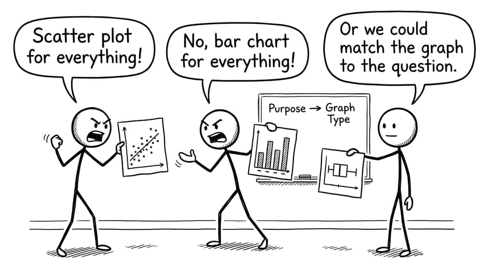
Distribution and comparison visuals
-
Box plots for spread, median, and outliers
-
Histograms for shape (skew, bimodality) when you have enough data
-
Bar charts only when categories matter more than continuous change
If your IA touches statistics skills you need to refresh before exams, build the foundation in the IB Mathematics Applications & Interpretation resources hub and then drill weaknesses using the platform tools.
Labeling: the smallest IB detail with the biggest payoff
IB presentation marks disappear over tiny omissions. A graph with missing units is like a proof with missing definitions: the reader might guess, but they should not have to.
A strong labeling pattern looks like this:
-
Horizontal axis: t (seconds)
-
Vertical axis: h (meters)
-
Caption: Figure 3: Height of the ball over time with quadratic model
Then do the most important part: refer to it in your writing. “Figure 3 shows…” is not filler; it is you guiding the examiner to the evidence.
For a more detailed formatting walk-through, How to format and label graphs in your IA is a practical companion while you edit.
Annotations turn an IB graph into an argument
A graph becomes persuasive when you annotate what matters.
Add labels for:
-
Intersections (and what they mean in context)
-
Turning points (max/min, point of inflection)
-
Asymptotes and restrictions
-
Outliers and possible reasons
In many IB IAs, the highest marks come from explaining what the graph implies about your assumptions. For example, pointing out where a fitted model stops matching real data is not a weakness; it is reflection.
If you want help pressure-testing those reflection moments, RevisionDojo’s AI Chat is useful for rewriting captions and interpretation sentences so they sound precise rather than vague. The Coursework Library also helps you see what “good annotation density” looks like in real student work.
Integrate visuals into the narrative (don’t drop them in)
A graph should never appear like it fell out of your calculator.
Use a simple three-step integration pattern:
-
Introduce: what the figure is and why it exists.
-
Observe: what the reader should notice.
-
Interpret: what that observation means for your model or next step.
Example template:
Figure 2 displays the scatter plot of (x) against (y). The upward trend suggests a linear relationship, but two points deviate strongly. This motivates testing a linear regression, followed by residual analysis to check whether the linear assumption is reasonable.
If your data analysis section still feels messy, How to use RevisionDojo to prepare for IB Math IA data analysis gives you a clean workflow from raw data to interpretation.
How RevisionDojo supports IB math communication while you revise for exams
IB students often try to do two hard things at once: write an IA and revise for exams. You can make them support each other.
-
Use Study Notes and Flashcards to tighten the definitions you use in captions and explanations.
-
Use the Questionbank to practice the exact graph interpretation skills that show up in exams (functions, statistics, calculus interpretation). Start with How to use the Questionbank for targeted math revision.
-
Use Grading tools to spot where your IA is descriptive instead of analytical.
-
Use Mock Exams and Predicted Papers to build speed, then bring that clarity back into how you describe trends and parameters.
-
Use Tutors when you need an outside eye to confirm that your visuals match your claims.
Closing: make your IB math visible
Your IB Math IA is not judged like a private notebook. It is judged like communication to another human who has to understand you quickly. Graphs and diagrams are how you make your reasoning visible, checkable, and memorable.
If you want to tighten visuals while also preparing for exams, use RevisionDojo as your loop: build skills with Study Notes and Flashcards, practice interpretation in the Questionbank, test yourself with Mock Exams and Predicted Papers, then polish your IA using AI Chat, Grading tools, and the Coursework Library. In IB, that combination turns “I did the math” into “I can explain the math.”