

Graphs can save your IB IA in the same way a clear map saves a tired traveler.
But they can also quietly sink it.
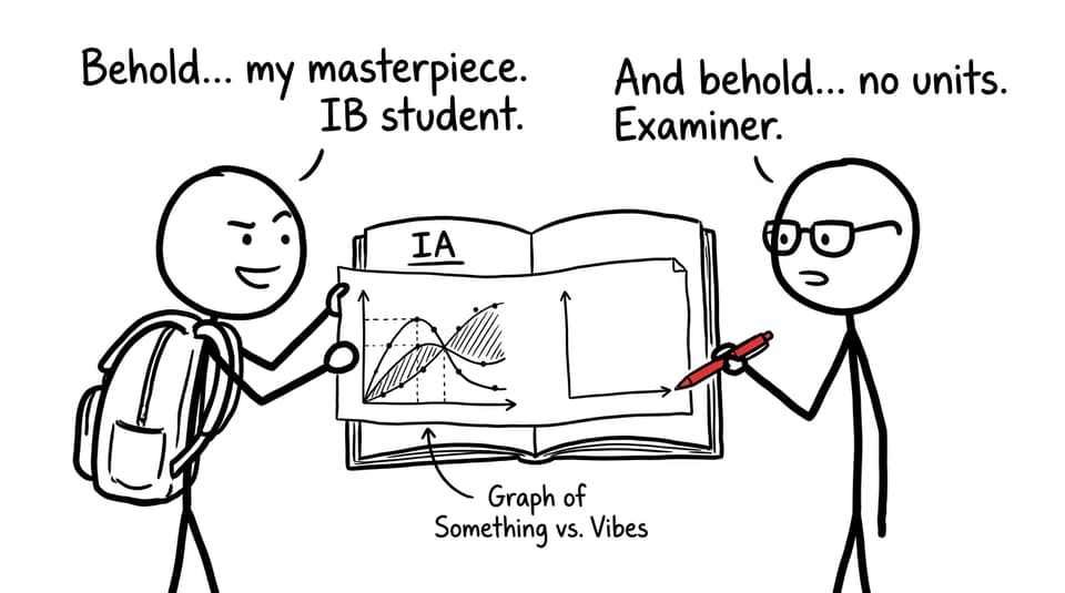
Most students don’t lose marks because their maths is wrong. They lose marks because the examiner has to guess what a graph means: an axis without units, a title that says “Graph 1,” or a screenshot so blurry it looks like it was exported through a sandwich. In the IB, that kind of friction signals messy thinking, even when your ideas are strong.
This guide is a practical, examiner-friendly approach to how to format and label graphs in your IA. It’s written for IB students who want their graphs to do what they were meant to do: communicate, justify, and make your reasoning feel inevitable.
A quick IB checklist for every IA graph
Before you insert any figure, run this fast scan. If you can tick most boxes, you’re already ahead.
-
The graph answers a specific question in your IA (not just “looks relevant”).
-
Both axes have variable names and units.
-
The scale is sensible (not compressed, not stretched, not misleading).
-
The title is descriptive and includes the relationship.
-
A caption explains what the reader should notice.
-
You refer to the graph in the text before and after it appears.
-
The export is high-resolution and readable in PDF.
-
The style is consistent across the whole IB IA.
For broader IA presentation rules, pair this with How to Format and Present Your IB Math IA Professionally.
Why formatting graphs matters in an IB IA
In an IB IA, your graph isn’t decoration. It’s evidence.
A strong figure earns credit in the parts of the rubric that reward communication: clear notation, defined variables, logical presentation, and visuals that strengthen the mathematical narrative. When examiners see clean labeling and consistent formatting, they assume (often correctly) that the thinking is also organized.
When they see messy graphs, they start reading defensively.
If you want the rubric language behind this, it’s worth skimming Criterion B: Mathematical Communication. It’s basically a checklist of what IB wants your graphs to prove about you.
How to format and label graphs in your IA so they stand alone
Your goal is simple: if someone covered all your surrounding paragraphs, your graph should still make sense.
Start with purpose: what claim is this graph supporting?
Before you touch font sizes or gridlines, write one sentence in your draft:
- “This graph shows that…”
If you can’t finish that sentence, the figure is probably exploratory, not explanatory. Exploratory graphs can live in an appendix, but your main body should be reserved for graphs that directly support your IB argument.
If you’re unsure how many graphs are enough, use How Many Graphs Should an IA Include? as a sanity check.
Axis labels: variables, units, and meaning
IB examiners should never have to infer what “x” means.
A complete axis label usually includes:
-
Variable name (mathematical symbol)
-
Quantity (what it represents)
-
Unit (in parentheses)
Examples:
-
t (time, s)
-
h (height, m)
-
C (concentration, mol dm⁻³)
If your IA uses non-standard symbols, define them in the text before the figure. For guidance on consistent notation across an IB document, read How to Use Mathematical Language and Notation Correctly in the IB Math IA.
Scale choices that don’t distort your conclusion
Scale is one of the easiest ways to accidentally mislead.
Use these IB-safe habits:
-
Choose a range that includes all relevant data with comfortable margins.
-
Avoid uneven scaling unless you explain it.
-
Keep intervals clean (1, 2, 5, 10 patterns are easier to read).
-
If you use log scales, label them explicitly (for example, log10(y)).
A good rule: if a trend looks dramatically different when you adjust the axes slightly, the graph is too sensitive and needs explanation.
Titles and figure numbering that sound like science, not admin
“Graph 2” is a filing label, not communication.
In an IB IA, a useful title includes the relationship and context:
-
“Figure 2: Reaction rate vs. temperature for catalase (Trial 1-3)”
-
“Figure 4: Residual plot for quadratic model fitted to projectile data”
Number figures consistently (Figure 1, Figure 2, etc.) and keep naming consistent across the whole IB document.
Captions: the quiet place where marks live
A caption isn’t a repeat of the title. It’s your chance to guide the examiner’s attention.
Strong captions often include:
-
What the data represents (raw vs processed)
-
What model is shown (linear, exponential, logistic)
-
What the reader should notice (trend, anomaly, limitation)
If you struggle to write captions that interpret rather than describe, How to Communicate Mathematical Ideas Clearly in the IB Math IA is a helpful companion.
Legends, colors, and accessibility (including grayscale)
Color is useful in an IB IA, but only if it remains readable when printed or converted.
Do this:
-
Use 2-4 consistent colors across all graphs.
-
Combine color with markers (circles, squares, triangles).
-
Place legends where they don’t cover data.
-
Check contrast and test a grayscale export.
Don’t do this:
-
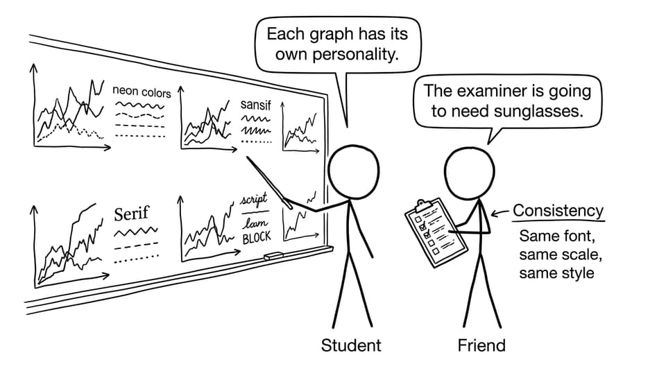
Neon palettes that overpower the data.
-
A different style theme for every figure.
Gridlines and clutter: make the data the loudest thing
Gridlines are helpful until they become the main character.
-
Use light gridlines when precision reading matters.
-
Remove heavy backgrounds.
-
Avoid dense minor gridlines unless needed.
If you need to annotate key points (turning points, intersections, asymptotes), add small labels with consistent formatting and explain them in the text.
How to integrate graphs into an IB IA narrative
A graph should never appear without a sentence introducing it and a paragraph interpreting it.
Use this simple IB pattern:
-
Before: “Figure 3 compares the observed data to the exponential model to test whether the growth assumption is reasonable.”
-
Graph
-
After: “The model fits closely for 0 ≤ t ≤ 6, but deviations increase after t = 7, suggesting a change in conditions or a limit to the model.”
If you want a deeper guide on choosing the right visual type and using graphs as argument, see How to Use Graphs Effectively in Your IB Math IA and How to Present Data Visually in Your IA.
Exporting graphs for Word/PDF without losing quality
Most IB graph problems happen at the final step: moving from a tool into the IA document.
Use these export rules:
-
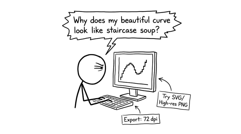
Prefer vector formats when possible (SVG or PDF export) for line graphs.
-
If using PNG, export at high resolution (think print quality, not screen).
-
Avoid screenshots unless absolutely necessary.
-
Check readability at 100% zoom in the final PDF.
A practical workflow many IB students use:
-
Build the graph in Desmos/GeoGebra/Excel.
-
Export as SVG or high-res PNG.
-
Insert into the IA.
-
Export the whole IA as PDF.
-
Do a final “print test” by zooming out slightly and checking labels.
Common IB graph mistakes (and quick fixes)
These are the issues examiners see constantly, which means fixing them is an easy way to stand out.
Unlabeled units
Fix: put units on axes and in table headers, not scattered in text.
Inconsistent rounding
Fix: decide decimal places based on measurement precision, then keep it consistent.
Graphs that aren’t referenced
Fix: write “Figure X shows…” before the figure and interpret after.
Overcrowded visuals
Fix: split into two figures or move secondary plots to an appendix.
Graphs that don’t answer the research question
Fix: use the “one-sentence purpose test” and cut anything that doesn’t earn its space.
If you want a broader data write-up checklist, use 10 Best Practices to Write Up Data and Results in Your IB IA.
How RevisionDojo helps you polish IA graphs (without overthinking)
The fastest way to improve your IB graphs is to stop reinventing standards every time.
RevisionDojo is built to reduce that decision fatigue:
-
Use the Coursework Library to see how top-scoring students present visuals: IB Coursework Examples: IA, EE and TOK Exemplars.
-
Use AI Chat to refine captions and ensure your interpretation matches what the graph actually shows.
-
Use Grading tools to catch presentation gaps that cost marks (missing units, unclear variables, weak figure references).
-
Use Study Notes and Flashcards to strengthen the maths behind your models, so your graphs reflect understanding, not just plotting.
-
Use the Questionbank to build exam confidence alongside coursework, especially if your IA topic overlaps with functions, statistics, or calculus: IB Mathematics AA Calculus Questionbank.
-
When deadlines get tight, Predicted Papers and Mock Exams help you keep exam preparation moving without sacrificing your IB IA quality.
-
If you’re stuck, Tutors can review your graph choices and the story you’re trying to tell.
Closing: make your graphs feel inevitable
A well-labeled graph in an IB IA does something subtle: it makes your argument feel calm.
The examiner isn’t fighting the page. They’re following your reasoning, step by step, with fewer opportunities to misunderstand you. That’s what “communication” looks like in practice.
If you want your next draft to look and read like a top-scoring IB submission, use RevisionDojo as your workflow: pull structure cues from the Coursework Library, polish captions with AI Chat, verify presentation with Grading tools, and keep exam momentum with the Questionbank, Mock Exams, and Predicted Papers. Then your graphs won’t just be formatted and labeled correctly in your IA; they’ll become part of a story the examiner can’t ignore.