



There’s a moment in revision where numbers stop feeling like facts and start feeling like a story.
You look at a list of data values and you know there’s something hiding inside it: typical performance, weird outliers, the way results bunch up, the way they drift. In Math HL, the box and whisker plot is one of the simplest ways to turn that hidden story into something you can argue clearly in an exam.
This guide shows you exactly how to build and interpret a box and whisker plot in IB contexts, and how to write the kind of comparison statements examiners reward.
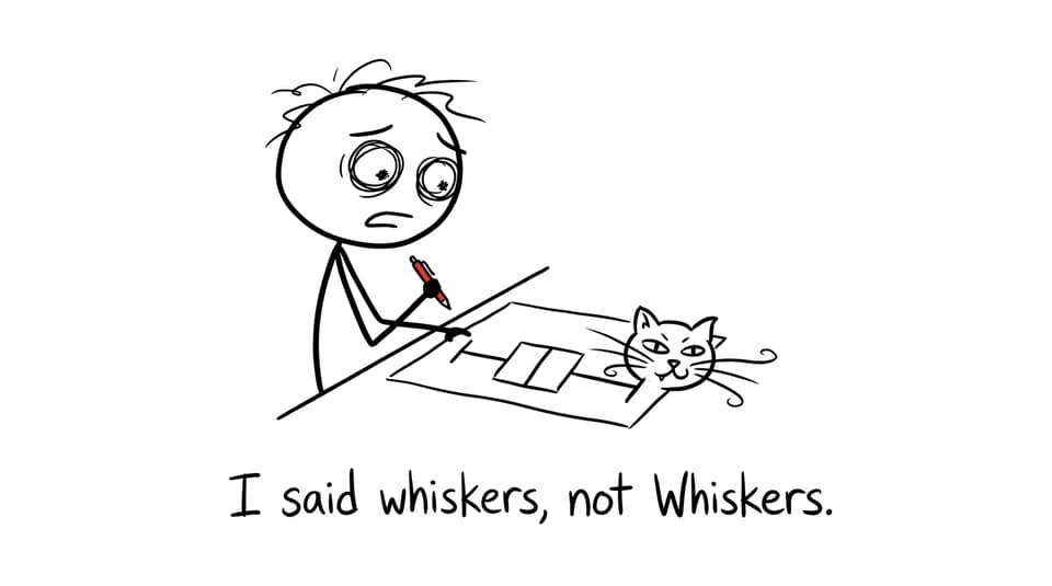
Quick checklist for box and whisker plot questions in Math HL
Before you touch your ruler (or your GDC), run this short checklist. It saves marks.
-
Put the data in order (or confirm it’s already ordered).
-
Identify the five-number summary: minimum, Q1, median, Q3, maximum.
-
Compute IQR = Q3 - Q1 and keep it ready for interpretation.
-
Sketch neatly and label the scale clearly.
-
If comparing sets, decide your comparison categories: center, spread, skewness, unusual values.
For targeted practice, the Math HL-relevant skills live inside RevisionDojo’s statistics resources, especially:
What a box and whisker plot actually shows (and why Math HL cares)
A box and whisker plot compresses a full data set into five anchor points:
-
Minimum
-
Lower quartile (Q1)
-
Median (Q2)
-
Upper quartile (Q3)
-
Maximum
Then it draws them in a way your eyes can compare instantly:
-
The box runs from Q1 to Q3.
-
The median line sits inside the box.
-
The whiskers extend out to the minimum and maximum (unless outliers are treated separately in the question).
In Math HL, this matters because IB often tests whether you can interpret distribution rather than just calculate it. A mean can be dragged around by extremes; a box and whisker plot shows the middle 50% honestly.
If you want the deeper “why,” this is a strong companion read: Why box plots reveal more than averages in IB statistics.
How to construct a box and whisker plot (the exam-safe method)
Step-by-step
-
Order the data from smallest to largest.
-
Find the median (Q2).
-
Split the data into a lower half and upper half.
-
Find Q1 as the median of the lower half.
-
Find Q3 as the median of the upper half.
-
Draw a scale, then plot min, Q1, median, Q3, max.
-
Draw the box (Q1 to Q3), median line, then whiskers.
Micro-example
Data: 4, 6, 7, 9, 11, 15, 18
-
Minimum = 4
-
Median (Q2) = 9
-
Q1 = 6
-
Q3 = 15
-
Maximum = 18
-
IQR = 15 - 6 = 9
In a Math HL response, you should be ready to state both the diagram and what it implies: “The middle 50% of values lie between 6 and 15.”
To drill the construction skill fast, use RevisionDojo’s bootcamp-style practice: Constructing box and whisker plots exercises.
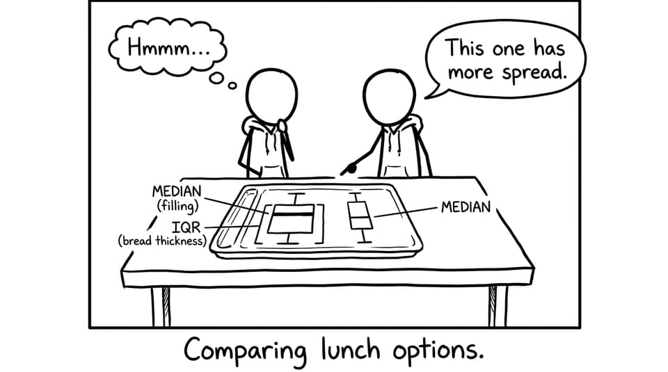
How to interpret a box and whisker plot like an examiner
A good interpretation sounds calm and specific. In Math HL, aim for these four lenses.
Center (typical value)
Use the median. In comparisons, write: “Dataset A has a higher median than Dataset B, so its typical value is larger.”
Spread (consistency)
Use the IQR first, then the full range if needed.
-
Smaller IQR = more consistent middle performance.
-
Larger IQR = more variability in the middle 50%.
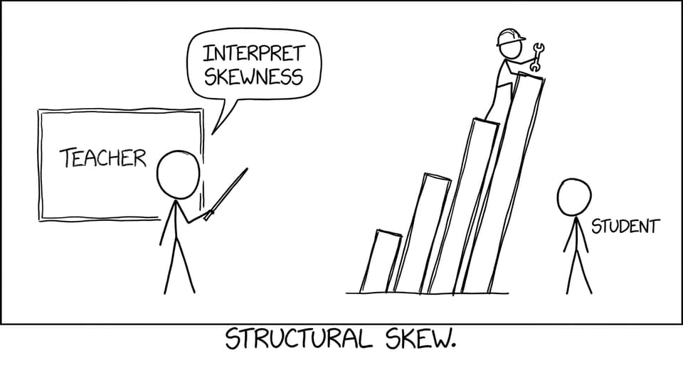
Skewness (shape)
A boxplot hints at skewness when:
-
The median is closer to Q1 or Q3.
-
One whisker is noticeably longer.
Your wording should be cautious: “The distribution appears right-skewed since the upper whisker is longer and the median is closer to Q1.” That kind of phrasing is very Math HL-safe.
Unusual values (outliers)
Some questions show outliers as separate points. If asked, you might use the rule “outliers beyond 1.5×IQR from Q1 or Q3,” but only if the question context invites it.
For broader statistics confidence (not just boxplots), build a routine from the hub: Statistics & Probability (Math AA) and practice sets via Statistics & Probability Questionbank (Math AA).
Common mistakes that quietly lose marks in Math HL
-
Quartiles from unsorted data: you get a neat-looking boxplot that is completely wrong.
-
No scale labels: the diagram becomes hard to award method marks.
-
Comparing only medians: IB loves “median + IQR” together.
-
Forgetting context: if the data are “reaction times,” say reaction times, not “values.”
When you want instant feedback on these details, RevisionDojo’s AI Chat can help you rewrite interpretations into exam language, and the Grading tools can check whether your comparison statements actually use the statistics you calculated.
Closing: Turn boxplots into easy Math HL marks
A box and whisker plot is quiet power: five numbers, one diagram, and suddenly you can talk about typical performance, consistency, skewness, and comparison with real precision. In Math HL, that precision is where marks hide.
If you want this topic to feel automatic, build a short routine on RevisionDojo: learn the idea with Study Notes, lock in definitions with Flashcards, drill comparisons in the Questionbank, and use AI Chat plus Grading tools to sharpen your written interpretations. When the exam comes, you won’t just draw the box and whisker plot, you’ll explain what it means like you own the data.