



Mixed media is where an IB Visual Arts student’s personality tends to show up first. Not in a dramatic, “look at me” way, but in the quieter way you choose a fabric scrap because it belonged to someone, or a receipt because it proves a habit, or a photo because memory is never as clean as the camera pretends.
Then exhibition week arrives, and suddenly that same brave work can look… chaotic. Not because it’s bad, but because mixed media is unforgiving: edges, glue, shadows, and labels can either make your intentions readable or bury them.
This guide helps you showcase mixed media so it looks deliberate, coherent, and examiner-friendly in IB Visual Arts.
Mixed media checklist for IB Visual Arts exhibitions
Before you install anything, run this quick check:
-
Is every material choice tied to your theme (not just aesthetics)?
-
Are the edges, mounts, and surfaces clean enough to feel intentional?
-
Does lighting reveal texture without harsh glare?
-
Is the work placed where viewers can actually understand it (distance, height, flow)?
-
Do labels clearly state mixed media components (and match across the whole show)?
If you’re still shaping your overall exhibition story, start with The Exhibition in IB Visual Arts: What You Need to Know and keep it open while you plan.
Why mixed media can score well in IB Visual Arts
In IB Visual Arts, mixed media is powerful because it shows two things examiners consistently reward: risk-taking and control.
Risk-taking is obvious: you’re combining processes, building layers, and letting materials carry meaning. Control is the part students miss. Control looks like intentional composition, stable construction, clear presentation choices, and a rationale that explains “why this material, here, now.”
To align your choices with assessment language, it helps to read how marking actually works: How Examiners Grade the IB Visual Arts Exhibition.
Best ways to showcase mixed media in an IB Visual Arts exhibition
Make “professional” your default setting
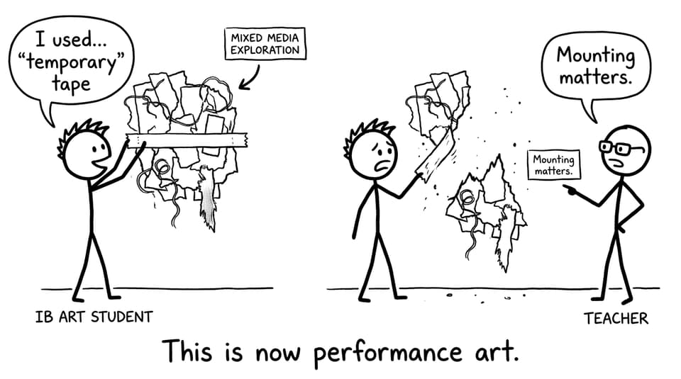
Mixed media can look raw without looking careless. Aim for clean edges, secure attachment, and surfaces that won’t peel, curl, or shed. If your work is unframed, finish the sides. If it’s mounted, mount it like it matters.
A strong mixed media piece often fails on one small detail: visible messy tape, weak glue, or uneven mounting. Those details read as accidental, and in IB Visual Arts, accidental is the enemy of meaning.
For a deeper look at intentional experimentation (the kind you can explain in your Process Portfolio), see IB Visual Arts: Exploring Mixed Media That Scores.
Curate placement like it’s part of the artwork
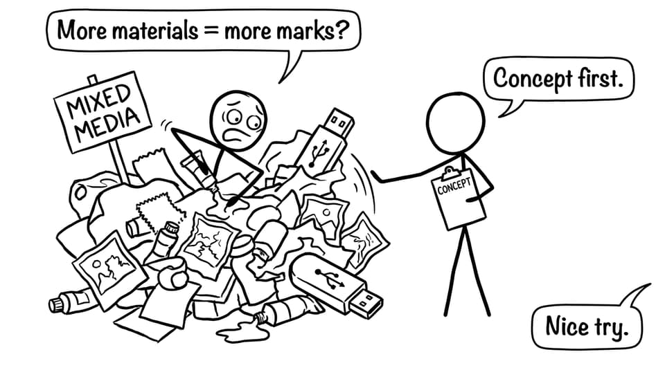
Mixed media usually has more visual “noise” than a drawing or photograph. That’s not bad. It just means placement matters.
Use mixed media as a focal point, then give it breathing room with simpler works nearby. Think of your exhibition as a paragraph: dense sentences need white space.
If your room is small (most are), plan for clarity with Best IB Visual Arts Exhibition Layouts for Small Spaces and avoid the common traps in Mistakes to Avoid in IB Visual Arts Exhibition Layout.
Use lighting to reveal texture, not punish it
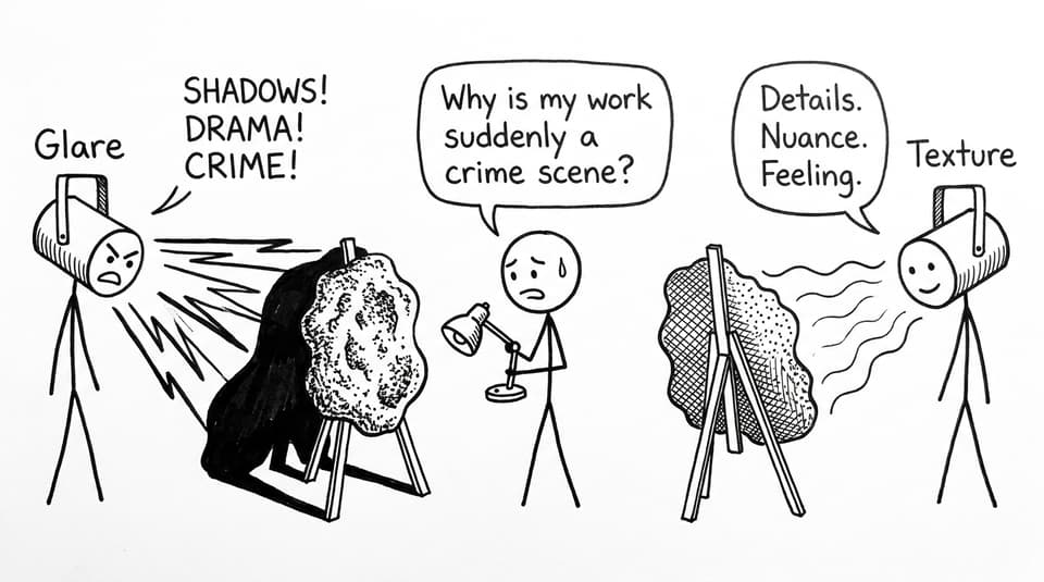
Texture is the point of mixed media, but bad lighting can flatten it or turn it into glare and harsh shadows. Test lights at the same time of day your exhibition will be viewed. Change angles. Step back. Photograph it.
Write labels that signal intention
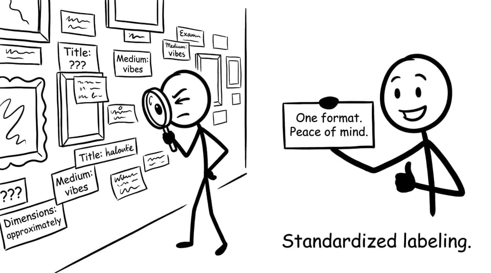
In IB Visual Arts, labels aren’t just admin. They’re evidence that you know what you did.
Be specific: “Mixed media (acrylic, collage, fabric, thread)” is stronger than “mixed media.” Keep format consistent across the whole exhibition so the viewer focuses on the work, not the randomness.
Use How to Write Exhibition Texts and Labels for IB Visual Arts as your template.
Quick examples of mixed media that feels coherent
-
Identity: portrait + stitched text + family photos, where stitching becomes a metaphor for repair.
-
Environment: painted surface + recycled packaging, where the material is literally the message.
-
Memory: layered found objects on wood, where the mounting choice supports the “archive” concept.
If you’re unsure whether your theme can hold varied media, pressure-test it with Best Themes for IB Visual Arts Exhibition.
Conclusion: make your mixed media readable
Mixed media in IB Visual Arts isn’t about adding more. It’s about choosing better. When your materials, layout, lighting, and labels all point to the same idea, the examiner doesn’t have to guess what you meant; they can spend that attention rewarding it.
If you want a calm way to tighten your exhibition planning, RevisionDojo helps you turn artistic choices into exam-ready evidence: use the Study Notes to understand requirements, the Flashcards to memorise key assessment language, and AI Chat to refine your curatorial rationale and labels. When you need real standards, explore the IB Visual Arts Exemplars in the Coursework Library, and build confidence with Mock Exams, Grading tools, and Tutors. Mixed media is already brave. Present it like you meant it.