
Introduction: the curve that quietly explains everything
A PPC looks harmless. Two axes. One curved line. A few points.
Then you see it in IB Economics exams and realize the Production Possibility Curve is doing a lot more than “showing choices.” It’s quietly testing whether you understand scarcity, efficiency, opportunity cost, and growth -- and whether you can explain them with calm precision under time pressure.
This guide breaks down what the PPC really shows, why it bends, how to describe shifts vs movements, and how to build real-life examples that feel natural in IB Economics answers.
PPC quick checklist (exam-ready)
When you see a PPC in IB Economics, check these fast:
-
Are the axes clearly labeled with two goods (or categories like consumer vs capital goods)?
-
Is the curve a boundary for maximum possible output given resources and technology?
-
Is the point on, inside, or outside the curve?
-
Is the question about a movement along the curve or a shift of the entire curve?
-
Can you state the opportunity cost using the idea of a trade-off (and, if relevant, the slope)?
If you want the syllabus-aligned version, keep this open while you revise: Production possibilities curve (PPC) topic hub.
What the Production Possibility Curve (PPC) really shows
In IB Economics, the PPC (also called the PPF) is a model showing the maximum combinations of two goods or services an economy can produce when it uses all resources efficiently, with current technology.
That single sentence hides three examinable ideas:
-
Scarcity: resources are limited.
-
Choice: producing more of one thing means producing less of something else.
-
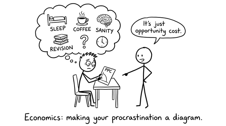
Opportunity cost: the “less of something else” is the cost.
For clean definitions you can lift into your own phrasing, RevisionDojo’s IB Economics glossary is a quick reference.
On, inside, and outside the curve (and what examiners want you to say)
On the PPC: productive efficiency
A point on the curve means the economy is producing at its productive capacity. In IB Economics, the key phrase is “resources are fully employed and used efficiently.”
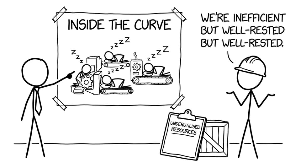
Inside the PPC: underutilised resources
A point inside the curve signals inefficiency -- unemployment, idle factories, poor organisation, or weak demand leading to unused capacity.
This is a common trap: inside the curve does not mean “good because there’s room to grow.” It means “output is below potential.”
Outside the PPC: unattainable (for now)
A point outside the curve is currently unreachable given the economy’s resources and technology. In IB Economics, you can add: “it may become attainable after economic growth,” which sets up an outward shift.
Why the PPC is usually bowed outward in IB Economics
A straight-line PPC implies constant opportunity cost, but most IB Economics diagrams use a bowed-out (concave) curve to show increasing opportunity cost.
The intuition: resources aren’t equally good at producing everything.
-
Land great for agriculture isn’t instantly great for heavy industry.
-
Skilled nurses can’t be converted into software engineers overnight.
So when an economy switches more and more resources toward one good, it eventually starts using resources that are less suitable. The sacrifice gets bigger. That’s increasing opportunity cost.
To tighten this up for exams, pair the curve shape with opportunity cost language. RevisionDojo’s breakdown of opportunity cost in IB Economics is helpful for building that sentence structure.
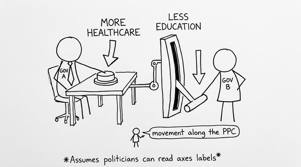
Movement along the PPC vs shifts of the PPC
Movement along the PPC: reallocating existing resources
A movement along the curve means the economy is still at productive capacity, but it’s changing the mix of output.
Example: A government redirects spending from education to healthcare. Output changes composition, but the economy is still using resources efficiently.
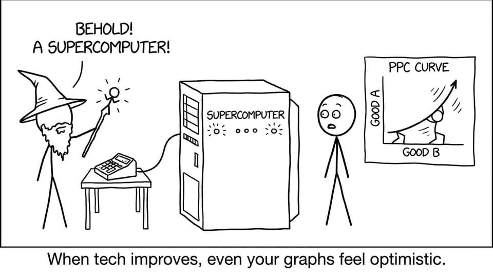
Outward shift: economic growth (more potential output)
An outward shift means the economy can produce more of both goods. In IB Economics, the standard causes are:
-
Technological progress
-
Increased quantity or quality of factors of production (labour, capital, land)
-
Investment in capital goods and human capital
For a macro link you can use in longer answers, see Economic growth notes.
Inward shift: loss of productive capacity
War, natural disasters, pandemics, or long-term capital destruction can shift the PPC inward. This is about reduced capacity, not just a temporary dip in demand.
Real-life PPC examples you can actually use in exams
In IB Economics, the best PPC examples are simple, realistic, and clearly tied to the model.
Guns vs butter (security vs living standards)
A country facing higher geopolitical risk may expand defence production. The movement along the PPC shows the trade-off: more military equipment means fewer consumer goods.
Healthcare vs education (public budget trade-offs)
If a government allocates more resources to hospitals and staffing, it may fund fewer teachers or school buildings. The PPC gives you a clean way to state the opportunity cost in units that feel “economic,” not moral.
Consumer goods vs capital goods (today vs tomorrow)
This one is gold in IB Economics. If an economy produces more capital goods today (machines, infrastructure), it sacrifices some consumer goods now -- but can shift the PPC outward later through higher productive capacity.
Renewable energy vs fossil fuel output (transition constraints)
During an energy transition, resources (investment, skilled labour, grid capacity) are limited. In the short run, pushing aggressively into renewables can reduce output elsewhere. Over time, tech improvements can shift the PPC outward.
If you want PPC practice that feels like exam marking, RevisionDojo’s Introduction to Economics questionbank is built around those “explain using a diagram” prompts.
How to score marks with PPC in IB Economics
Most PPC questions reward the same habits:
-
Draw clearly and label axes.
-
Mark a point (A/B) and describe it (inside/on/outside).
-
Use “opportunity cost” explicitly.
-
If shifting, add arrows and name a cause (tech, labour force, capital).
If you’re revising PPC as a full subtopic, use the core RevisionDojo pages for the same content in multiple formats: PPC study notes and PPC videos.
Conclusion: PPC is small, but it’s not simple
The PPC is one of the first diagrams you learn in IB Economics, and it’s one of the last ones you stop using. It’s a model of trade-offs, yes -- but more importantly it’s a model of how scarcity forces decisions, how efficiency has a shape, and how growth is more than a headline number.
If you want to turn PPC into easy marks, build a loop: learn the definitions, practise the diagram language, then drill exam-style prompts. RevisionDojo makes that loop fast with its Study Notes, Flashcards, AI Chat, Grading tools, Questionbank, Predicted Papers, Mock Exams, and support from Tutors inside the wider IB Economics resource hub. And once the PPC clicks, a lot of IB Economics starts to feel calmer too.
