This criterion assesses the recording, processing and presentation of the collected data.
Data refers to quantitative data or a combination of both quantitative and qualitative data.
The breakdown of the criteria is as follows.
Figure 1: Criteria breakdown
Communication
Clearcommunication means that the method of processing can be understoodeasily.
Precisecommunication refers to following conventions correctly, such as those relating to the of and or the use of , and .
annotation
graphs
tables
units
decimal places
significant figures
Major omissions, inaccuracies or inconsistencies impede the possibility of drawing a valid conclusion that addresses the research question.
Significant omissions, inaccuracies or inconsistencies allow the possibility of drawing a conclusion that addresses the research question but with some limit to its validity or detail.
Recording data
Data can be classified as quantitative or qualitative.
Both types of data should be included in this section.
The amount of data collected will depend on the type of investigation and the sampling rate discussed in section 2.1.
Some investigations will naturally produce more raw data than others.
If large amounts of raw data are collected, it is recommended that students only present a sample of the data or include the complete raw data tables in the Appendix.
Tip
Whatever the amount of data collected, it should be presented in an appropriate data table (or results table) and labelled as Table 1, Table 2, etc., with appropriate and clear titling.
A data table must include the units of the measurement together with the absolute uncertainty.
The data must be recorded to the correct number of decimal places.
This is determined by the measuring device and should be consistent for the same device.
SI units should be used throughout the report.
Quantitative data should also be included in the results table, depending on the protocol used.
Example of results table are shown below.
Example
Figure 2: Sample 1 of results table
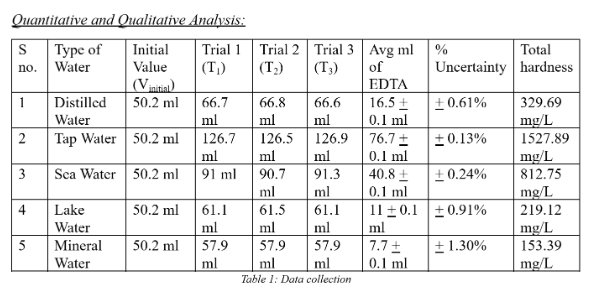
The heading of the table is too vague.
Besides, despite the title, qualitative data is missing from the table.
It could be that there was no qualitative data collected in this particular investigation.
Also, the format is not completely clear: the units included in the cells are shown differently.
The units for the measured volume should be included once at the top of the column and not in each cell.
This goes for the units used in the far right column, which is labelled as total hardness.
There is also some inconsistency with the number of decimal places used for the raw data, which should be the same number of decimal places.
The average volume has been calculated with a percentage uncertainty, although this should also be included at the top of the column.
In the first columnS no. means sample #, but it is not correctly expressed.
Example
Figure 3: Sample 2 of results table
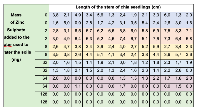
The table presented in the previous page (Table 3 in the example) displays the collecteddata and is clearly aligned with the variables outlined in the Research Question; namely, the mass of zinc used and the length of the seedlings.
Although the data collection table is relatively concise and could be incorporated into the main body of the Internal Assessment (IA), it is generally advisable to place raw data tables in the appendix for better organization and readability.
Overall, this part of the criteria is correctly done by the student.
However, he/she must have included qualitative data.
Example
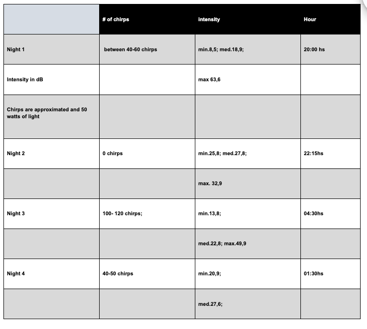
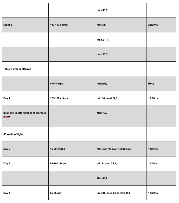
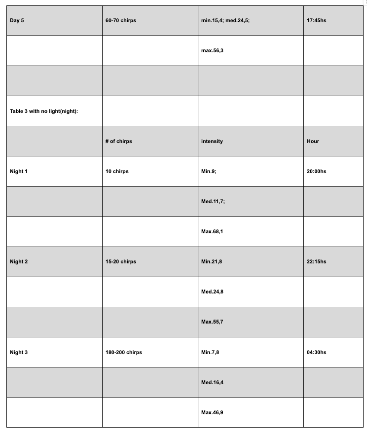
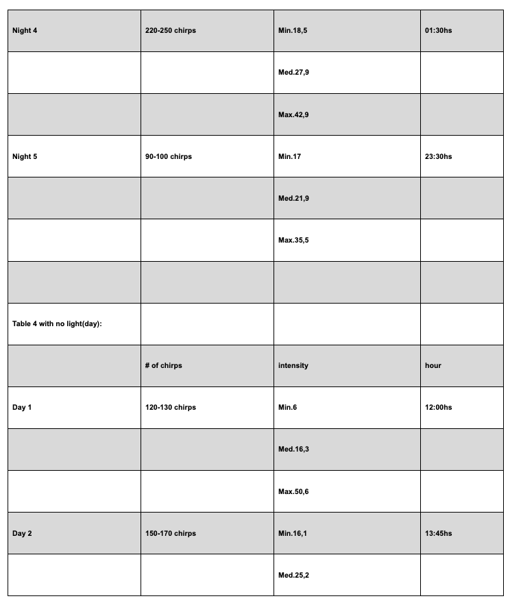
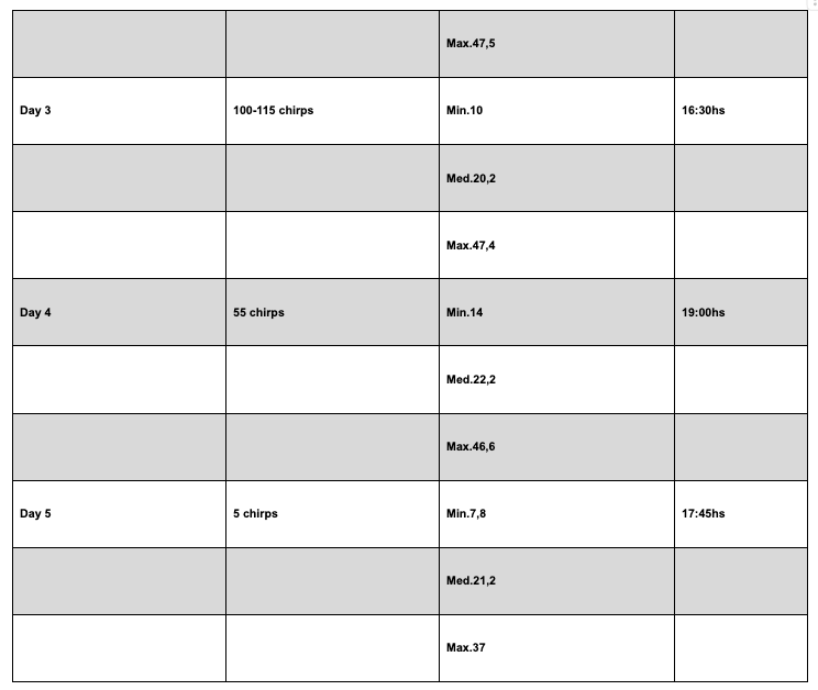
This example is referred to gathering data of the number of cricket chirps and the intensity of their sound depending on absence and presence of light.
Figure 4: Sample 3, excerpt 1 of results data
Figure 5: Sample 3, excerpt 2 of results data
Figure 6: Sample 3, excerpt 3 of results data
Figure 7: Sample 3, excerpt 4 of results data
Figure 8: Sample 3, excerpt 5 of results data
Unlike Example 2, this case illustrates an incorrect presentation of tables and the student should be awarded 1–2 marks in this criterion.
Despite their considerable size, the candidate chose to include the tables within the main body of the work, which is inappropriate.
Tables of this magnitude should be placed in the appendix to maintain the clarity and readability of the report.
Additionally, the formatting of the tables is unclear and they are cut, making the reading too difficult.
The column headings for light intensity are incomplete, lacking both units and uncertainty values.
The inclusion of time in hours is also questionable, as it does not contribute meaningfully to the data analysis.
Furthermore, the data listed under “Number of Chirps” is imprecise and presented as intervals.
While this may reflect a limitation of the investigation, it should be clearly labeled under a different title included in the heading to distinguish it from exact measurements and to better communicate the nature of the data.
Qualitative data are not included.
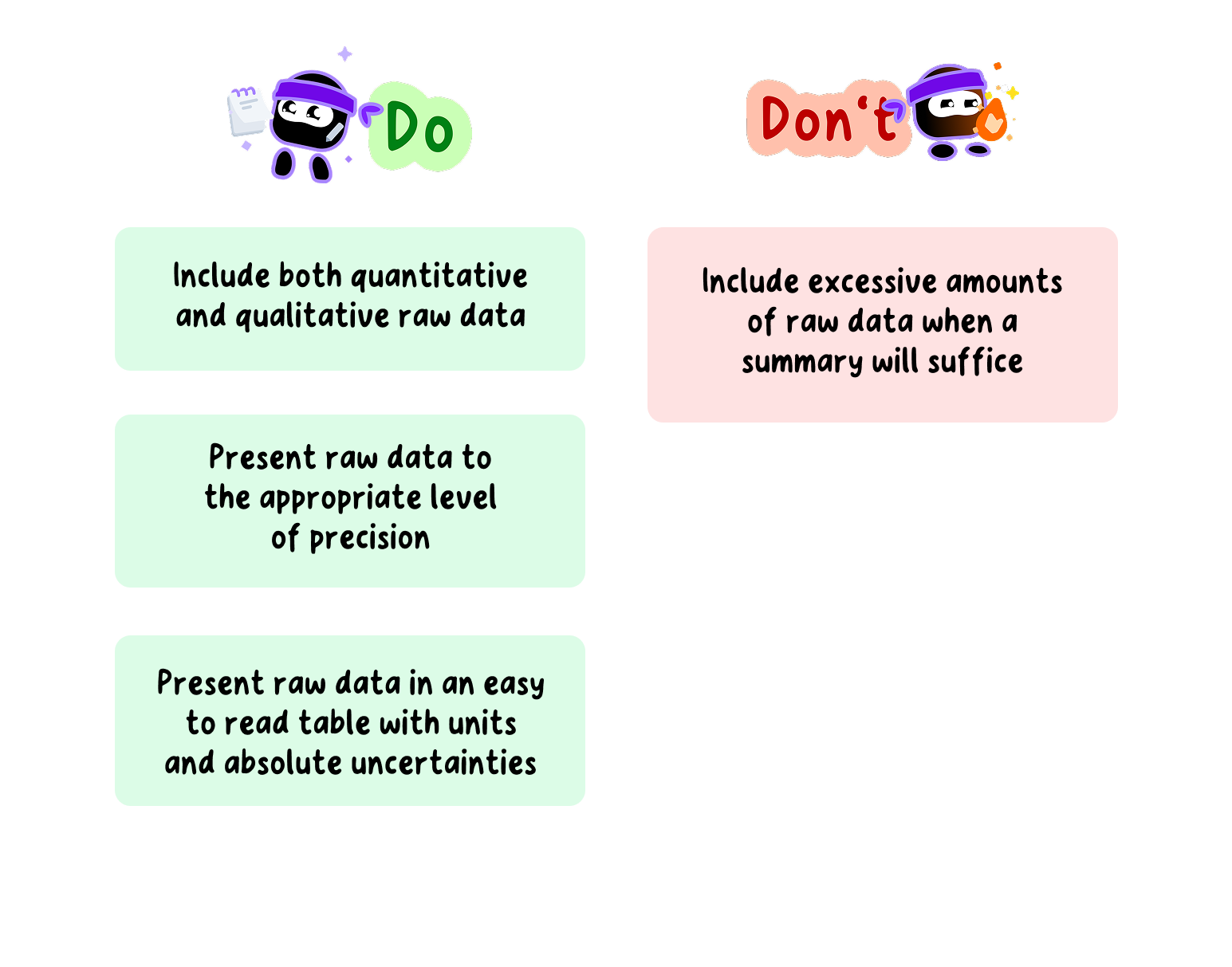
When including samplingdata in Data Collection section, instruct students to:
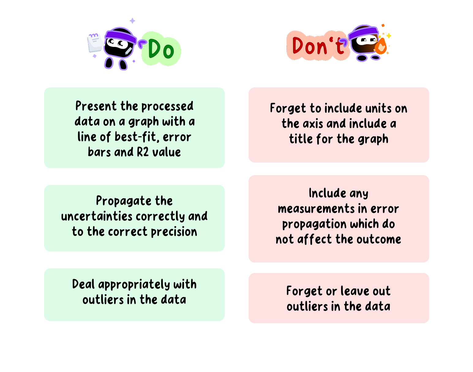
Data Recording Do's and Don'ts for your Bio IA
Data Processing
Data processing involves transforming the raw data into different forms that allow the relationship between the variables to be determined and the research question to be answered.
This criterion assesses the extent to which the student’s report provides evidence that the student has recorded, processed and presented the data in ways that are relevant to the research question.
This could include finding the average when multiple trials have been conducted, calculating a rate of reaction, plotting a graph and determining a best-fit line, statistical analysis, among other methods.
Tip
The use of spreadsheets might be appropriate here as they allow for the easier processing of data.
Because the scope of possible investigations is so large, it is not possible to give explicit instructions for every form of data processing.
Therefore, it is recommended that students do their own research to determine the type of data processing required for their investigation.
Whatever the form of data processing used in the investigation, it is recommended to present an example calculation which is clear and easy to follow.
Tip
Pay particular attention to the use of significant figures and decimal places in calculations.
Graphing is an important part of data processing.
A graph provides a visual representation of the processed data and makes it easier to determine any relationships or trends in said data.
The type of graph produced will depend on the investigation, however, there are some important points to consider, regardless of the type:
Graphs should have axes that are clearly labelled, a title and if appropriate, a legend.
They should also be appropriately sized and easy to read.
The independent variable is usually plotted on the x-axis, and the dependent variable (or the derived value) is usually plotted on the y-axis.
A best-fit line, which can be a straight line or a curve, depending on the data, should be added.
Error bars should also be included; these are discussed in more detail in the next section.
The coefficient of determination (R²) should also be determined, if necessary.
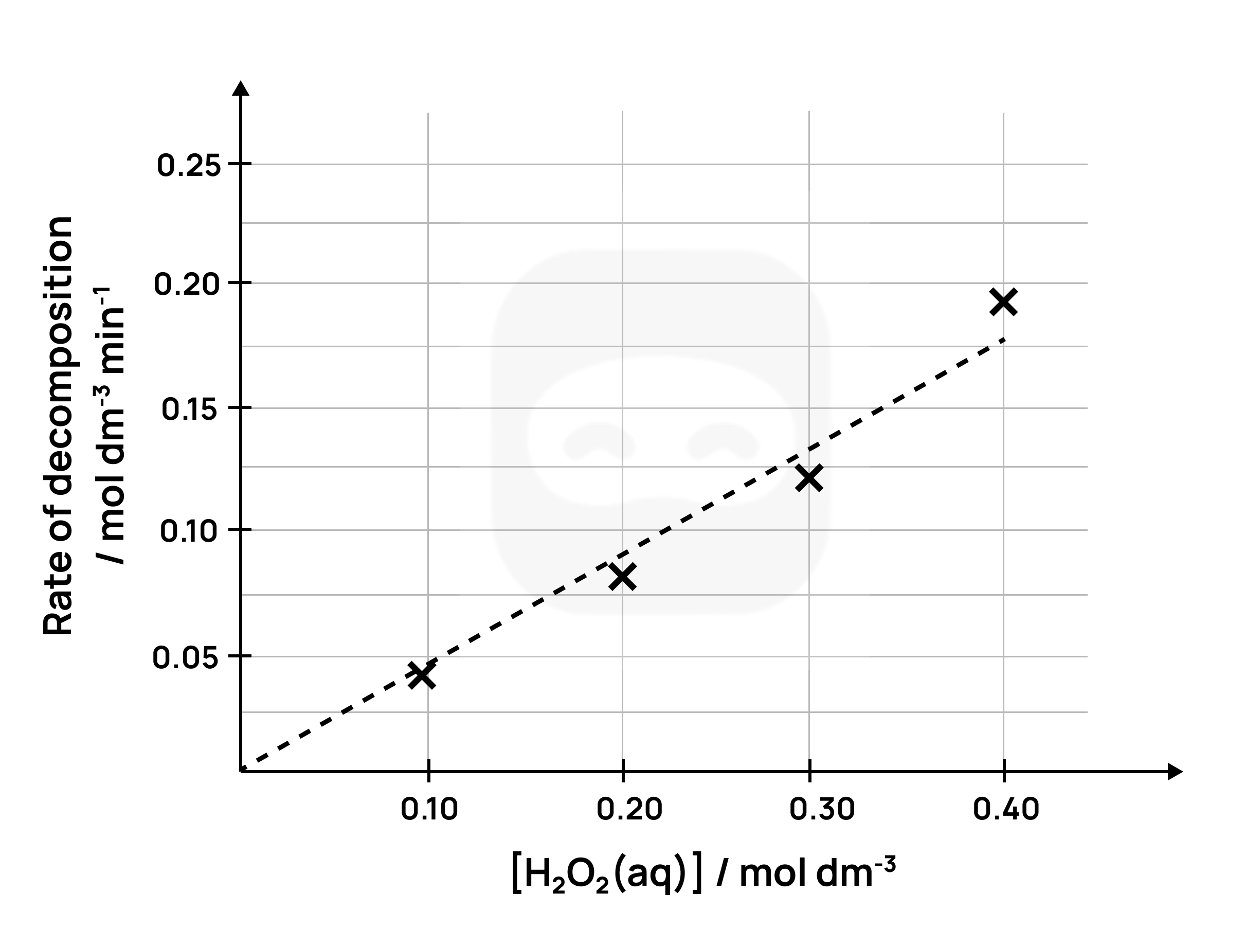
Example
A graph can be of the following:
Figure 9: Sample graph
The graph above clearly shows the trend of an enzymatic reaction of catalases of cow liver.
Note that the above graph has labelled axes with units, and a best-fit line.
From the best-fit line, we can see that the rate of decomposition is directly proportional to the concentration of H₂O₂.
Example
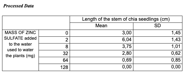
The followingtable was developed based on the table with raw data shown in one of the previous examples for the experiment investigating the effectof zinc on the length of chia seedlings.
Figure 10: Sample 1 of processed data (table)
The processed data table is accurate and well-organized; however, it lacks a critical detail: the uncertainties are not indicated in the column headings.
Additionally, the table title is vague and does not explicitly reference the variables presented.
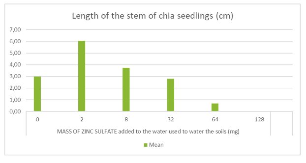
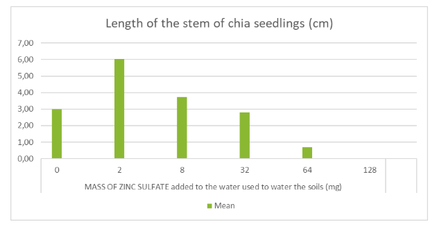
The graph displayed below corresponds to the data shown in the table on the previous page.
While the graph design appropriately illustrates the interaction between variables and their respective trends, several key elements are missing.
Although the title suggests that both the mean and standard deviation are represented, no error bars are included to reflect the standard deviation of the calculated means.
Furthermore, the Y-axis lacks labels, units, and uncertainty values, and the X-axis does not include uncertainties either.
Figure 11: Sample 1 of graph
Example
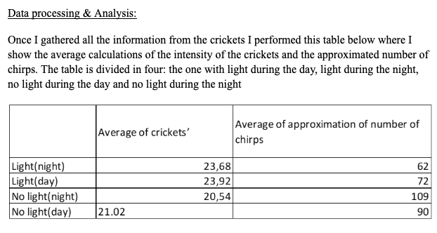
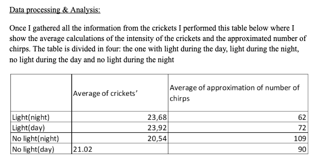
The Processed Data table done by the student when investigating crickets’ chirps is displayed below and, similar to the raw data information, also contains several mistakes.
Figure 12: Sample 2 of processed data (table)
The table headings are unclear.
For instance, the label “Average of approximation of number of chirps” is vague and lacks precision.
Moreover, representing the number of crickets using decimal values is inappropriate, as animals should be counted using whole numbers.
The classification of “Light (night)” and “No light (day)” is also inaccurate, given that the original raw data tables record light intensityquantitatively.
This simplified categorization does not accurately reflect the measured data.
Additionally, there is a formatting error in the final row of the table, which compromises the overall presentation of the data.
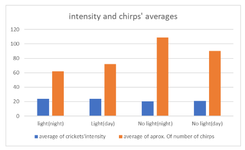
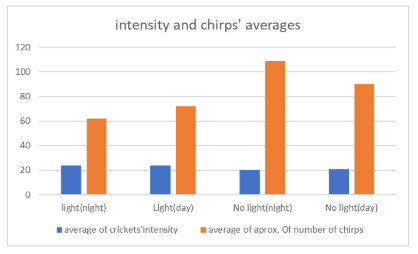
The following graph was designed according to the variables shown on the previous table.
Figure 13: Sample 2 of graph
Again, the candidate has omitted some key elements needed for a clear graph analysis.
The y-axis is not labelled, so it is not possible to know which variable is being represented.
The mean values apparently were calculated as they are shown on the table, but the y-axis is not labelled, so it is not possible to know which independent variable is represented.
No error bars are included to reflect the standard deviation of the calculated means, but the SD is not included on the processed data table either.
Uncertainties and Errors
Random Errors
Whenever a measurement is taken in the laboratory, there is an uncertainty associated with that measurement.
These are known as random uncertainties or random errors.
Random errors are caused by the limit of precision of the apparatus used to take the measurement, and will cause the measured value to be either higher or lower than the actual value.
These uncertainties are an unavoidable part of the measuring process and cannot be completely eliminated.
However, they can be reduced by conducting repeat trials and taking an average and by using more precise apparatus.
Random errors will cause the measured value to be either higher or lower than the actual value.
They are usually expressed together with the measured value as a range using the ± sign and are known as absolute uncertainties.
Example
For instance, the mass of a substance measured on a mass balance could be expressed as: $$2.50 \pm 0.01 \text{ g}$$
Note that this mass is recorded to the same precision as the absolute uncertainty (in this example, two decimal places).
This tells us that the actual mass of the substance lies somewhere between 2.49 g and 2.51 g.
Example
Another example is the measuring of a volumeofsolution using a graduated cylinder, which is expressed as: $$50.0 \pm 0.5 \text{ cm}^3$$
Once again, we see that the volume is recorded to the same precision as the absolute uncertainty (one decimal place).
The absolute uncertainty of a piece of apparatus will differ depending on the precision of the apparatus.
More precise apparatus will have a lower absolute uncertainty, and less precise apparatus, a higher absolute uncertainty.
Representing uncertainties graphically
Uncertainties can be represented graphically through the use of error bars.
Error bars show the maximum and minimum range of the uncertainty of the plotted point.
They are usually plotted above and below the plotted point (for the y-value), but can also be plotted from side to side (for the x-value).
They are usually plotted using graphing software such as Excel or Google Sheets.
Example
An example of a graph, together with error bars, is shown below.
Figure 14: Sample graph with uncertainties
As can be seen from the graph above, larger error bars show a larger uncertainty and vice versa.
When plotting graphs, students should remember the following:
Data Processing & Graphing Do's and Don'ts for your Bio IA
Example
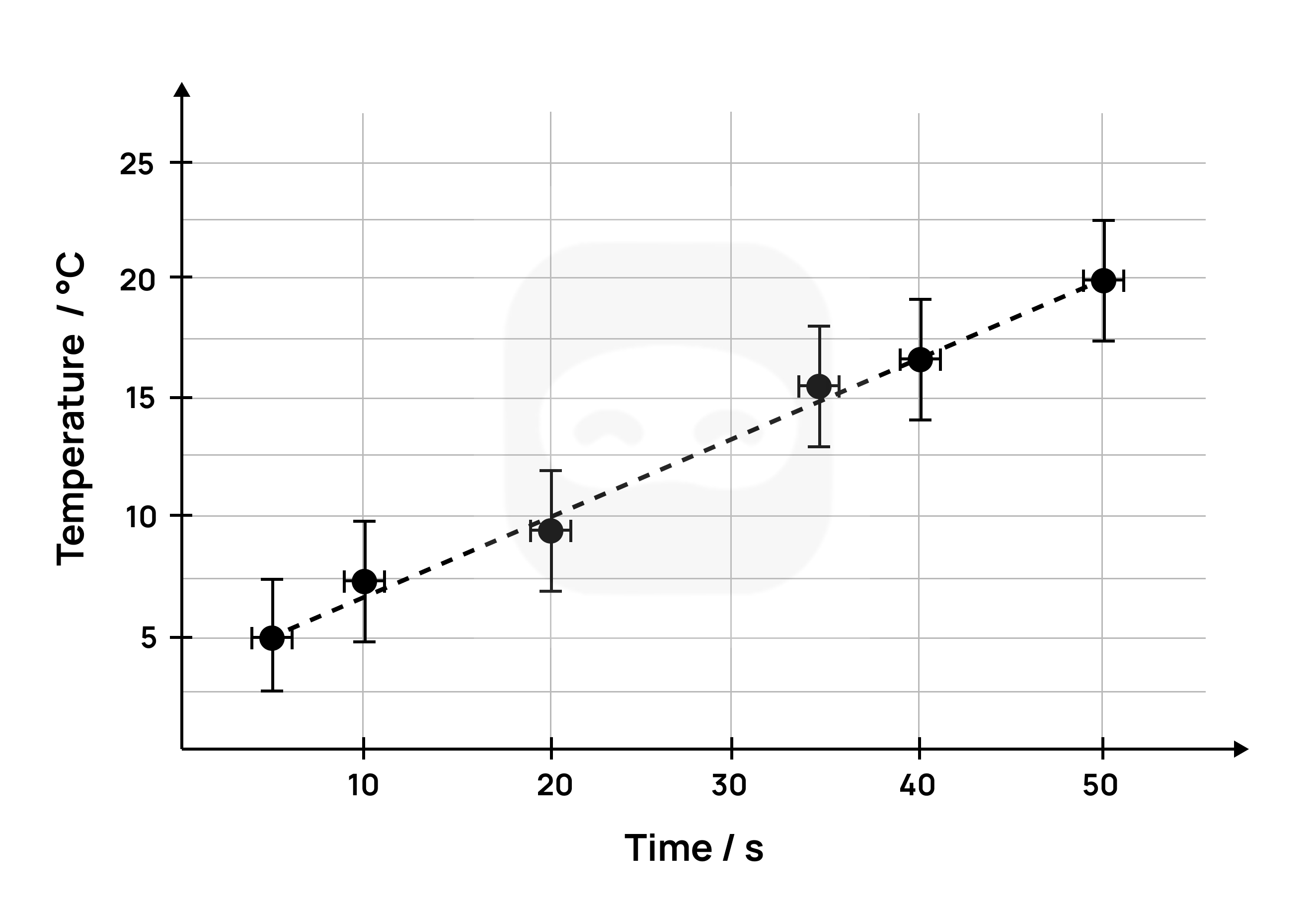
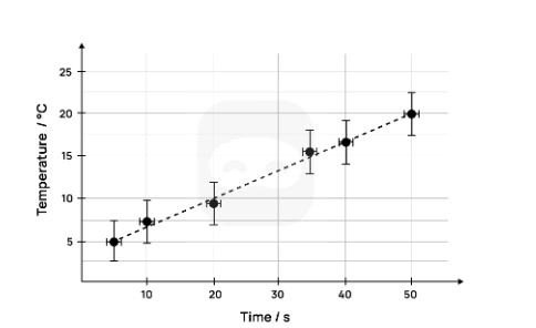
A second example of a graph with error bars is shown below.
This graph has temperature on the y-axis and time on the x-axis.
The error bars for the temperature show an uncertainty of ± 2.5 °C.
Figure 15: Sample 2 graph with uncertainties
In the above graph, the error bar for the temperature (on the y-axis) is larger than the one for the time (on the x-axis).
In this case, it would be appropriate to take the larger uncertainty of the temperature as the overall uncertainty and give less significance to the smaller uncertainty of the time.
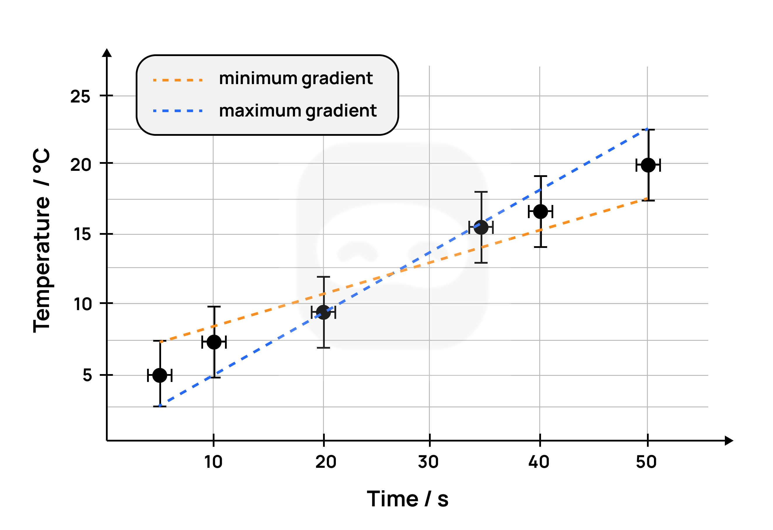
The gradient of a best-fit line can be determined using error bars.
To do this, two lines are drawn; one with the minimum gradient and one with the maximum gradient; with both lines passing through the error bars.
The graph below shows the two lines drawn with the maximum and minimum gradients (also known as the worst-fit lines).
Figure 16: Sample of graph with uncertainties and gradient
The gradient of the best-fit line is the average of the minimum gradient and the maximum gradient: $$m = \frac{m_{\text{maximum gradient}} + m_{\text{minimum gradient}}}{2}$$
The uncertainty of the final gradient is calculated as follows: $$\Delta m = \frac{m_{\text{maximum gradient}} - m_{\text{minimum gradient}}}{2}$$
R² – the coefficient of determination
The coefficient of determination (R²) is a measure of how close the data is to the best-fit line and also how well the model fits the data.
It is a measure of how well the independent variable explains the variation in the dependent variable. Note that students do not have to understand how the R² is calculated, as this can be done by most graphing software.
However, students should understand how to interpret the value of the R² specifically with respect to the strength of the relationship between the independent and dependent variables.
R² values can range from 0.0 to 1.0.
The higher the value of the R², the better the fit of the data points with the best-fit line.
Note
An R² value of 1.0 suggests a perfect fit between the data and the model used.
In other words, all of the variance in the dependent variable is explained by the independent variable.
Lower values of R² suggest that the independent variable cannot explain all the variance in the dependent variable.
Very low values of R², such as 0, suggest that none of the variance in the dependent variable is explained by the independent variable.
In this case, it is likely that the wrong model has been chosen to analyse the data.
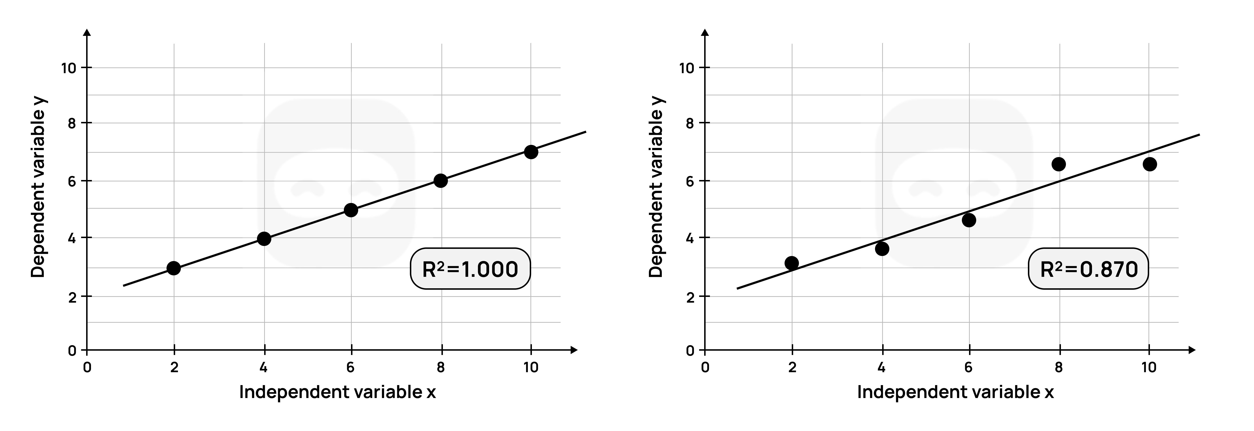
Example
Consider the two graphs shown and their R² values.
Figure 17: Graphs with R squared values
The graph on the left, with an R² of 1.0, indicates that all (100%) of the variation in the dependent variable is explained by the independent variable.
The linear model used perfectly predicts the dependent variable.
The graph on the right, with an R² of 0.83, indicates that 83% of the variation in the dependent variable is explained by the independent variable.
In other words, all the variance in the data cannot be accounted for by the linear model.
In the scientific investigation, the R² could be used to determine the strength of the relationship between the independent and dependent variables, for example, how concentration affects the rate of reaction.
If the calculated R² value is high, this indicates a strong relationship between the independent variable (concentration) and the dependent variable (rate of reaction).
In other words, the model used explains most, but not all, of the variance in the dependent variable.
Dealing with outliers
An outlier is a data point that differs significantly from the other data points in a set of data.
Outliers can be higher or lower than other data points.
They usually occur as a result of flaws in the methodology, human error, or faulty measuring equipment.
According to the IB, outliers should not be removed from the calculations during data processing.
The justification given for this is that outliers are measured values, and removing or ignoring them can be considered data manipulation.
If a student has outliers in their collected data, it is recommended that they present their data processing both with and without the outlier(s).
This will allow the impact of the outliers to be demonstrated.
An alternative method is to identify the flaw or error in the methodology, take steps to remedy the flaw, and repeat the measurement.
Tip
In this case, the modification(s) made should be described in the report.
Important
Processing data in Biology requires a statistical analysis of the data.
This is because of the inherent variability of the material used as well as variation due to its manipulation.
Thus the set of data will possess uncertainties because of the instrument used to measure it (e.g., a millimetre ruler).
A student could represent this by calculating a margin of error.
The simplest would be ± the range of measurements or ± half the range of measurements.
If the data permits, the error margin could be represented by ± the standard deviation of the mean or the standard error of the mean.
These ranges may be expressed as error bars on graphs.
Key points
All measured data has an uncertainty or error associated with it, known as its random error or random uncertainty.
Raw data must be presented with its absolute uncertainty using the symbol ±, such as 2.50 ± 0.01 g.
Random errors cause values to be either higher or lower than the actual value.
Random errors cannot be eliminated, but can be reduced by conducting repeat trials (and taking an average) and by using more precise apparatus.
Systematic errors are caused by flaws in the experimental design and they are analyzed in the Evaluation section.
They produce results which are consistently higher or lower than the actual value.
They cannot be reduced or eliminated by taking repeat measurements.
They can be reduced or eliminated by making changes or modifications to the design of the experiment.
Graphs should include error bars and R² value if it has been calculated.
Outliers should be dealt with appropriately and not ignored.
Example
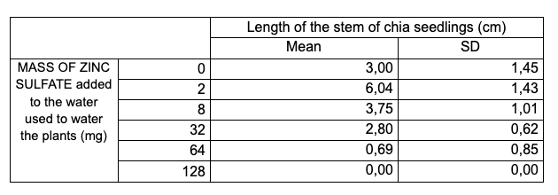
The following table was developed based on the table with raw data shown for the experiment investigating the effect of zinc on the length of chia seedlings.
Figure 18: Sample 1 of processed data for uncertainties
The processed data table is accurate and well-organized; however, it lacks a critical detail: the uncertainties are not indicated in the column headings.
Additionally, the table title is vague and does not explicitly reference the variables presented.
The graph displayed below corresponds to the data shown in the table on the previous page.
While the graph design appropriately illustrates the interaction between variables and their respective trends, several key elements are missing.
Although the title suggests that both the mean and standard deviation are represented, no error bars are included to reflect the standard deviation of the calculated means.
Furthermore, the Y-axis lacks labels, units, and uncertainty values, and the X-axis does not include uncertainties either.
Figure 19: Sample 1 of graph for uncertainties
Example
The Processed Data table done by the student when investigating crickets’ chirps is displayed below and, similar to the raw data information, also contains several mistakes.
Figure 20: Sample 2 of processed data table for uncertainties
The table headings are unclear.
For instance, the label “Average of approximation of number of chirps” is vague and lacks precision.
Moreover, representing the number of crickets using decimal values is inappropriate, as animals should be counted using whole numbers.
The classification of “Light (night)” and “No light (day)” is also inaccurate, given that the original raw data tables record light intensityquantitatively.
This simplified categorization does not accurately reflect the measured data.
Additionally, there is a formatting error in the final row of the table, which compromises the overall presentation of the data.
Averages (Mean values) have been calculated but the Standard deviation (SD), which shows the spreading of data, is not shown / not calculated.
The graph below was designed according to the variables shown on the previous table.
Figure 21: Sample 2 graph for uncertainties
Once again, the candidate has omitted keyelements necessary for a clear and effective graph analysis.
Most notably, the Y-axis is not labelled, making it impossible to determine which variable is being represented.
Although mean values appear to have been calculated (as shown in the processed data table), the absence of a Y-axis label prevents identification of the dependent variable.
No error bars are included to reflect the standard deviation of the calculated means, but the SD is not included on the processed data table either.
Example
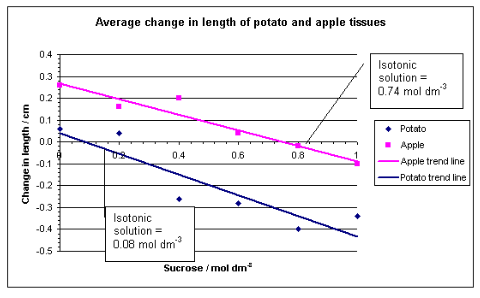
The graph below is used to processthedata collected by measuring the lengths of potato and apple slices before and after immersion in sucrose solutions, followed by calculating the average change in length.
The raw data were presented in a table of unprocessed data; therefore, calculations and a table showing the processed data must be included to meet the requirements.
The graph was constructed by using the x-axis intercepts to determine the sucrose concentrationsisotonic to the tissue sap.
In this method, calculating the percentage change in length is unnecessary, as all tissue samples were initially cut to the same length (4.0 cm), allowing direct comparison of absolute changes.
The graph adheres to appropriate conventions: it includes a clear title, and uncertainties are represented through trend lines.
The axes are properly graduated, enhancing the precision of estimating the isotonic point of the solutions.
Figure 22: Sample 3 of graph for uncertainties
Example
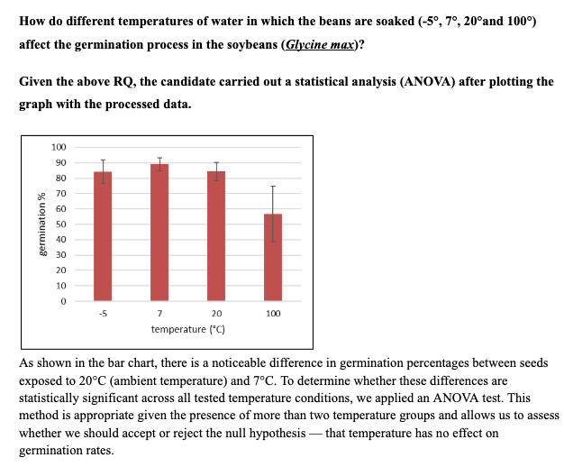
Figure 23: Sample 4 of graph for uncertainties
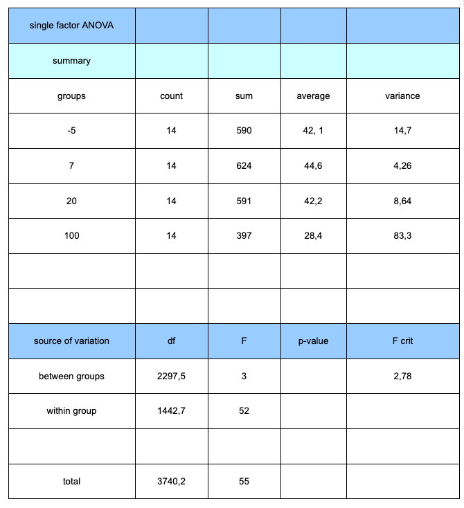
Figure 24: Sample 4 of processed data for uncertainties
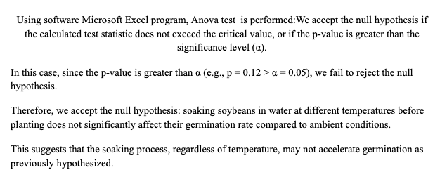
Figure 25: Sample 4 of content for uncertainties
This example provides clear evidence of how biological experimental data should be analyzed using an appropriate statistical test.
A common mistake made by candidates is using too small a sample size, which can weaken or invalidate the application of statistical methods.
Additionally, students often fail to justify their choice of statistical test, leaving their analysis unsupported.
In this case, however, the candidate not only explained the rationale behind the use of the statistical test but also applied it correctly and interpreted the results clearly.
This demonstrates a solid understanding of how statistical tools enhance the reliability and validity of experimental conclusions.
View Biology IA Exemplars
And thousands of other examples from high-scoring students.