If the work does not reach a standard outlined by the performance level descriptors, 0 marks are awarded for this criterion.
Summary for Criterion C.
Recording Data
Data can be classified as quantitative or qualitative, and both types of data should be included in this section.
The amount of data collected will depend on the type of investigation and the sampling rate discussed in section 2.1.
Some investigations will naturally produce more raw data than others.
If large amounts of raw data are collected, it is recommended that students only present a sample of the data.
Whatever the amount of data collected, it should be presented in an appropriate data table (or results table) and labelled as Table 1, Table 2, etc.
A data table must include the units of measurement together with the absolute uncertainty.
The data must be recorded to the correct number of decimal places.
This is determined by the measuring device and should be consistent for the same device.
Note
SI units should be used throughout the report.
Quantitative data should also be included in the results table, depending on the protocol used.
Example
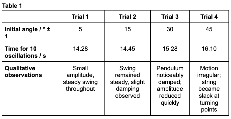
A results table for measurements of the period of a pendulum at different initial displacement angles from the vertical axis is shown below.
Figure 1: Sample 1 of recorded data
Note that the above table includes the uncertainty of each measurement as well as the units.
Qualitative data, such as observations of the pendulum’s motion at larger angles, is also included.
In addition, the data is recorded to the appropriate number of significant figures or decimal places.
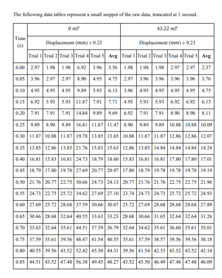
Example
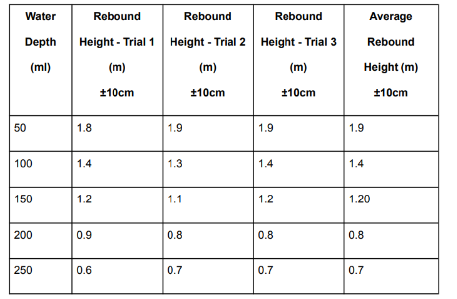
Figure 2: Sample 2 of recorded data
This example is weak because although data is tabulated with trials, the measurement method produces very poor precision.
The uncertainty (±10 cm) is too large to reveal trends confidently.
To improve, the essay should use a more precise measurement method (e.g., video analysis) and reportraw data with consistent significant figures and separate processed averages.
Example
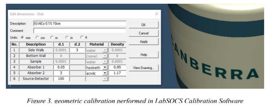
Figure 3: Sample 3, excerpt 1 of recorded data
Figure 4: Sample 3, excerpt 2 of recorded data
This example shows some rigor because measurements from obtained spectra are included and activity is presented with units, but it lacks replication and explicit uncertainty.
To improve, the essay should provide:
Repeated irradiations for consistency
Recordraw counts in a systematic table
Calculate uncertainties for measured activity values.
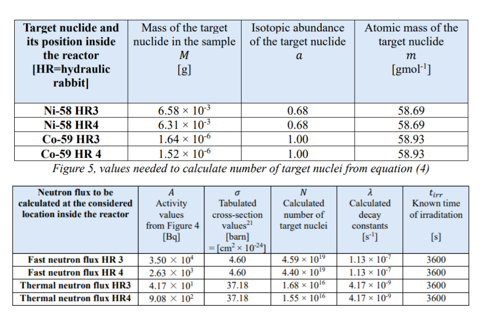
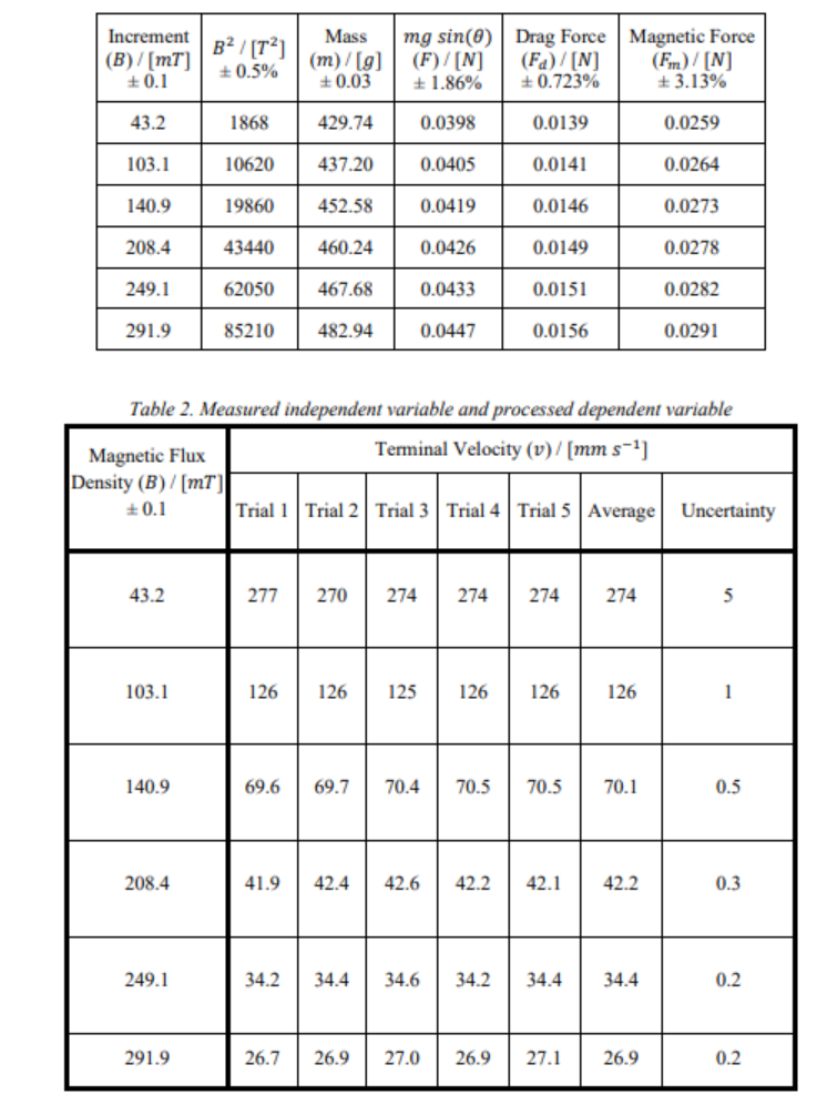
Example
Figure 5: Sample 4, excerpt 1 of recorded data
Figure 6: Sample 4, excerpt 2 of recorded data
This example is strong because data recording is systematic, precise, and consistent with IB standards.
Raw data is distinguished from processed data, uncertainties are included, and multiple trials ensure reliability.
The only minor improvement would be to document all raw motion encoder output in an appendix for completeness.
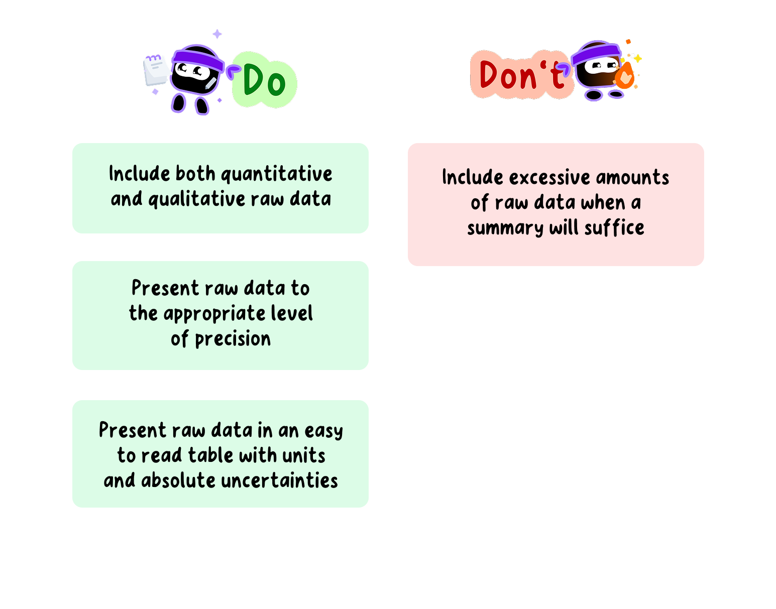
Data Recording Do's and Don'ts for your Physics EE
Data processing and graphing
Data processing involves transforming the raw data into different forms that allow the relationship between the variables to be determined and the research question to be answered.
This could include:
Finding the average when multiple trials have been conducted
Calculating the acceleration due to gravity from pendulum timings
Determining resistance from voltage and current measurements
Plotting a graph and determining a best-fit line.
Tip
The use of spreadsheets might be appropriate here as they allow for the easier processing of data.
Because the scope of possible EE topics is so large, it is not possible to give explicit instructions for every form of data processing.
Therefore, it is recommended that students do their own research to determine the type of data processing required for their investigation.
Whatever the form of data processing used in the investigation, it is recommended to present an example calculation that is clear and easy to follow.
Tip
Pay particular attention to the use of significant figures and decimal places in the calculations.
Graphing is an important part of data processing.
A graph provides a visual representation of the processed data and makes it easier to determine any relationships or trends in the data.
Main hints for data processing and graphing.
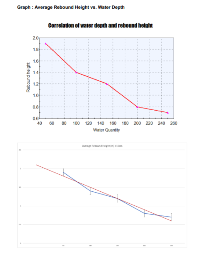
Example
Figure 7: Sample 1 of data processing and graphing
This example is weak because although it produces a graph, the analysis is superficial.
Error bars are missing at one of the graphs.
No attempt is made to model the physical relationship between depth and rebound height.
No attempt is made to linearize the relationship.
No attempt is made to quantitatively interpret graphs.
Axes are not properly labeled.
Graph descriptions are not present.
To improve:
The essay should include error bars.
Attempt fitting (e.g., polynomial or exponential).
Discuss how uncertainties affect confidence in the observed trend.
Clearly mark the axes.
Justify the fits.
Example
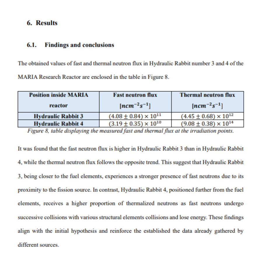
Figure 8: Sample 2 of data processing and graphing
This example shows correct theoretical processing, but the dataset is too limited for robust graphing.
With only two positions, the “graph” risks being more of a diagram.
To improve:
The essay should include error propagation for activity and flux.
Show spectra overlays with uncertainties.
Ideally expand to more positions to allow meaningful graphical trends.
Example
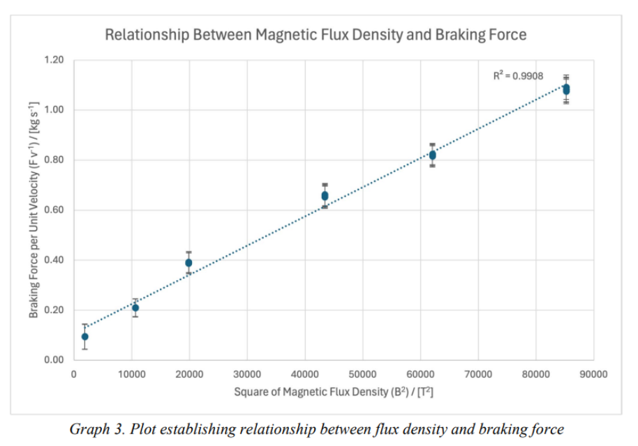
Figure 9: Sample 3 of data processing and graph
This example is strong because it systematically processes raw data into derived quantities and presents graphs with uncertainties and fitted curves.
The quadratic fit demonstrates a strong connection between theory and experiment.
A minor improvement would be to show more intermediate data (velocity-time graphs for each trial) in an appendix for transparency.
Data Processing and Graphing Do's and Don'ts for your Physics EE
Uncertainties and Errors
Random Errors
Whenever a measurement is taken in the laboratory, there is an uncertainty associated with that measurement.
These are known as random uncertainties or random errors.
Random errors are caused by the limit of precision of the apparatus used to take the measurement.
They cause the measured value to be either higher or lower than the actual value.
Note
These uncertainties are an unavoidable part of the measuring process and cannot be completely eliminated.
However, they can be reduced by conducting repeat trials and taking an average and by using more precise apparatus.
Random errors will cause the measured value to be either higher or lower than the actual value.
They are usually expressed together with the measured value as a range using the ± sign and are known as absolute uncertainties.
Example
For instance, the length of a pendulum measured with a meter rule could be written as: $$1.000 ± 0.001 m$$
This tells us that the actuallength lies between 0.999 m and 1.001 m.
Example
Another example is timing an oscillation with a digital stopwatch:
$$2.50 ± 0.01 s$$
Here, the recorded time has the same number of decimal places as the absolute uncertainty.
The absolute uncertainty of a piece of apparatus will differ depending on the precision of the apparatus.
More precise apparatus will have a lower absolute uncertainty, and less precise apparatus, a higher absolute uncertainty.
Example
For instance, a length measured with a standard meter rule might be recorded as
$$1.00 ± 0.05 m$$
whereas the same length measured with a vernier caliper could be recorded as
$$1.000 ± 0.001 m$$
The latter is clearly more precise, leading to a smaller random error.
The absolute uncertainty can usually be read directly from the apparatus. If not, it can be estimated as follows:
For analogue apparatus, the absolute uncertainty is typically taken as half the smallest scale division.
For example, if a ruler has millimetre markings, the uncertainty is ±0.5 mm.
For digital apparatus, the absolute uncertainty is usually the smallest scale division shown on the display.
For example, if a stopwatch records to 0.01 s, the uncertainty is ±0.01 s.
Systematic Errors
Systematic errors are caused by problems or flaws with the experimental design. They cause the measured value to be consistently higher or consistently lower than the actual value.
Note
Unlike random errors, they cannot be reduced by conducting repeat trials.
However, they can be reduced or eliminated by modifying the experimental design.
Example
Some types of systematic errors are:
Not zeroing a digital balance, stopwatch, or force sensor before use.
Miscalibration of equipment, such as a motion sensor, light gate, or voltmeter.
Parallax error when reading analogue instruments like a ruler, protractor, or analogue ammeter.
Consistently starting or stopping a stopwatch too late/early due to reaction time bias.
Misalignment of apparatus, such as a pendulum not released from the vertical, or a projectile launcher not level.
Using a measuring device with a constant offset error (e.g. a meter rule worn down at one end, or a voltmeter with a small internal zero offset).
Environmental conditions affecting all trials in the same way (e.g. air resistance not accounted for, or background light interfering with a photogate).
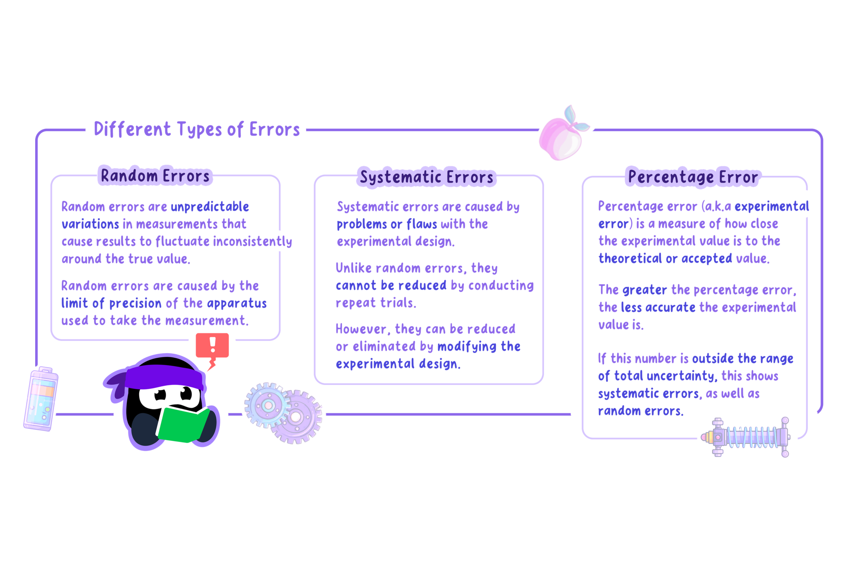
Summary about different types of errors.
Accuracy and Precision
Accuracy refers to how close a measured value is to the true or accepted value.
Measurements with high accuracy have small systematic errors.
Precision refers to how detailed the measurement is, usually reflected in the number of significant figures or decimal places.
Measurements with high precision have lower random errors.
Example
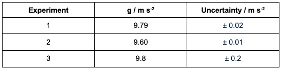
Take, for instance, the data shown below for three experiments measuring the acceleration due to gravity, g. The accepted value is 9.81 m s⁻².
Figure 10: Sample of accuracy and precision
Experiment 1 has high accuracy and high precision: the value is close to 9.81 and the uncertainty is small.
Experiment 2 has low accuracy but high precision: the measurements are consistent (low random error) but shifted away from the true value, suggesting a systematic error.
Experiment 3 has high accuracy but low precision: the mean value is very close to 9.81 but the uncertainty is large, meaning the measurements are not consistent.
Propagation of Uncertainties
Propagation of errors, or error propagation, is the process of calculating the uncertainty for a derived value in an investigation.
Tip
In physics, this might be a calculated acceleration, resistance, damping constant, or gravitational field strength.
During data processing, the uncertainty of each measured value must be carried through to the final result.
The way uncertainties are combined depends on whether the values are added and subtracted, or multiplied and divided.
Addition and subtraction of uncertainties
When adding or subtracting measured values, the absolute uncertainties are added.
Example
For instance, suppose the initial and final lengths of a stretched spring are measured to calculate the extension:
Initial length of spring = $12.0 \pm 0.1 \,\text{cm}$ Final length of spring = $15.5 \pm 0.1 \, \text{cm}$
Final result with uncertainty: $$g = 9.78 \pm 0.24 \, \text{m s}^{-2} \quad (2.5\% \, \text{of } 9.78 = 0.24)$$
As these examples show, error propagation can become complicated.
It is essential that students take their time, show at least one worked example calculation in full, and apply the rulesconsistently throughout the investigation.
Uncertainties of Averaged Values
It is recommended that students conduct repeat trials in their investigation, which means taking repeated measurements of the dependent variable.
The average of these values is then calculated.
The uncertainty of the averaged value must also be considered.
For averaged values, the uncertainty is taken to be the same as for the individual values, since the measuring apparatus does not change.
The uncertainty of the average value is the same as the uncertainty of the individual values:
$$2.01 \pm 0.01 \, \text{s}$$
Note that the value and its uncertainty are written to the same precision (two decimal places).
Representing uncertainties graphically
Uncertainties can be represented graphically through the use of error bars.
Error bars show the maximum and minimum range of the uncertainty of the plotted point.
They are usually plotted above and below the point (for the y-value) but can also be plotted side to side (for the x-value).
They are typically plotted using graphing software such as Excel or Google Sheets.
Example
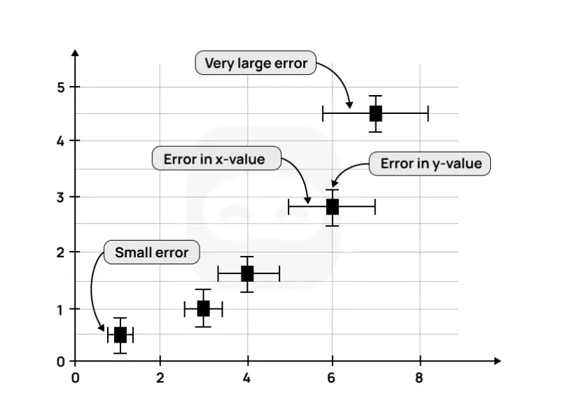
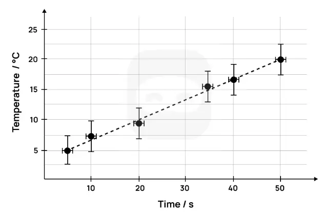
An example of a graph, together with error bars, is shown below.
Figure 11: Sample graph with uncertainties
As can be seen from the graph above, larger error bars show a larger uncertainty and vice versa.
Example
A second example of a graph with error bars is shown below.
This graph has temperature on the y-axis and time on the x-axis.
The error bars for the temperature show an uncertainty of ± 2.5 °C.
Figure 12: Sample 2 graph with uncertainties
In the above graph, the error bar for the temperature (on the y-axis) is larger than the one for the time (on the x-axis).
In this case, it would be appropriate to take the larger uncertainty of the temperature as the overall uncertainty and give less significance to the smaller uncertainty of the time.
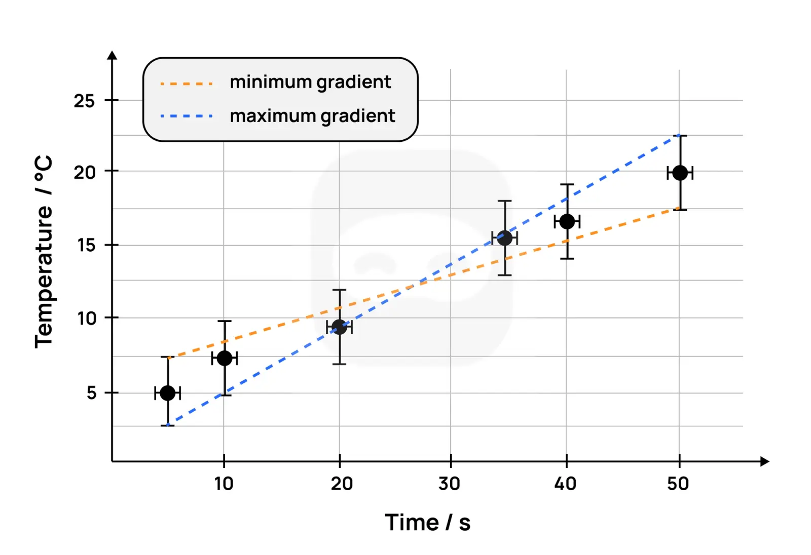
The gradient of a best-fit line can be determined using error bars.
To do this, two lines are drawn; one with the minimum gradient and one with the maximum gradient; with both lines passing through the error bars.
The graph below shows the two lines drawn with the maximum and minimum gradients (also known as the worst-fit lines).
Figure 13: Sample of graph with uncertainties and gradient
The gradient of the best-fit line is the average of the minimum gradient and the maximum gradient. $$m = \frac{m_{\text{maximum gradient}} + m_{\text{minimum gradient}}}{2}$$
The uncertainty of the final gradient is calculated as follows: $$\Delta m = \frac{m_{\text{maximum gradient}} - m_{\text{minimum gradient}}}{2}$$
R² – the coefficient of determination
The coefficient of determination ($R^{2}$) is a measure of how close the data is to the best-fit line and how well the model fits the data.
It indicates how well the independent variable explains the variation in the dependent variable.
Students do not need to understand how $R^{2}$ is calculated, as this can be done by most graphing software.
However, they should understand how to interpret the value of $R^{2}$ with respect to the strength of the relationship between the independent and dependent variables.
$R^{2}$ values can range from 0.0 to 1.0.
The higher the value of $R^{2}$, the better the fit of the data points with the best-fit line.
Note
An R² value of 1.0 suggests a perfect fit between the data and the model used.
In other words, all of the variance in the dependent variable is explained by the independent variable.
Lower values of R² suggest that the independent variable cannot explain all the variance in the dependent variable.
Very low values of R², such as 0, suggest that none of the variance in the dependent variable is explained by the independent variable.
In this case, it is likely that the wrong model has been chosen to analyse the data.
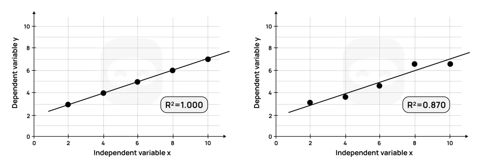
Example
Consider the two graphs shown and their R² values.
Figure 14: Graphs with R squared values
The graph on the left, with an R² of 1.0, indicates that all (100%) of the variation in the dependent variable is explained by the independent variable.
The linear model used perfectly predicts the dependent variable.
The graph on the right, with an R² of 0.83, indicates that 83% of the variation in the dependent variable is explained by the independent variable.
In other words, all the variance in the data cannot be accounted for by the linear model.
In the scientific investigation, the $R^{2}$ value can be used to determine the strength of the relationship between the independent and dependent variables.
For example, it can show how surface area affects terminal velocity, how amplitude affects period, or how voltage affects current.
If the calculated $R^{2}$ value is high, this indicates a strong relationship between the independent variable and the dependent variable.
In other words, the model used explains most, but not all, of the variance in the dependent variable.
Linearization
In physics investigations, many relationships between variables are not naturally linear.
Example
For instance, the period of a pendulum is proportional to the square root of its length, and the intensity of light decreases with the inverse square of the distance from the source.
When plotted directly, such data do not produce a straight line, which makes it more difficult to interpret trends, extract constants, or compare experimental results with theory.
If the relationship is, for example, quadratic, the form of the curve alone would not generally allow one to distinguish a parabola from an exponential function over the considered interval.
Linearization is the process of transforming non-linear data into a linear form, often by plotting one variable against a function of the other.
Linearized graphs allow students to:
Clearly demonstrate proportional relationships
Determine physical constants from the slope or intercept of a straight line
Identify systematic deviations from theory more easily
Example
If the research question involves determining the value of the free fall acceleration $g$ using a simple pendulum, the theoretical relationship is:
$$T = 2 \pi \sqrt{\frac{L}{g}}$$
This is not linear in its raw form ($T$ vs. $L$). By squaring the period, we obtain:
$$T^2 = \frac{4\pi^2}{g}L$$
A plot of $T^2$ against $L$ will yield a straight line with slope $\frac{4\pi^2}{g}$, from which $g$ can be determined.
There are several techniques for linearizing non-linear data. A common method is to apply a mathematical transformation to one or both variables so that the relationship becomes linear.
Example
For instance, if a relationship follows a power law of the form $y = ax^n$, then plotting $\ln y$ against $\ln x$ produces a straight line with slope $n$ and intercept $\ln a$, since:
$$\ln y = \ln(ax^n) = \ln a + \ln x^n = \ln a + n\ln x$$
This is called a log–log plot, and it is widely used in physics to identify scaling laws.
Similarly, if a relationship follows an exponential form, such as $y = Ae^{kx}$, then plotting $\ln y$ against $x$ yields a straight line with slope $k$, since:
$$\ln y = \ln(Ae^{kx}) = \ln A + \ln(e^{kx}) = \ln A + kx$$
These transformations allow complex relationships to be analysed using the same simple graphical techniques used for directly proportional data.
When data is linearized, it is important to consider how uncertaintiespropagate through the transformation.
Example
For instance, if a variable $x$ with an absolute uncertainty $\Delta x$ is squared to form $x^2$, the percentage uncertainty doubles.
If a logarithmic transformation is used, the uncertainty in $\ln x$ can be approximated as $\frac{\Delta x}{x}$, which is the fractional uncertainty of the original measurement.
This means that in a log–log or semi-log plot, the error bars on the transformed data points correspond to fractional uncertainties from the raw measurements.
Tip
Careful attention to error propagation ensures that gradients and intercepts derived from linearized graphs are reported with appropriate uncertainties, strengthening the reliability of the conclusions.
Percentage Error
Some investigations may result in the calculation of an experimental value, which is often different from the theoretical or literature value.
Percentage error (also known as experimental error) is a measure of how close the experimental value is to the theoretical or accepted value.
The greater the percentage error, the less accurate the experimental value is.
It is calculated as shown below: $\text{Percentage error} = \frac{|\text{Experimental value} - \text{Theoretical value}|}{\text{Theoretical value}} \times 100%$
If the experimental value is less than the theoretical value, the percentage error will be negative, but it is usually reported as a positive value.
If it is greater than the theoretical value, the percentage error will be positive.
The percentage error should always be compared to the total uncertainty.
If the percentage error is outside the range of the total uncertainty, this indicates the presence of systematic errors in the experimental procedure, in addition to random errors.
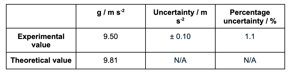
Example
The table below shows the experimental and literature values for the acceleration due to gravity, g.
Since the percentage error (3.2%) exceeds the percentage uncertainty (1.1%), systematic error is indicated (most plausibly large release angles lengthening the period) so future trials should restrict θ ≤ 10° and verify length and timer calibration.
Dealing with Outliers
An outlier is a data point that differs significantly from the other data points in a dataset.
Outliers can be either higher or lower than other data points.
They usually occur as a result of flaws in the methodology, human error, or faulty measuring equipment.
Outliers should not be removed from the calculations during data processing.
The justification for this is that outliers are measured values, and removing or ignoring them can be considered data manipulation.
If a student has outliers in their collected data, it is recommended that they:
Present their data processing both with and without the outlier(s) to demonstrate their impact.
Alternatively, identify the flaw or error in the methodology, take steps to remedy it, and repeat the measurement.
Tip
In this case, the modification(s) made should be described in the report.
Key points
All measured data has an uncertainty or error associated with it, known as its random error or random uncertainty.
Raw data must be presented with its absolute uncertainty using the symbol ±, such as 2.50 ± 0.01 g.
The precision of the measured value and the absolute uncertainty should be the same.
Random errors cause values to be either higher or lower than the actual value.
Random errors cannot be eliminated, but can be reduced by conducting repeat trials (and taking an average) and by using more precise apparatus.
Systematic errors are caused by flaws in the experimental design.
They produce results which are consistently higher or lower than the actual value.
They cannot be reduced or eliminated by taking repeat measurements.
They can be reduced or eliminated by making changes or modifications to the design of the experiment.
Graphs should include error bars and R² value, if the graph requires a trend line.
Outliers should be dealt with appropriately and not ignored. In case the candidate decides not to include them in the calculations, this decision should be clearly supported.
Example
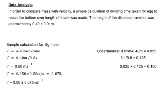
Figure 16: Sample 1, excerpt 1 of data analysis
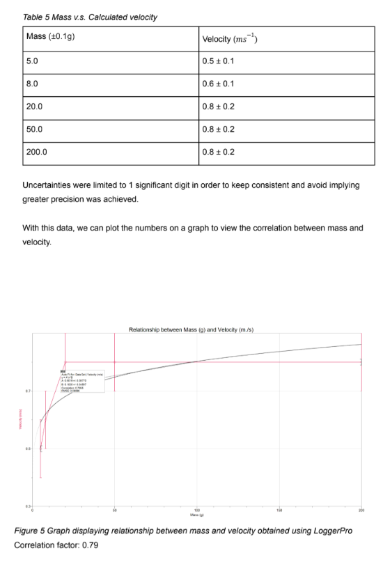
Figure 17: Sample 1, excerpt 2 of data analysis
The analysis in this investigation is weak because the data processing does not actually answer the research question.
The stated dependent variable was terminal velocity, but the student instead calculated average speed by dividing distance by time in a container too short for terminal velocity to be reached.
The uncertainty treatment is also flawed:
Relative errors are added incorrectly.
The reported values lack consistency in significant figures.
The correlation coefficient is given but without any interpretation of its physical meaning.
To improve:
Redefine the dependent variable clearly as average velocity if the setup cannot allow terminal velocity.
Use correct error propagation methods, such as the root-sum-square formula.
Include error bars on the graph.
Comment explicitly on whether the results support the hypothesis.
Acknowledge the limitations of the experimental design — if terminal velocity is the research focus, a deeper column or an alternative method of measurement is necessary.
Example
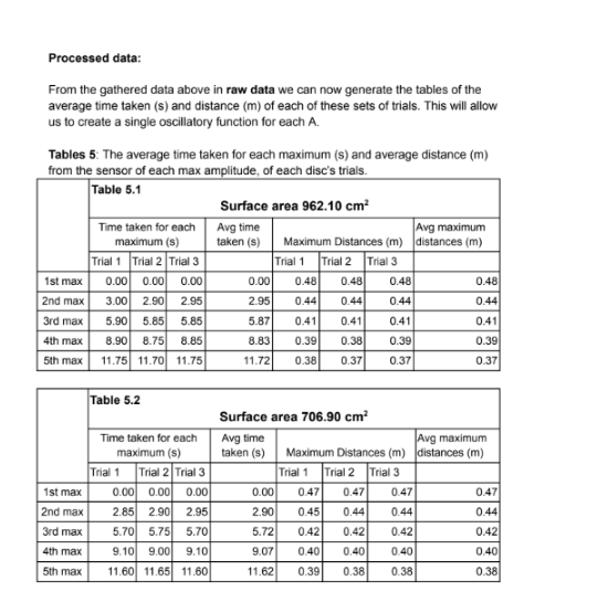
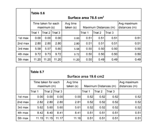
Figure 18: Sample 2, excerpt 1 of data analysis
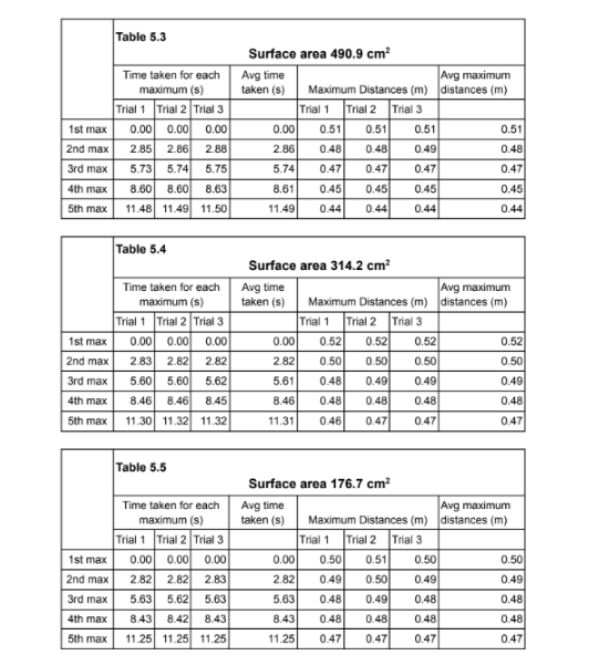
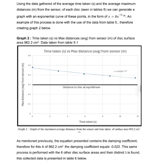
Figure 19: Sample 2, excerpt 2 of data analysis
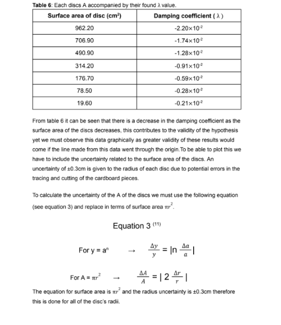
Figure 20: Sample 2, excerpt 3 of data analysis
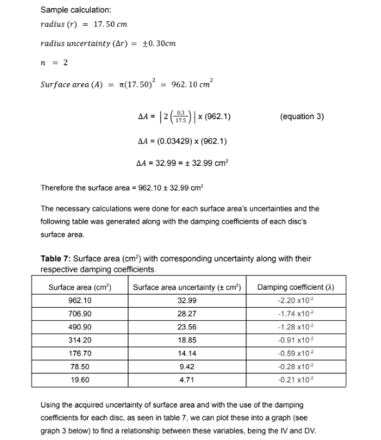
Figure 21: Sample 2, excerpt 4 of data analysis
Figure 22: Sample 2, excerpt 5 of data analysis
Figure 23: Sample 2, excerpt 6 of data analysis
Figure 24: Sample 2, excerpt 7 of data analysis
Figure 25: Sample 2, excerpt 8 of data analysis
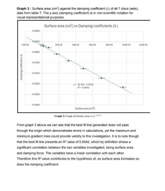
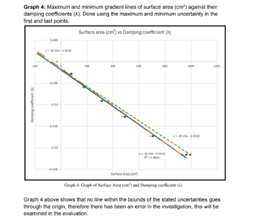
The analysis here is stronger and shows a clear attempt to process raw oscillation data into a physically meaningful parameter, the damping coefficient $\lambda$.
The student correctly identifies the exponential decay model, but the execution could be improved.
Only five oscillations were analysed per trial, which limits precision.
The data reduction method does not fully exploit the logarithmic form of the damping model.
The values of $\lambda$ are reported but inconsistently formatted, sometimes even with negative signs, which obscures interpretation.
The regression of $\lambda$ against surface area is sensible and produces a strong correlation, yet the claim that the line “should pass through the origin” is not fully tested with confidence intervals.
To reach a higher standard:
Fit $\ln A$ versus time to determine $\lambda$ systematically.
Extend the number of peaks included in the analysis.
Report uncertainties from the regression fits.
Interpret the intercept with care.
This would yield a more rigorous and convincing demonstration of the expected proportionality between the damping coefficient and surface area.
Example
Figure 26: Sample 3, excerpt 1 of data analysis
Figure 27: Sample 3, excerpt 2 of data analysis
Figure 28: Sample 3, excerpt 3 of data analysis
Figure 29: Sample 3, excerpt 4 of data analysis
Figure 30: Sample 3, excerpt 5 of data analysis
Figure 31: Sample 3, excerpt 6 of data analysis
Figure 32: Sample 3, excerpt 7 of data analysis
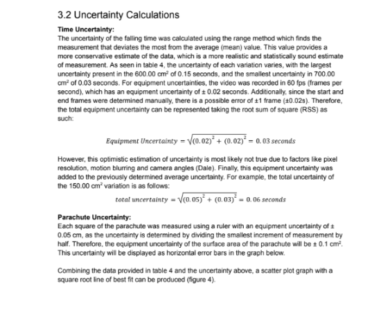
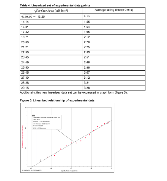
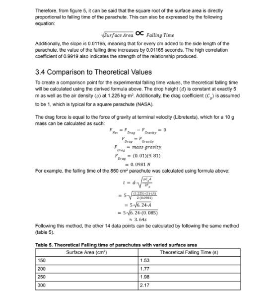
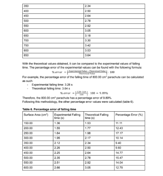
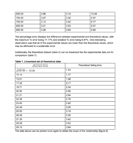
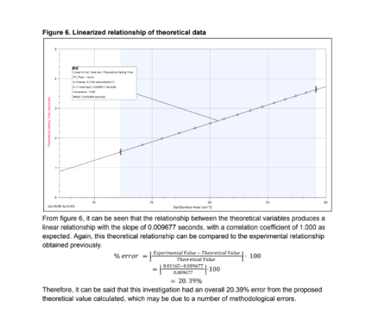
This analysis is exemplary and demonstrates how to handle complex data appropriately.
The student begins with careful uncertainty treatment, combining random and equipment errors via root-sum-square, and presents processed averages with justified uncertainties.
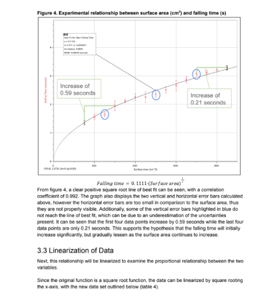
The data are correctly linearized, with fall time plotted against the square root of surface area to reveal a proportional relationship.
The slope and intercept are reported with uncertainties, and the very high correlation coefficient is interpreted meaningfully.
A thoughtful comparison to theoretical predictions is also made:
The student calculates expected values using drag force relationships.
The percentage error relative to experimental results is evaluated.
The recognition that experimental fall times were consistently shorter than theory, and the proposal of a physical explanation (effective drag coefficient lower than assumed due to canopy porosity or incomplete inflation), shows a mature understanding of systematic errors.
Minor improvements:
Explicitly state the units of the regression slope.
Derive an experimental drag coefficient for direct comparison.
Overall, this is a model example of thorough, quantitative IA data analysis.
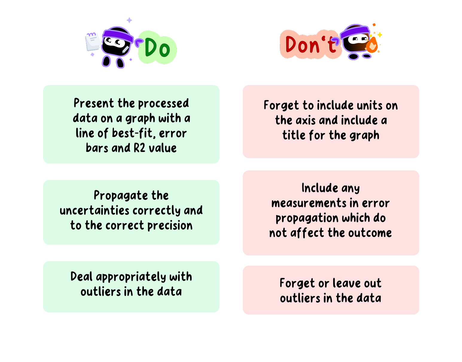
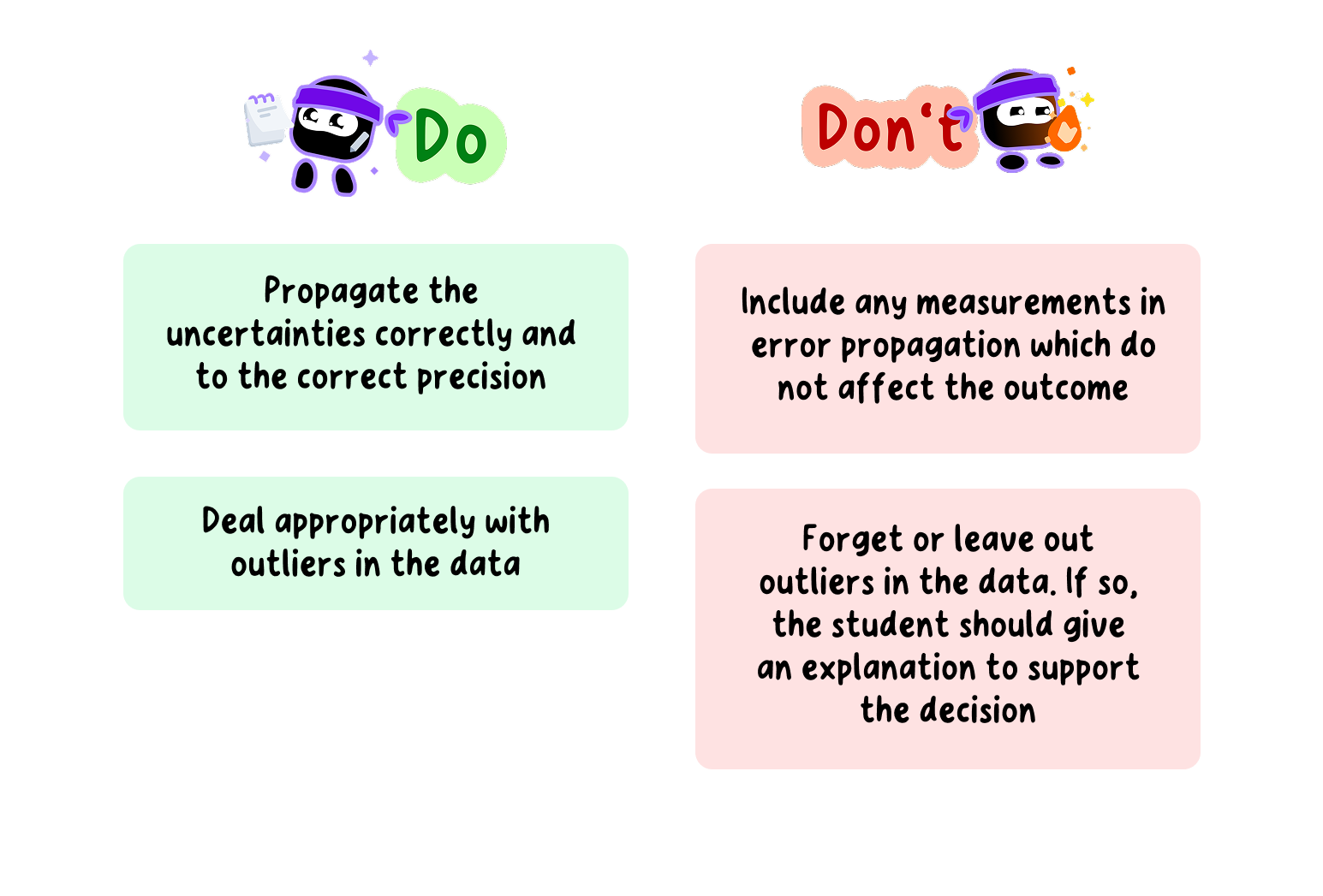
Do's and Don'ts of Dealing with Uncertainties in your Physics EE