Guiding question: Does the studentanalyse the information presented in the essay and produce a coherent line of argument?
Note
If the work does not reach a standard outlined by the performance level descriptors, 0 marks are awarded for this criterion.
Number of marks
Analysis
Line of argument
1-2
The essay is descriptive rather than analytical.
A partial line of argument is present.
3-4
The essay includes analysis that is partially effective and produces some relevant findings.
A partially consistent line of argument links the research question, research findings and conclusions.
5-6
Analysis in the essay is effective and consistently produces relevant findings.
A clear, sustained line of argument links the research question, research findings and conclusions.
Recording Data
Data can be classified as quantitative or qualitative.
Both types of data should be included in this section.
The amount of data collected will depend on the type of investigation and the sampling rate.
Some investigations will naturally produce more raw data than others.
Tip
If large amounts of raw data are collected, it is recommended that students only present a sample of the data in the body of the essay and include the whole table of raw data in the appendix.
Whatever the amount of data collected, it should be presented in an appropriate titled data table (or results table) and labelled as Table 1, Table 2, etc.
A data table must include the units of the measurement together with the absolute uncertainty.
The data must be recorded to the correct number of decimal places.
This is determined by the measuring device and should be consistent for the same device.
Quantitative data should also be included in the results table, depending on the protocol used.
Tip
SI units should be used throughout the report.
Example
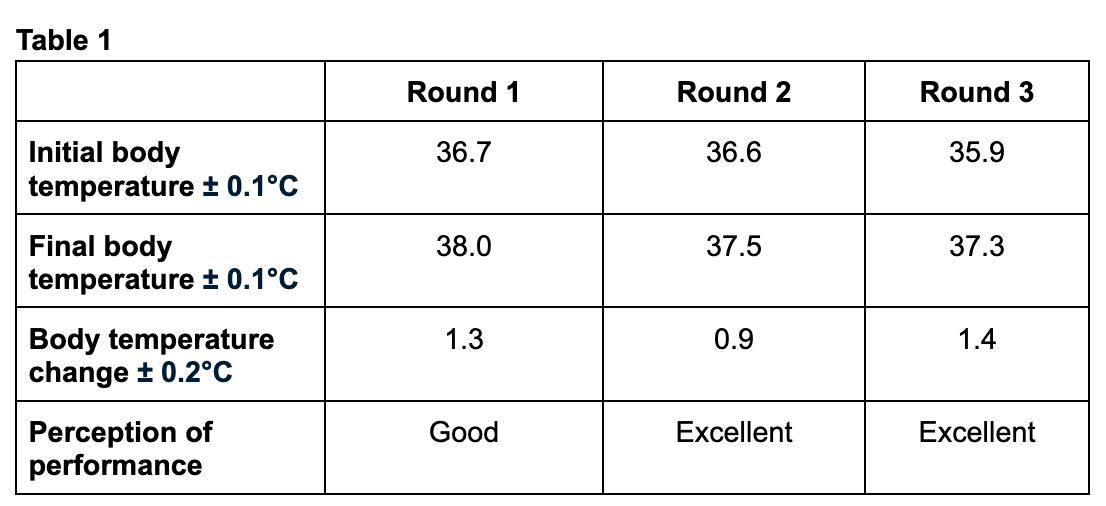
Figure 1: Sample of recording data
Note that the above table includes the uncertainty of each measurement as well as the units.
Qualitative data, the perception of the performance, is also included.
In addition, the data is recorded to the appropriate number of significant figures or decimal places.
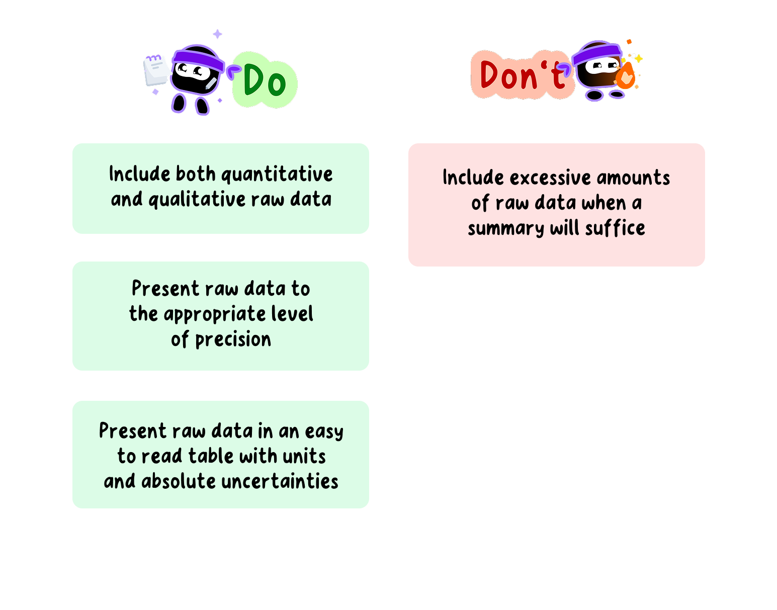
Do's and Don'ts of Recording Data for your SEHS EE
Data processing and graphing
Data processing involves transforming the raw data into different forms that allow the relationship between the variables to be determined and the research question to be answered.
This could include:
Finding the average when multiple trials have been conducted.
Calculating an enthalpy change or rate of reaction.
Plotting a graph and determining a best-fit line.
Conducting appropriate statistical analysis.
Tip
The use of spreadsheets might be appropriate here as they allow for the easier processing of data.
As the scope of possible EE topics is so large, it is not possible to give explicit instructions for every form of data processing.
Therefore, it is recommended that students do their own research to determine the type of data processing required for their investigation.
Whatever the form of data processing used in the investigation, it is recommended to present an example calculation which is clear and easy to follow.
Tip
Pay particular attention to the use of significant figures and decimal places in the calculations.
Graphing is an important part of data processing.
A graph provides a visual representation of the processed data and makes it easier to determine any relationships or trends in said data.
The type of graph produced will depend on the data, however, there are some important points to consider, regardless of the type.
Graphs should have axes that are clearly labelled, a title, and if appropriate, a legend.
They should be appropriately sized and easy to read.
The independent variable is usually plotted on the x-axis, and the dependent variable (or the derived value) is usually plotted on the y-axis.
A best-fit line, which can be a straight line or a curve, depending on the data, should be added.
Error bars representing standard deviations should also be included; these are discussed in more detail in the next section.
The coefficient of determination (R²) should also be determined, if necessary.
Statistical analysis must be carried out with a suitable explanation to justify the selection of the test used.
Example
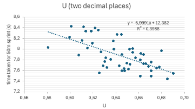
An example graph is shown below for an investigation to determine the relation between sprint velocity and an index (U) relating the body mass distribution.
Figure 2: Sample of graphing
Note that the above graph has a title which starts with Graph 1, labelled axes with units, and a best-fit line.
From the best-fit line, we can see that the relation shown seems to be inversely proportional.
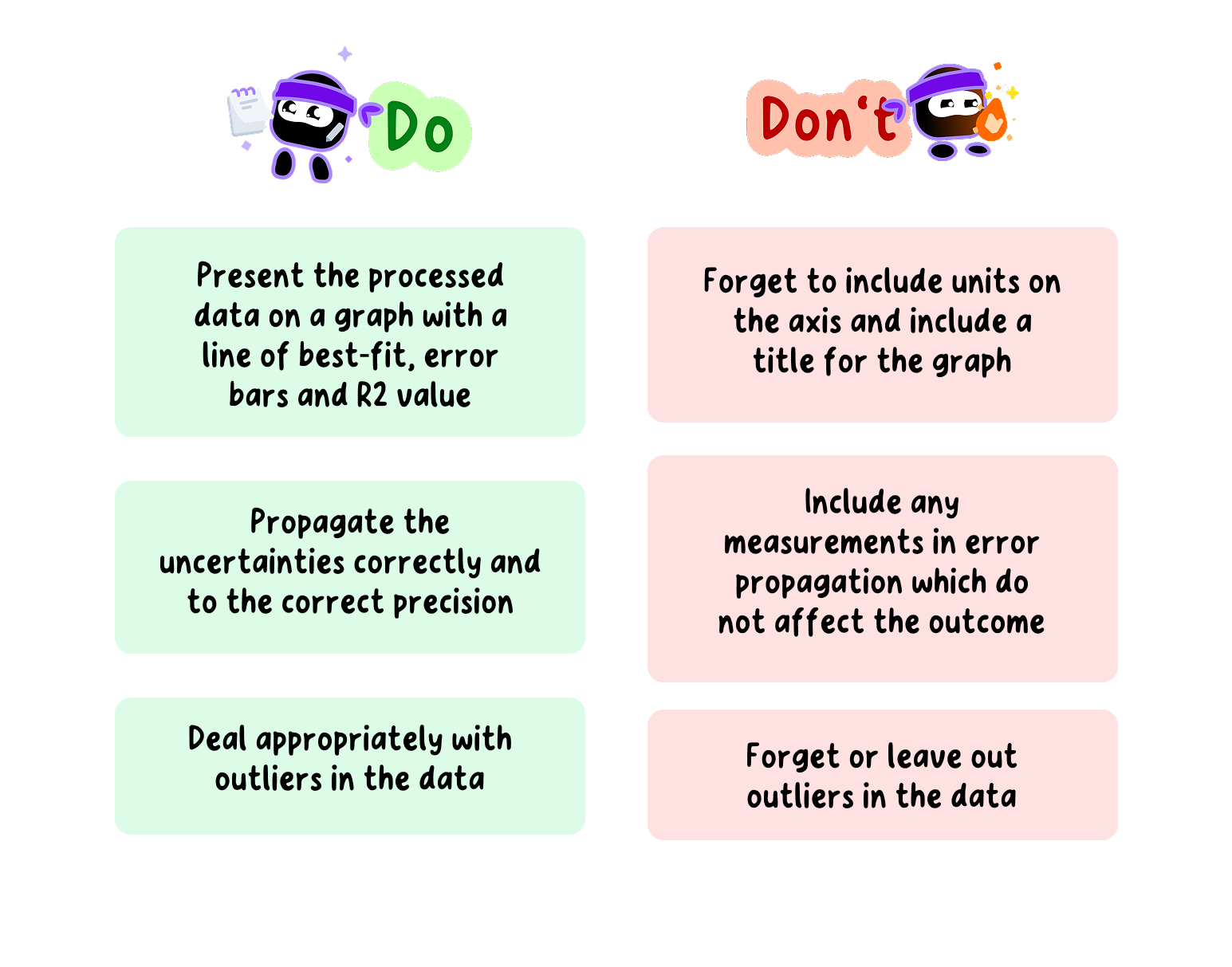
Do's and Don'ts of Data Processing and Graphing in your SEHS EE
Uncertainties and Error
Random Errors
Whenever a measurement is taken in the laboratory or during field work, there is an uncertainty associated with that measurement.
These are known as random uncertainties or random errors.
Random errors are caused by the limit of precision of the apparatus used to take the measurement and will cause the measured value to be either higher or lower than the actual value.
These uncertainties are an unavoidable part of the measuring process and cannot be completely eliminated.
However, they can be reduced by conducting repeat trials, taking an average, and using more precise apparatus.
Random errors will cause the measured value to be either higher or lower than the actual value.
They are usually expressed together with the measured value as a range using the ± sign and are known as absolute uncertainties.
Example
For instance, the mass of an athlete can be expressed as:
78.50 ± 0.01 kg
Note that this mass is recorded to the same precision as the absolute uncertainty (in this example, two decimal places).
This tells us that the actual mass of the substance lies somewhere between 78.49 g and 78.51 g.
The absolute uncertainty of a piece of apparatus will differ depending on the precision of the apparatus.
More precise apparatus will have a lower absolute uncertainty, and less precise apparatus will have a higher absolute uncertainty.
Example
For instance, a mass recorded on a mass balance that can measure to four decimal places is more precise than one that can measure to two decimal places and therefore has a lower absolute uncertainty, as can be seen below.
62.50 ± 0.01 kg
62.5000 ± 0.0001 kg
The measurement that is below is more precise and has a lower absolute uncertainty, which equates to a lower random error.
The absolute uncertainty of a piece of apparatus can sometimes be found in the apparatus itself. If not, the absolute uncertainty can be determined as follows:
For analogue apparatus, the absolute uncertainty can be taken as half the smallest scale division. If the smallest scale division is 1 cm³, the absolute uncertainty is ± 0.5 cm³.
For digital apparatus, the absolute uncertainty can be taken as the smallest scale division. If the smallest scale division is 0.01 g, the uncertainty is ± 0.01 g.
Systematic Errors
Systematic errors are caused by problems or flaws with the experimental design.
They cause the measured value to be consistently higher or consistently lower than the actual value.
Unlike random errors, they cannot be reduced by conducting repeat trials.
However, they can be reduced or eliminated by modifying the experimental design.
Accuracy and Precision
Accuracy refers to the closeness of the measured value to the actual value.
Measured values with high accuracy have smaller systematic errors and vice versa.
Precision refers to the number of significant figures, or decimal places, there are in a measured value.
Measured values with higher precision have lower random errors.
Propagation of uncertainties
Propagation of errors, or error propagation, is the calculation of the overall uncertainty in a derived value during an investigation.
During data processing, the uncertainty of each measurement is combined to give the final uncertainty of the calculated result.
How the uncertainties are combined depends on the type of mathematical operation used, i.e. whether the values are added and subtracted, or multiplied and divided.
Addition and subtraction of uncertainties
When adding or subtractingmeasured values, the absolute uncertainties are added.
Multiplication and division of uncertainties
When multiplying or dividing uncertainties, the absolute uncertainties must first be converted to percentage uncertainties, using the equation shown below.
Once converted, the percentage uncertainties are added together to get the overall uncertainty.
If the overall percentage uncertainty is equal to or greater than 2%, it is given to one significant figure.
If the overall percentage uncertainty is less than 2%, it is given to two significant figures.
The percentage uncertainty can be converted back to the absolute uncertainty if necessary.
Uncertainties of averaged values
Tip
It is recommended that students conduct repeat trials in their investigation which will require repeat measurements of the dependent variable.
The average of these values is then taken and the uncertainty of the averaged value must be considered.
For averaged values, the uncertainty should be the same as for the individual values.
Representing uncertainties graphically
Uncertainties can be represented graphically through the use of error bars.
Error bars show the maximum and minimum range of the uncertainty of the plotted point.
They are usually plotted above and below the plotted point (for the y-value), but can also be plotted from side to side (for the x-value).
They are usually plotted using graphing software such as Excel or Google Sheets.
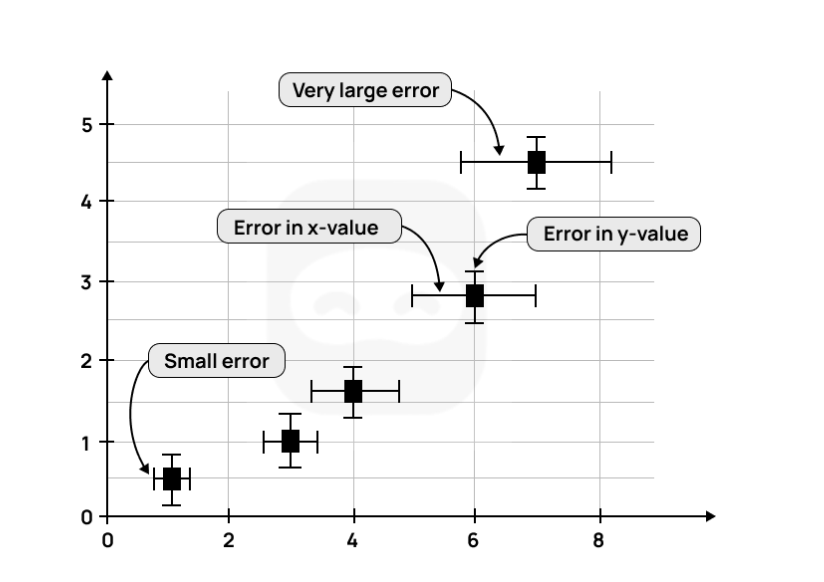
Example
Figure 3: Sample of uncertainties in graphs
An instance of a graph with error bars is shown above.
As can be observed, the larger error bars show a larger uncertainty and vice versa.
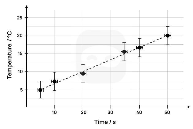
Example
A second instance of a graph with error bars is shown below. This graph has temperature on the y-axis and time on the x-axis. The error bars for the temperature show an uncertainty of ± 2.5 °C.
Figure 4: Sample 2 of uncertainties in graphs
In the above graph, the error bar for the temperature (on the y-axis) is larger than the one for the time (on the x-axis).
In this case, it would be appropriate to take the larger uncertainty of the temperature as the overall uncertainty and give less significance to the smaller uncertainty of the time.
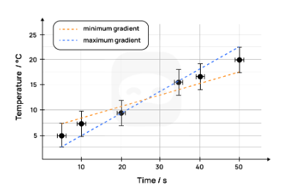
The gradient of a best-fit line can be determined using error bars.
To do this, two lines are drawn; one with the minimum gradient and one with the maximum gradient; with both lines passing through the error bars.
The graph below shows the two lines drawn with the maximum and minimum gradients (also known as the worst-fit lines).
Figure 5: Sample of graph with uncertainties and gradient
The gradient of the best-fit line is the average of the minimum gradient and the maximum gradient. $$m = \frac{m_{\text{maximum gradient}} + m_{\text{minimum gradient}}}{2}$$
The uncertainty of the final gradient is calculated as follows: $$\Delta m = \frac{m_{\text{maximum gradient}} - m_{\text{minimum gradient}}}{2}$$
R² – the coefficient of determination
The coefficient of determination (R²) is a measure of how close the data is to the best-fit line and how well the model fits the data.
It indicates how well the independent variable explains the variation in the dependent variable.
Students do not need to understand how R² is calculated, as this can be done by most graphing software.
However, they should understand how to interpret the value of R², specifically with respect to the strength of the relationship between the independent and dependent variables.
R² values can range from 0.0 to 1.0.
The higher the value of R², the better the fit of the data points with the best-fit line.
Note
An R² value of 1.0 suggests a perfect fit between the data and the model used.
In other words, all of the variance in the dependent variable is explained by the independent variable.
Lower values of R² suggest that the independent variable cannot explain all the variance in the dependent variable.
Very low values of R², such as 0, suggest that none of the variance in the dependent variable is explained by the independent variable.
In this case, it is likely that the wrong model has been chosen to analyse the data.
Example
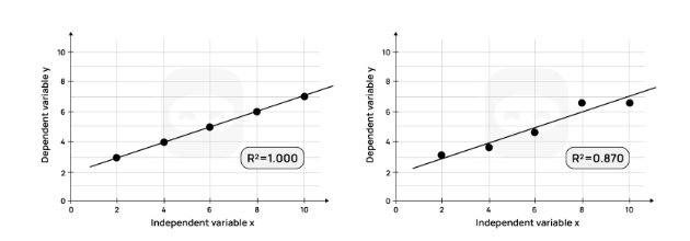
Consider the two graphs shown and their R² values.
Figure 17: Graphs with R squared values
The graph on the left, with an R² of 1.0, indicates that all (100%) of the variation in the dependent variable is explained by the independent variable.
The linear model used perfectly predicts the dependent variable.
The graph on the right, with an R² of 0.83, indicates that 83% of the variation in the dependent variable is explained by the independent variable.
In other words, all the variance in the data cannot be accounted for by the linear model.
In the scientific investigation, the R² can be used to determine the strength of the relationship between the independent and dependent variables (for example, how concentration affects the rate of reaction).
If the calculated R² value is high, this indicates a strong relationship between the independent variable (concentration) and the dependent variable (rate of reaction).
In other words, the model used explains most, but not all, of the variance in the dependent variable.
T-test
A t-test is a statistical tool used to determine whether there is a significant difference between the means of two groups.
For example, an investigation may compare the resting heart rate of two groups of athletes who follow different training programs.
The independent variable in this case is the training program (group A vs. group B).
The dependent variable is the resting heart rate.
While differences in the means may appear from the raw data, a t-test helps determine whether the difference is statistically meaningful, or whether it could have occurred by chance. If n < 10 this tool should not be used.
A p-value is calculated as part of the test:
If the p-value is < 0.05, the difference between the groups is considered statistically significant.
A high p-value suggests that any observed difference is likely due to random variation, not the independent variable.
Note
Students do not need to know how to calculate the t-test manually, as software or calculators can generate the result.
However, they should understand how to interpret the p-value in relation to their research question.
Example
If p = 0.02, it means there is only a 2% probability that the observed difference occurred by chance, supporting the conclusion that the training program has a genuine effect on resting heart rate.
ANOVA (Analysis of Variance)
An ANOVA test is used when comparing three or more groups.
For example, if a student is investigating the effect of different warm-up methods (dynamic stretching, static stretching, no stretching) on sprint time, a t-test would not be sufficient, because it only compares two groups.
ANOVA compares the variation between groups to the variation within groups:
If the variation between groups is much greater than the variation within groups, this suggests a real difference in performance.
The test produces an F-statistic and a corresponding p-value.
A p-value < 0.05 indicates that at least one group differs significantly from the others.
However, ANOVA does not specify which groups are different.
If the result is significant, further post-hoc tests (such as Tukey’s test) can identify the specific group differences.
Example
ANOVA might reveal a statistically significant difference among the three warm-up methods.
A post-hoc test could then show that dynamic stretching improves performance significantly compared to static stretching, but not compared to no stretching.
Chi-square test (χ²)
Another useful tool is the chi-square test, which is used when data are categorical rather than numerical.
Example
A student might investigate whether there is a relationship between gender (male/female) and preferred type of physical activity (team sports/individual sports/fitness training).
The chi-square test compares the observed frequency of responses in each category with the expected frequencies if there were no relationship.
A large difference between observed and expected frequencies results in a higher chi-square value.
The associated p-value indicates whether this difference is statistically significant.
If p < 0.05, it suggests that gender and preferred activity type are not independent, meaning there is a meaningful relationship between the two variables.
Application to the IB Extended Essay in SEHS
Just as R² helps quantify the strength of a relationship between variables, and percentage error helps identify systematic errors, statistical tests such as the t-test, ANOVA, and chi-square allow students to evaluate whether observed differences or patterns in their data are significant or simply due to chance.
When writing an Extended Essay, it is not necessary to show the full calculation of these tests. However, students should:
Justify the use of the appropriate tool.
Report the statistical values (e.g., t, F, χ²) and the p-value.
Interpret the results clearly in the context of their research question.
Discuss whether their findings support or contradict existing literature.
Tip
By using these statistical tools correctly, students can provide stronger evidence for their conclusions and demonstrate critical thinking in their analysis.
Dealing with Outliers
An outlier is a data point that differs significantly from the other data points in a set of data.
Outliers can be higher or lower than other data points.
They usually occur as a result of flaws in the methodology, human error, or faulty measuring equipment.
Outliers should not be removed from the calculations during data processing.
The justification given for this is that outliers are measured values, and removing or ignoring them can be considered data manipulation.
If a student has outliers in their collected data, it is recommended that they present their data processing both with and without the outlier(s).
This will allow the impact of the outliers to be demonstrated.
An alternative method is to identify the flaw or error in the methodology, take steps to remedy the flaw, and repeat the measurement.
Tip
In this case, the modification(s) made should be described in the report.
Key points
All measured data has an uncertainty or error associated with it, known as its random error or random uncertainty.
Raw data must be presented with its absolute uncertainty using the symbol ±, such as 2.50 ± 0.01 g.
The precision of the measured value and the absolute uncertainty should be the same.
Random errors cause values to be either higher or lower than the actual value.
Random errors cannot be eliminated, but can be reduced by conducting repeat trials (and taking an average) and by using more precise apparatus.
Systematic errors are caused by flaws in the experimental design.
They produce results which are consistently higher or lower than the actual value.
They cannot be reduced or eliminated by taking repeat measurements.
They can be reduced or eliminated by making changes or modifications to the design of the experiment.
Graphs should include error bars and R² value, if the graph requires a trend line.
Outliers should be dealt with appropriately and not ignored. In case the candidate decides not to include them in the calculations, this decision should be clearly supported.
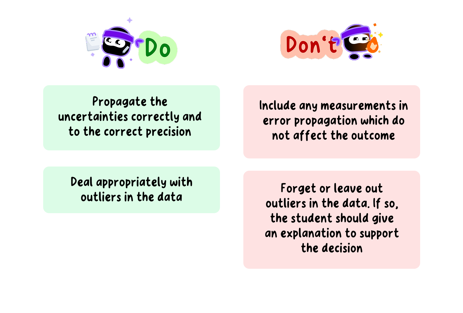
Do's and Don'ts of Dealing with Outliers in your SEHS EE