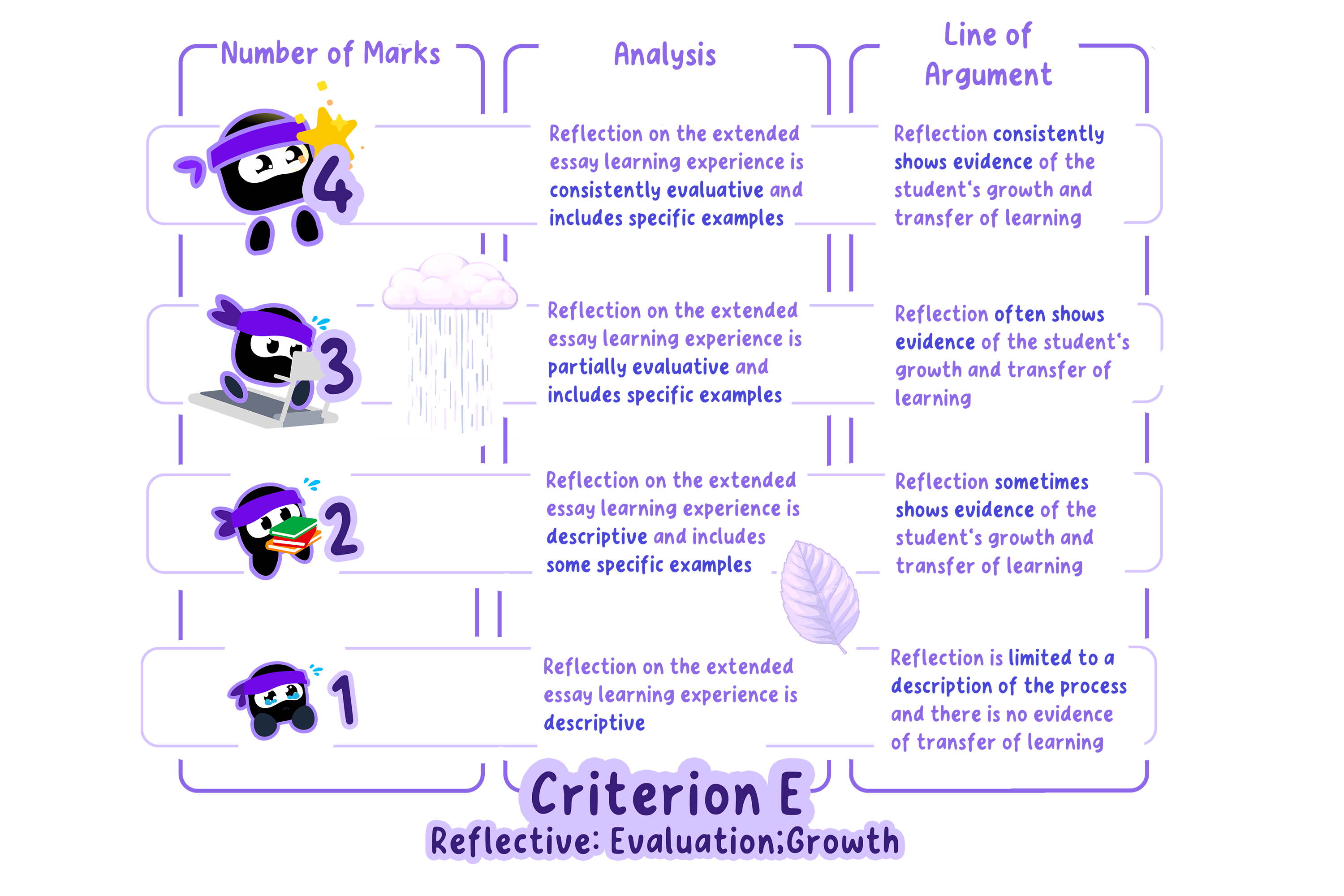
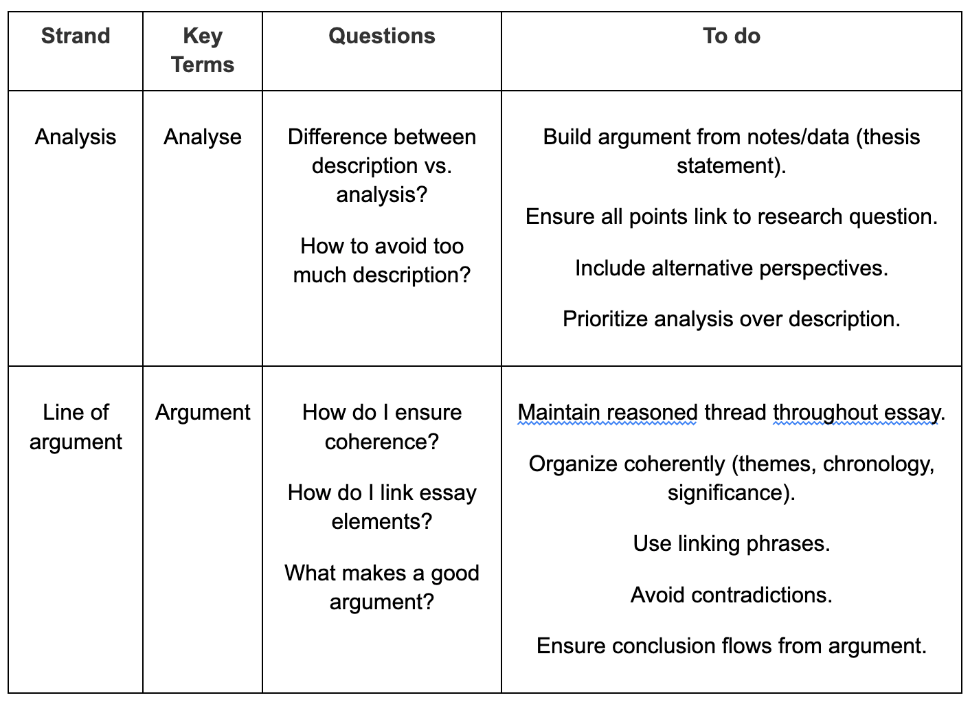
If the work does not reach a standard outlined by the , are awarded for this .
performance level descriptors
0 marks
criterion
Summary for Criterion E.
Essential Elements of this Section
Figure 1: Essential elements
Recording Data
Data in an ESS Extended Essay can be both quantitative and qualitative, and students are expected to include an appropriate balance of the two depending on the research question.
Quantitative data might include:
Biodiversity indices
Water or soil quality measurements
Survey statistics
Qualitative data could take the form of:
Interview responses
Field observations
Photographic records
The amount of data collected will depend on the type of investigation and sampling strategy, and some projects will naturally yield more raw data than others.
If large datasets are generated, it is recommended that only representative samples be presented in the main body of the essay, with the full dataset placed in the appendix.
Whatever the type and amount of data:
It should be clearly organized into appropriately formatted tables or figures labelled as Table 1, Table 2, Figure 1, etc.
Tables should include all units of measurement and note any sources of uncertainty where relevant.
Measurements should be recorded consistently and, where possible, expressed using SI units.
Graphs, maps, and charts should be used to present patterns in quantitative data, while qualitative data such as survey or interview responses should be summarized clearly and structurally, with supporting evidence provided.
This ensures that the results section communicates both the scientific and social dimensions of the investigation effectively.
Note
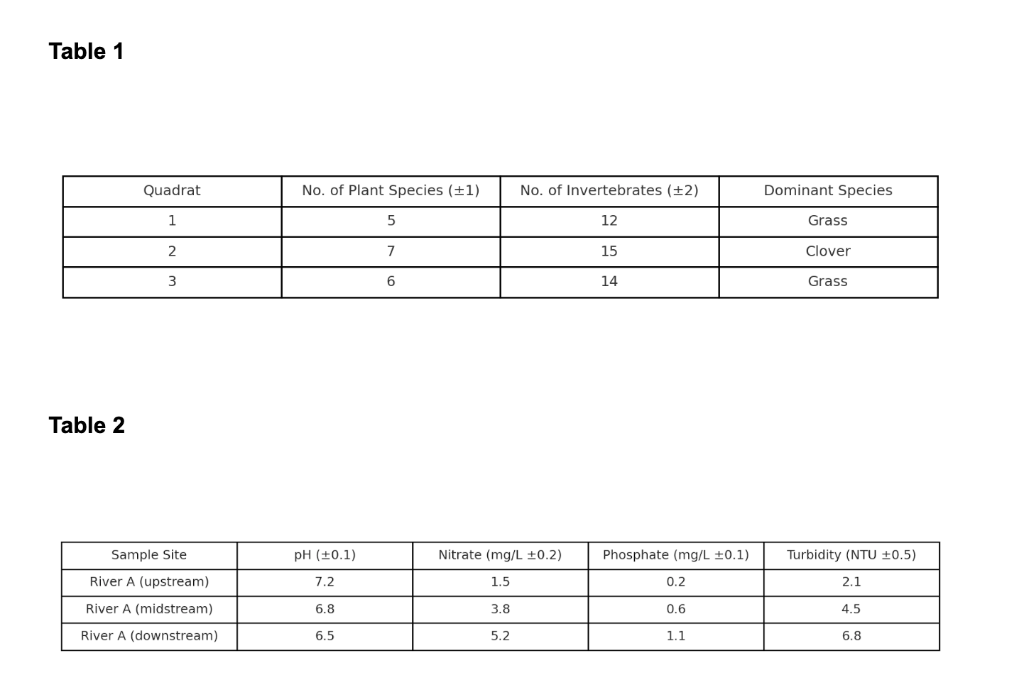
Figure 2: Sample of tables (data)
The above table includes the uncertainty of each measurement as well as the units.
Qualitative data, the colour change of the indicator, is also included.
In addition, the data is recorded to the appropriate number of significant figures or decimal places.
Example
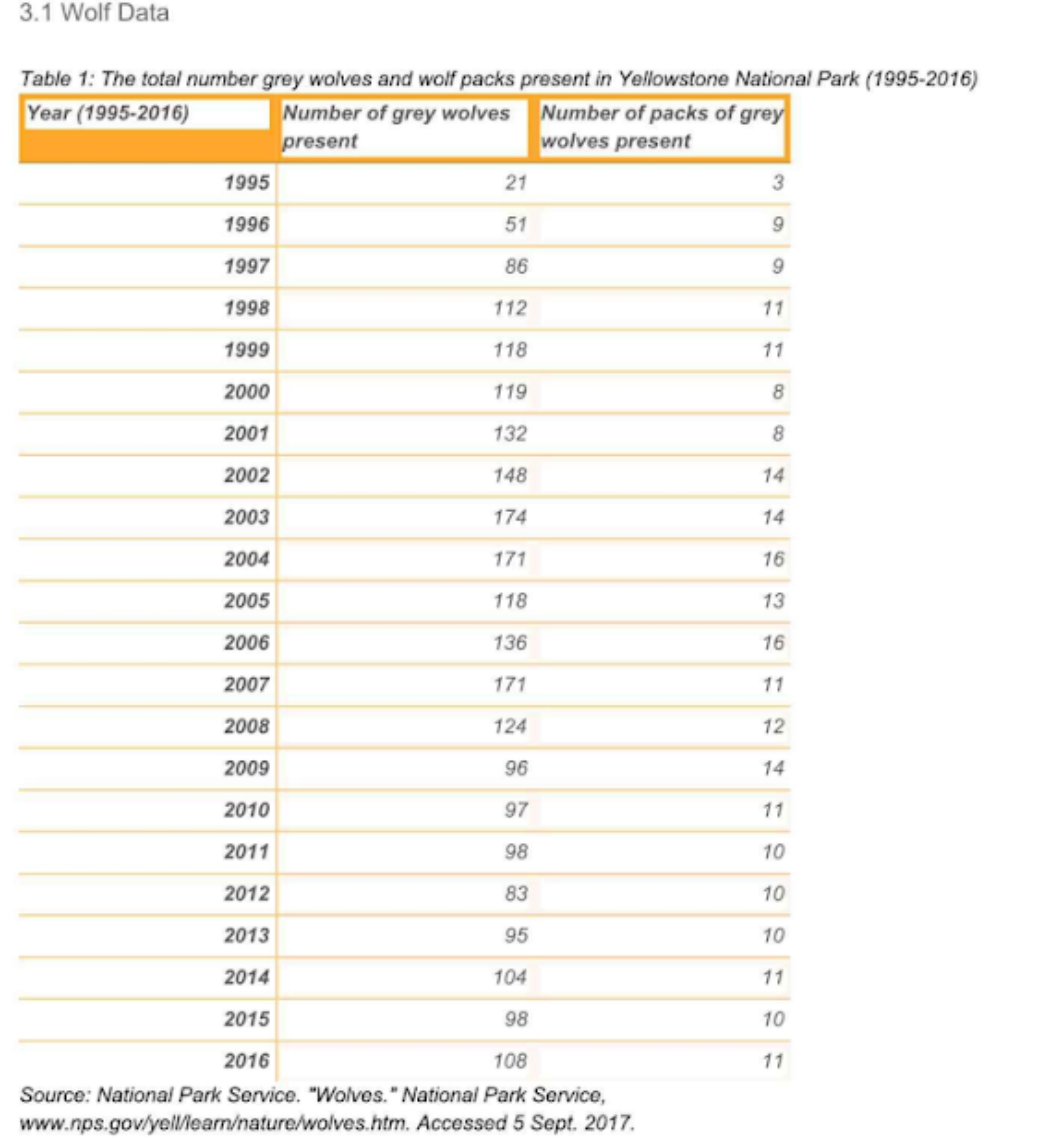
Figure 2: Sample 1 of recording data
The table’s strength lies in its long-term dataset, which allows trends and fluctuations to be clearly observed.
However, it only presents raw counts, without information on causes of change such as disease outbreaks, prey density, or human-wildlife conflict.
Example
Figure 3: Sample 2 of recording data
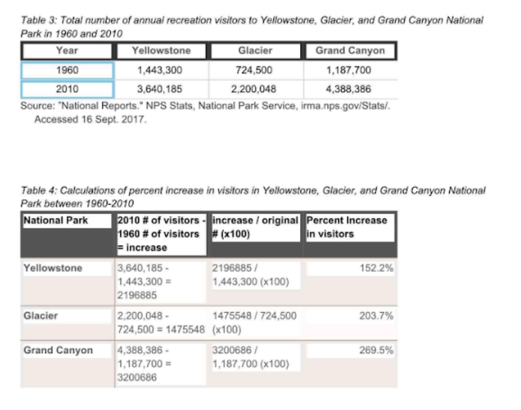
This example shows visitor data for Yellowstone, Glacier, and the Grand Canyon in 1960 and 2010, along with calculated percentage increases.
As secondary data, it is clear, reliable, and relevant, since park visitation trends can be linked to environmental management, conservation policies, or ecotourism impacts—all suitable topics for ESS.
The use of both raw numbers and processed percentages strengthens the analysis by showing not only growth but also relative differences between parks.
However, as evidence for an ESS EE, the dataset is quite limited:
It only compares two years across a 50-year span, which misses fluctuations, seasonal patterns, or external influences (such as policy changes, infrastructure development, or ecological disturbances).
This makes it more descriptive than analytical.
To be truly effective in an EE, it would need to be expanded by:
Using a longer dataset
Linking visitation trends to ecological or social factors
Applying more advanced processing (e.g., correlation tests with biodiversity indicators or conservation outcomes)
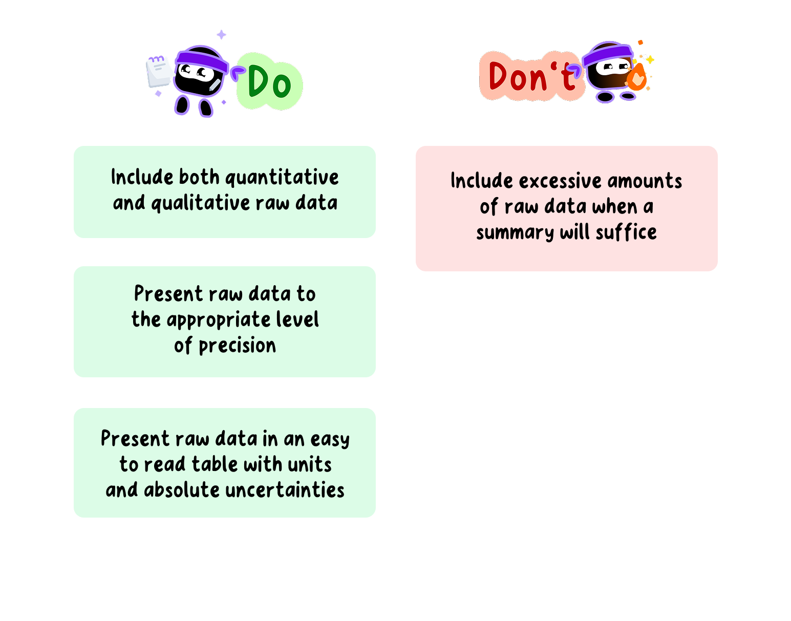
Do's and Don'ts of Recording Data in your ESS EE
Data Processing and Graphing
Data processing involves transforming the raw data into different forms that allow the relationship between the variables to be determined and the research question to be answered.
This could include:
Finding the average when multiple trials have been conducted
Calculating an enthalpy change or rate of reaction
Plotting a graph and determining a best-fit line
The use of spreadsheets might be appropriate, as they allow for easier processing of data.
As the scope of possible EE topics is so large, it is not possible to give explicit instructions for every form of data processing.
Therefore, students should do their own research to determine the type of data processing required for their investigation.
Whatever form of data processing is used, it is recommended to present an example calculation that is clear and easy to follow.
Pay particular attention to the use of significant figures and decimal places in calculations.
Note
Graphical representation is a crucial part of data processing in ESS.
A graph provides a visual representation of the processed data and makes it easier to determine any relationships or trends in said data.
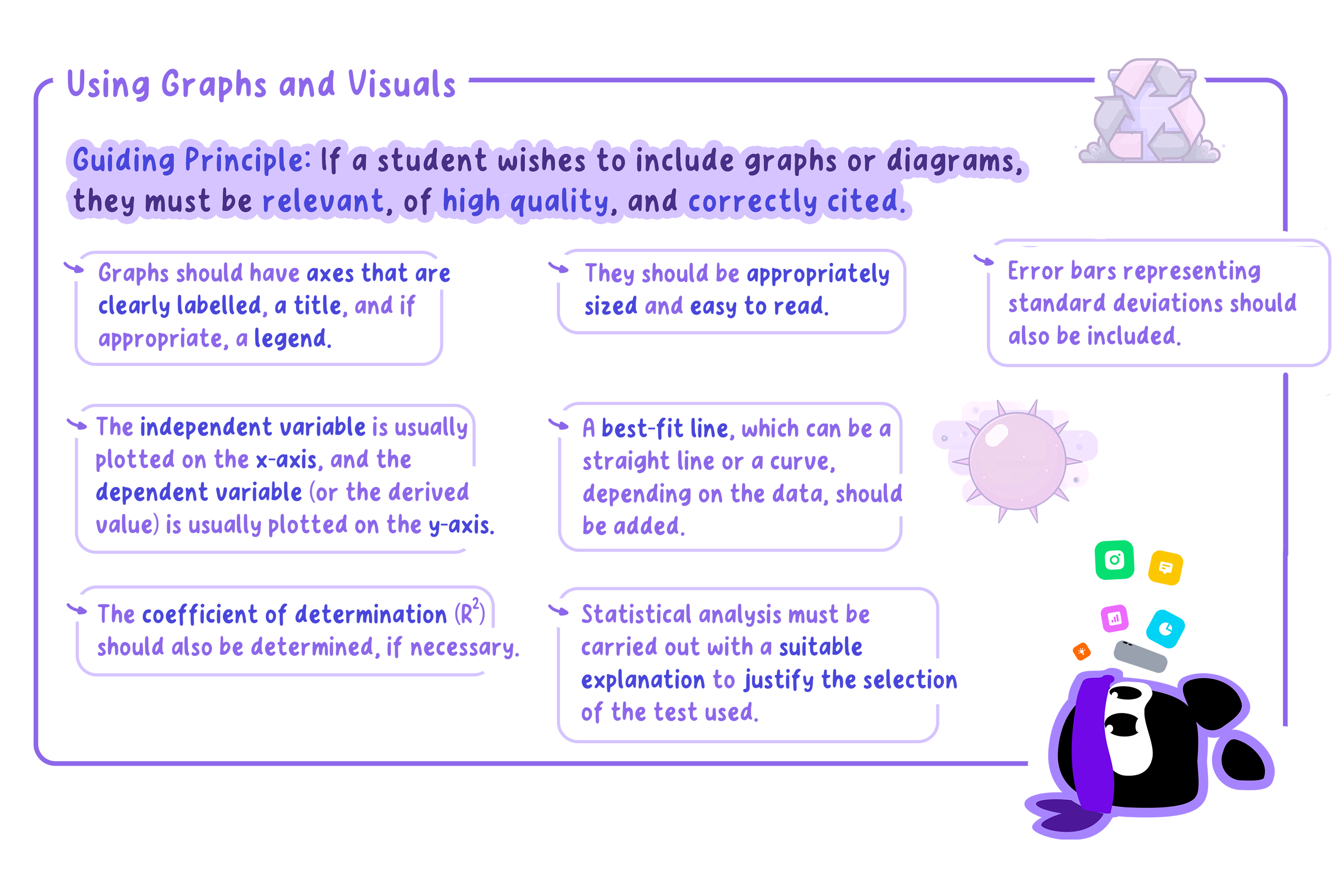
The type of graph produced will depend on the data, however, there are important points to consider regardless of the type:
Main hints for data processing and graphing.
Example
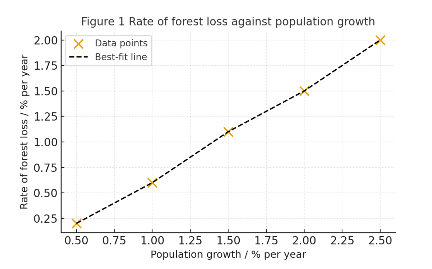
A sample graph is shown below for an investigation to determine while population growth increases, forest loss also increases.
Figure 4: Sample of graph
The above graph has a title starting with Figure 1, labelled axes with units, and a best-fit line.
From the best-fit line, we can see that the rate of forest loss is directly proportional to population growth.
This demonstrates how human demographic factors can influence environmental change.
Example
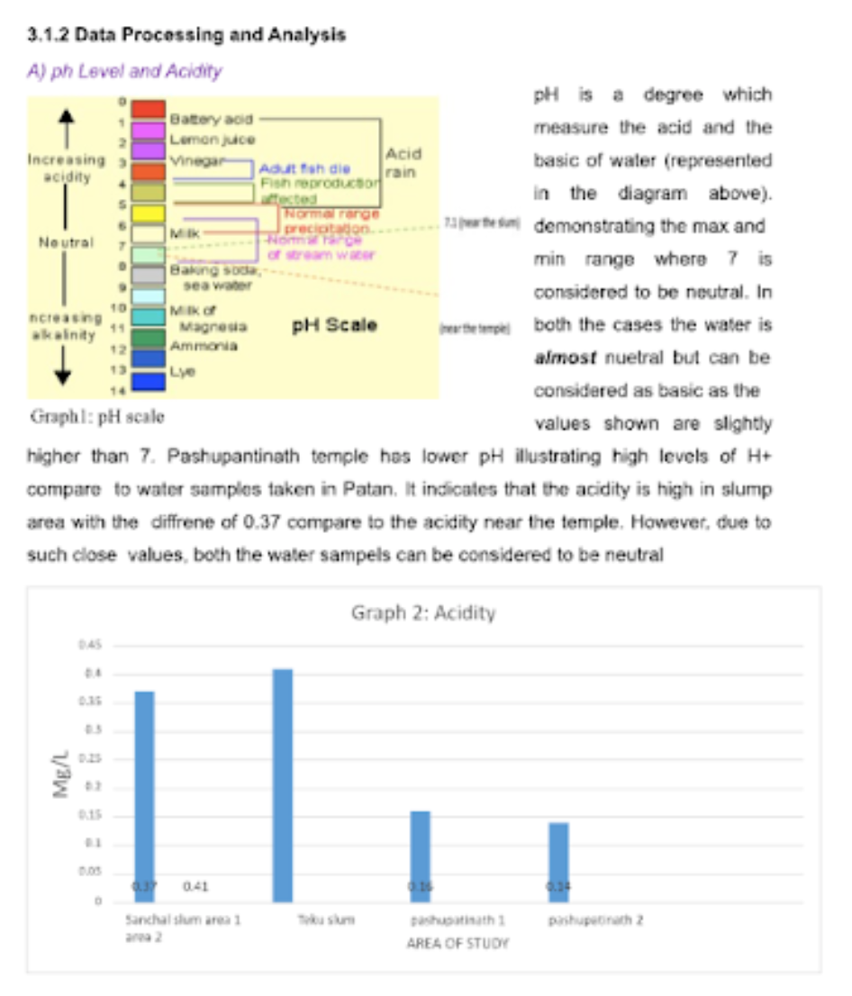
Figure 5: Sample 1, excerpt 1 of data processing
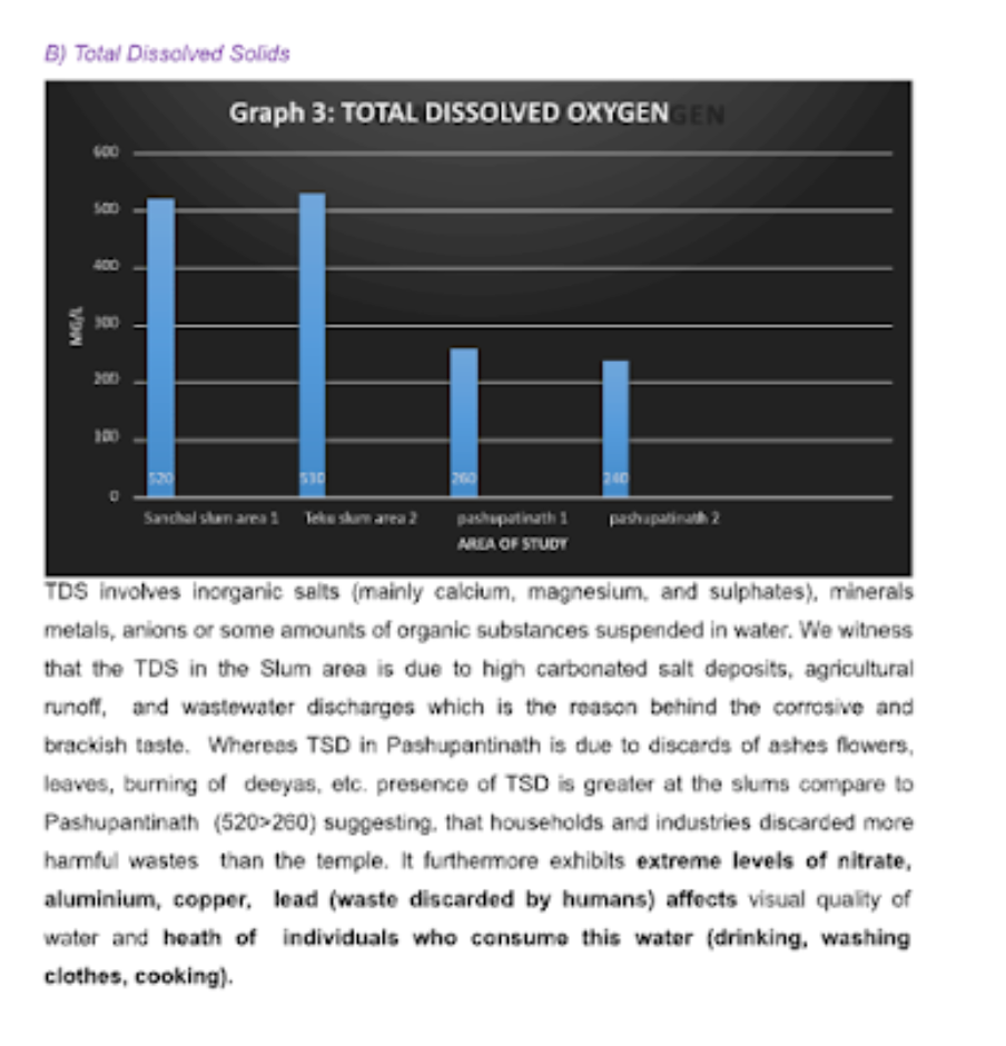
Figure 6: Sample 1, excerpt 2 of data processing
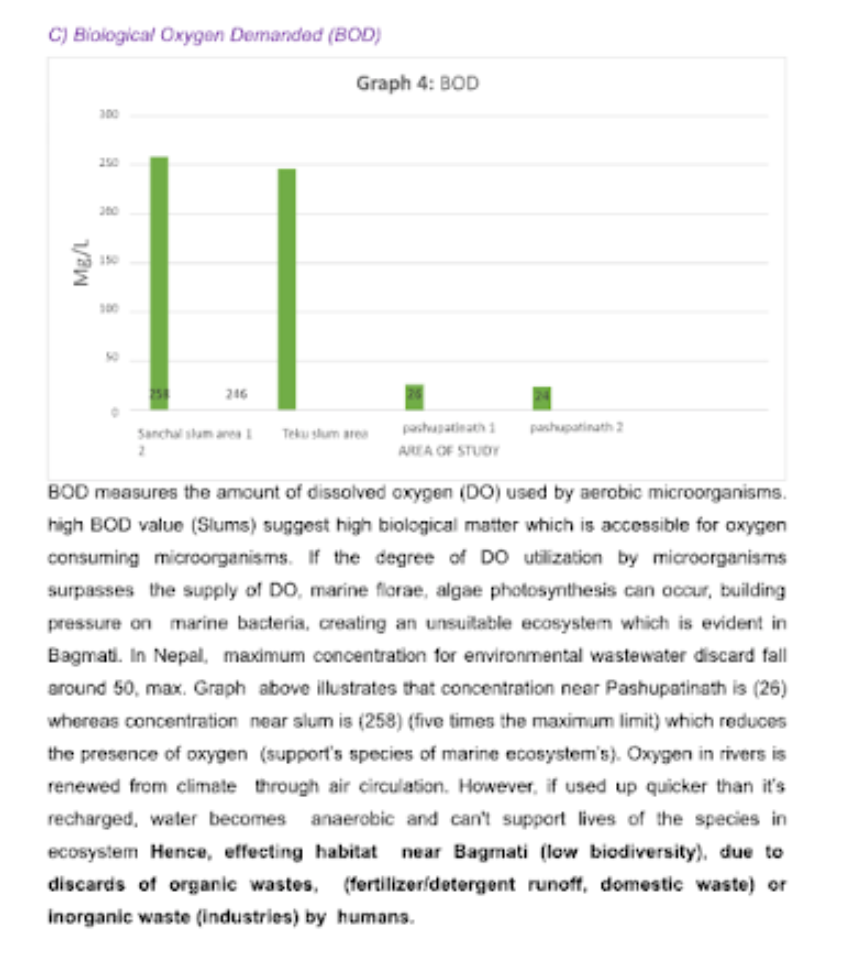
Figure 7: Sample 1, excerpt 3 of data processing
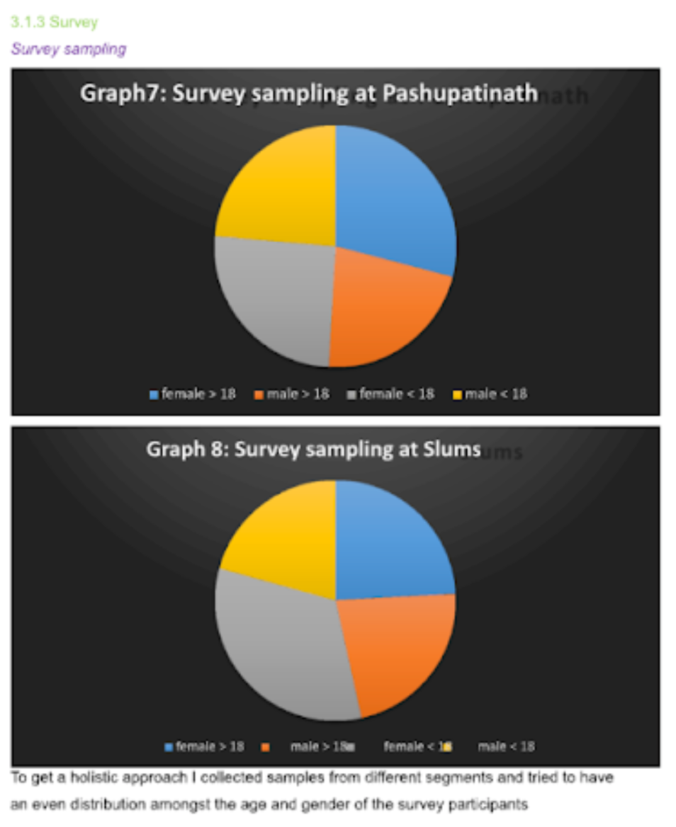
Figure 8: Sample 1, excerpt 4 of data processing
The graphs (pH levels, total dissolved solids, biological oxygen demand, and survey distributions) demonstrate a clear attempt to combine quantitative environmental data with qualitative social data, which aligns well with the interdisciplinary nature of ESS.
The inclusion of both scientific parameters (pH, TDS, BOD) and community-based survey results reflects a balanced approach that connects ecological quality with human activity and perception.
However, while the data is relevant, the presentation and analysis are largely descriptive rather than analytical.
The graphs show trends and differences between sites, but there is limited interpretation of why these variations occur or how they relate to the research question.
For example, pH and BOD are explained in terms of pollution and human impact, but the analysis could go further by:
Linking changes to specific sources (e.g., waste discharge, land use, or cultural practices)
Comparing findings to environmental quality benchmarks
Additionally, the graph formatting could be improved to meet IB expectations:
Axes should be clearly labelled with units.
Each graph should include a concise, informative title and, where appropriate, error bars or uncertainty values.
Colour choices and scales should enhance readability and consistency across figures.
The survey pie charts are effective for visualizing demographic representation but would be more meaningful if linked directly to attitudes or behaviors relevant to the environmental issue studied (e.g., awareness of pollution, waste management practices).
Overall, the graphs provide a good foundation for data presentation but need stronger analytical commentary that interprets environmental and social data together, drawing explicit connections to sustainability and the research question.
Data processing Do's and Don'ts for your ESS EE
Example
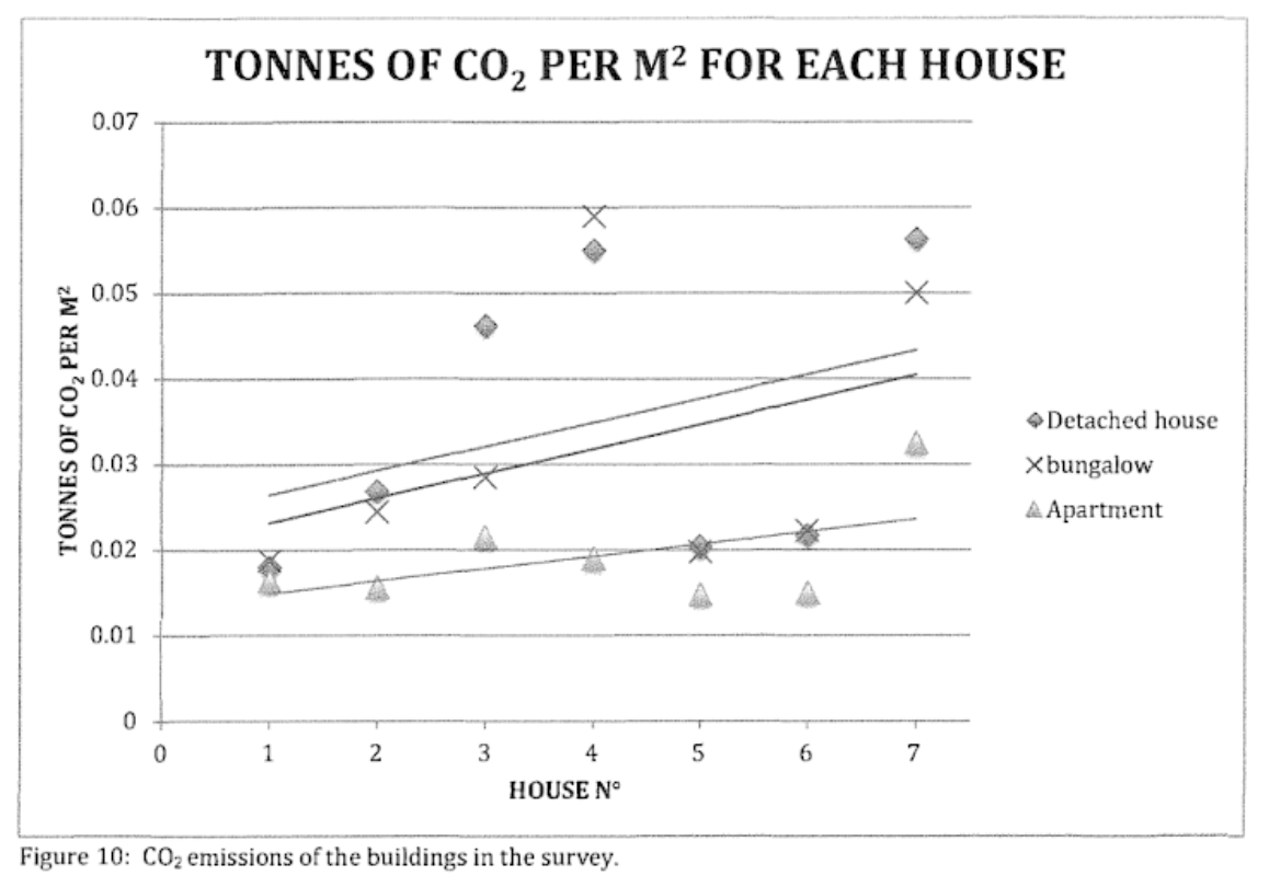
Figure 9: Sample 2 of data processing
The graph is clear, well-labeled, and relevant to the research question, effectively comparing CO₂ emissions among different housing types.
Its use of distinct symbols and trend lines helps visualize patterns, which aligns with ESS expectations for clear data presentation.
However, it lacks important analytical features such as:
Error bars
Uncertainty ranges
Statistical indicators (e.g., $R^2$ values) which are essential for assessing data reliability.
Additionally, the use of house number on the x-axis appears arbitrary and does not represent a meaningful variable, weakening the validity of the correlations.
Overall, while the graph communicates trends effectively, it remains descriptive rather than analytical, limiting its potential to score highly under Criterion C for critical thinking and data interpretation.
For Environmental Systems and Societies (ESS) EEs, the expectations are:
Graphs and data presentation are required if you are working with quantitative data.
They should be clear, labelled, and directly linked to the research question.
Uncertainties:
If you are collecting primary data with measurements (e.g., pH, temperature, biodiversity counts, etc.), you should include uncertainties in tables and acknowledge error sources.
For secondary data, you are expected to discuss limitations and possible uncertainties in collection methods, but you are not always able to present absolute uncertainties (since official sources may not provide them).
$R^2$ values (statistical tests):
These are not mandatory for all EEs, but they are strongly recommended whenever you are testing relationships between variables (e.g., correlation between wolf populations and visitor numbers, or temperature rise and bleaching events).
Using $R^2$ or similar statistical tools (chi-square, t-test, regression analysis) shows higher-level data processing and strengthens Criterion C (Critical thinking).
Uncertainties and Errors
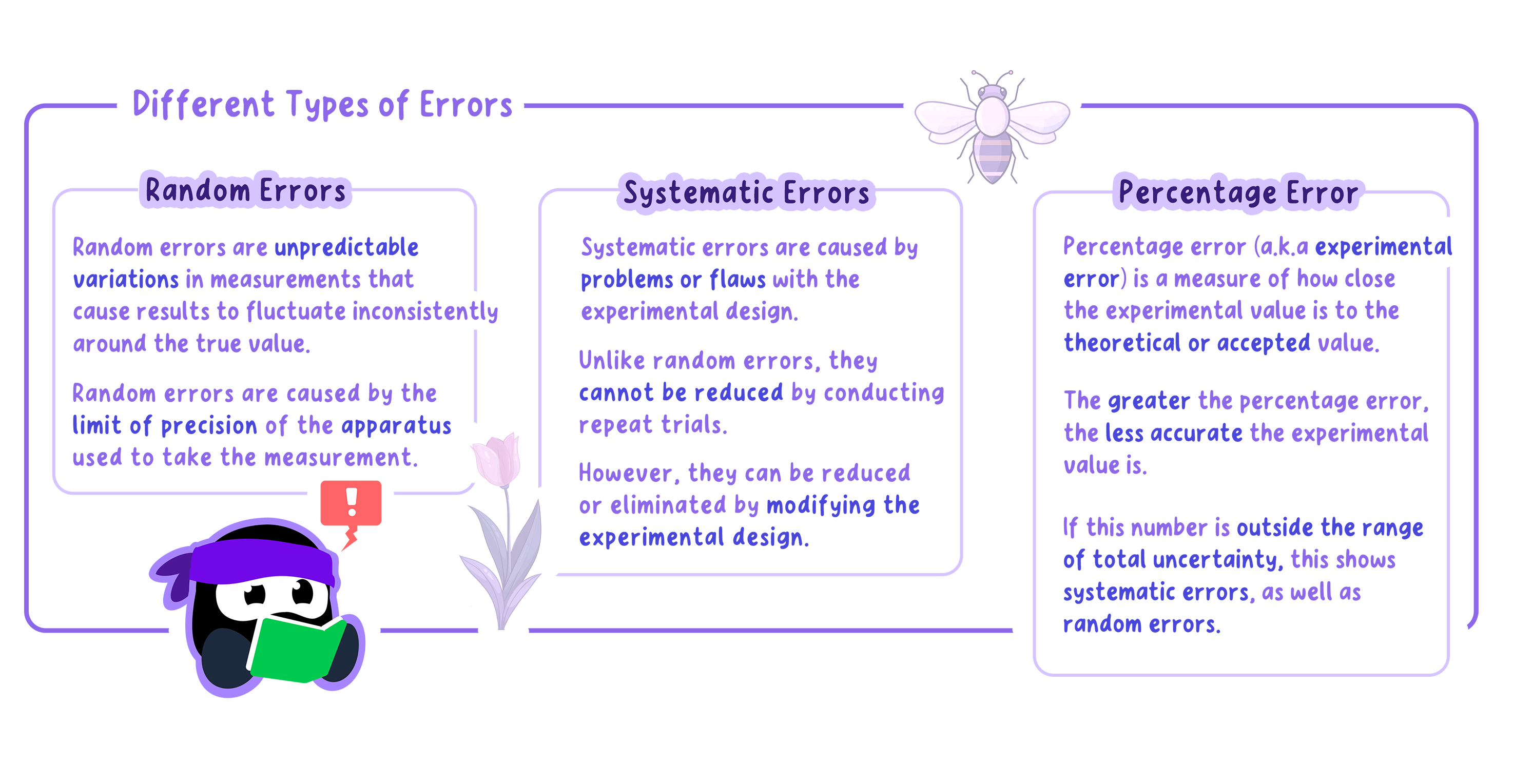
Random Errors
Whenever environmental data are collected in the field or laboratory, there is an uncertainty associated with the measurement.
These are known as random errors and occur due to the limited precision of the instruments or sampling methods used.
For example:
Estimating vegetation cover within a quadrat may vary slightly between observers.
A pH probe may fluctuate around a true value.
Random errors cause measurements to be sometimes higher and sometimes lower than the actual value.
They are unavoidable, but their effect can be reduced by:
Taking repeated samples
Averaging results
Using more precise instruments or standardized protocols
Example
In ESS, uncertainties should be expressed with the measured value using the ± sign, for example:
Dissolved oxygen = 7.5 ± 0.2 mg/L
Quadrat area = 1.00 ± 0.05 m²
This shows the likely range within which the true value lies.
The level of uncertainty depends on the precision of the instrument or method:
A digital turbidity meter has lower uncertainty than a simple visual clarity test using a Secchi disk.
For analogue apparatus, the absolute uncertainty is typically taken as half the smallest scale division, whereas for digital instruments it is the smallest scale division.
Systematic Errors
Systematic errors occur when flaws in the experimental design or sampling technique cause values to be consistently too high or too low.
These cannot be corrected by repeating trials but can often be reduced by improving the design.
Example
Cases relevant to ESS include:
Using a poorly calibrated pH probe that consistently reads 0.2 units too high.
Collecting water samples from different depths without standardizing, leading to biased comparisons.
Counting mobile invertebrates during quadrat sampling, where some consistently escape before being recorded.
Failing to randomize quadrat placement, leading to overrepresentation of certain habitats.
By being explicit about both random and systematic errors, students show awareness of the limitations of their methodology and strengthen the reliability of their evaluation.
Summary about different types of errors.
Accuracy and Precision in ESS
Accuracy refers to how close a measured environmental value is to the true or accepted value.
Measurements with high accuracy have smaller systematic errors.
Low accuracy indicates consistent bias in the method or instrument.
Precision refers to the level of detail and consistency in measurements, often shown by the number of significant figures or decimal places recorded.
Measurements with higher precision have smaller random errors, since repeated trials under the same conditions produce similar results.
Example
Trial
Measured pH values
Average pH
Accuracy/Precision Comment
Set 1
7.0, 7.0, 7.1
7.0
Accurate and precise (matches reference value 7.0)
Set 2
7.3, 7.3, 7.2
7.27
Precise but not accurate (systematic error present)
Set 3
6.5, 7.0, 7.5
7.0
Not precise, variable results (random error present).
In an ESS investigation measuring the pH of river water, the accepted reference value from a calibrated standard solution is 7.0.
If a probe records 7.0 repeatedly, the results are both accurate and precise.
If the probe records 7.3, 7.3, and 7.2, the results are precise (values are consistent) but not accurate (systematic error).
If a colorimetric test produces readings of 6.5, 7.0, and 7.5 for the same sample, the results are less precise due to greater random error, and may also be less accurate depending on calibration.
Propagation of Uncertainties
Propagation of errors (or error propagation) is the calculation of the uncertainty for the determined value in the investigation.
This could be a rate of reaction or an enthalpy change.
During data processing, the uncertainty of each measurement is calculated and then added together to give the final uncertainty.
How the uncertainties are processed depends on whether the values are added and subtracted or multiplied and divided.
Addition and Subtraction of Uncertainties
When adding or subtracting measured values, the absolute uncertainties are added.
The table below shows the initial and final temperatures of a solution and the change in temperature.
To find the change in temperature, the initial temperature was subtracted from the final temperature.
The absolute uncertainty of the initial and final temperatures is ± 0.5 °C, which is added together to get ± 1.0 °C for the change in temperature.
Initial temperature of solution ± 0.5 C
Final temperature of solution ± 0.5 C
Change in temperature of solution ± 1.0 C
18.5
26.0
7.5
Multiplication and Division of Uncertainties
When multiplying or dividing uncertainties, the absolute uncertainties must first be converted to percentage uncertainties, using the equation shown below.
Once converted, the percentage uncertainties are added together to get the overall uncertainty.
If the overall percentage uncertainty is equal to or greater than 2%, it is given to one significant figure.
If the overall percentage uncertainty is less than 2%, it is given to two significant figures.
The percentage uncertainty can be converted back to absolute uncertainty if necessary.
Example
The table below shows the mass of hydrated copper(II) sulfate and the volume of solution used to make a solution:
Mass of CuSO4·5H2O ± 0.01 g
Volume of solution ± 0.5 cm3
25.00
500.0
The calculation for the concentration of the solution together with the uncertainties is as follows:
Calculate the amount, in mol, of CuSO₄·5H₂O, $M = 249.69\ g\ mol^{-1}$:
The concentration of the solution with the absolute uncertainty:
$C = 0.2002 ± 2.803 × 10^{-4}\ mol\ dm^{-3}$
As can be seen from these examples, error propagation can be quite complicated, so it is important that students take their time when propagating uncertainties in their investigation.
Uncertainties of Averaged Values
It is recommended that students conduct repeat trials in their investigation, which will require repeat measurements of the dependent variable.
The average of these values is then taken, and the uncertainty of the averaged value must be considered.
For averaged values, the uncertainty should be the same as for the individual values.
Trial
Change in temperature of solution ± 1.0 C
1
7.5
2
7.0
3
8.0
The average temperature is calculated as:
$(7.5 + 7.0 + 8.0) / 3 = 7.5\ °C$
The uncertainty of the averaged values is the same as the individual values, which is ± 1.0 °C.
So the average temperature with the uncertainty is: 7.5 ± 1.0 °C
Note that the temperature and its uncertainty are given at the same precision, which is one decimal place.
Representing uncertainties graphically
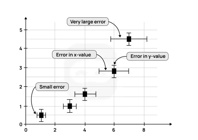
Uncertainties can be represented graphically through the use of error bars.
Error bars show the maximum and minimum range of the uncertainty of the plotted point.
They are usually plotted above and below the point (for the y-value) but can also be plotted side to side (for the x-value).
They are typically plotted using graphing software such as Excel or Google Sheets.
Example
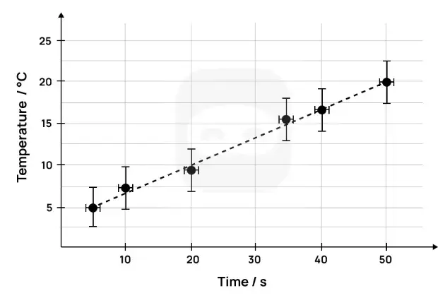
An example of a graph, together with error bars, is shown below.
Figure 5: Sample graph with uncertainties
As can be seen from the graph above, larger error bars show a larger uncertainty and vice versa.
Example
A second example of a graph with error bars is shown below.
This graph has temperature on the y-axis and time on the x-axis.
The error bars for the temperature show an uncertainty of ± 2.5 °C.
Figure 6: Sample 2 graph with uncertainties
In the above graph, the error bar for the temperature (on the y-axis) is larger than the one for the time (on the x-axis).
In this case, it would be appropriate to take the larger uncertainty of the temperature as the overall uncertainty and give less significance to the smaller uncertainty of the time.
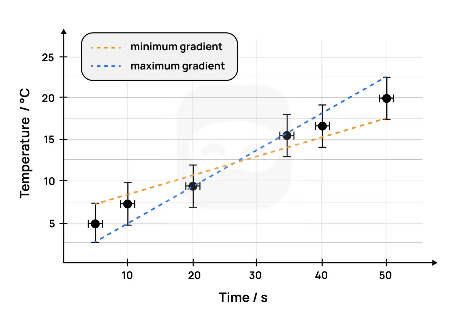
The gradient of a best-fit line can be determined using error bars.
To do this, two lines are drawn; one with the minimum gradient and one with the maximum gradient; with both lines passing through the error bars.
The graph below shows the two lines drawn with the maximum and minimum gradients (also known as the worst-fit lines).
Figure 7: Sample of graph with uncertainties and gradient
The gradient of the best-fit line is the average of the minimum gradient and the maximum gradient. $$m = \frac{m_{\text{maximum gradient}} + m_{\text{minimum gradient}}}{2}$$
The uncertainty of the final gradient is calculated as follows: $$\Delta m = \frac{m_{\text{maximum gradient}} - m_{\text{minimum gradient}}}{2}$$
R² – the coefficient of determination
The coefficient of determination ($R^{2}$) is a measure of how close the data is to the best-fit line and how well the model fits the data.
It indicates how well the independent variable explains the variation in the dependent variable.
Students do not need to understand how $R^{2}$ is calculated, as this can be done by most graphing software.
However, they should understand how to interpret the value of $R^{2}$ with respect to the strength of the relationship between the independent and dependent variables.
$R^{2}$ values can range from 0.0 to 1.0.
The higher the value of $R^{2}$, the better the fit of the data points with the best-fit line.
Note
An R² value of 1.0 suggests a perfect fit between the data and the model used.
In other words, all of the variance in the dependent variable is explained by the independent variable.
Lower values of R² suggest that the independent variable cannot explain all the variance in the dependent variable.
Very low values of R², such as 0, suggest that none of the variance in the dependent variable is explained by the independent variable.
In this case, it is likely that the wrong model has been chosen to analyse the data.
Example
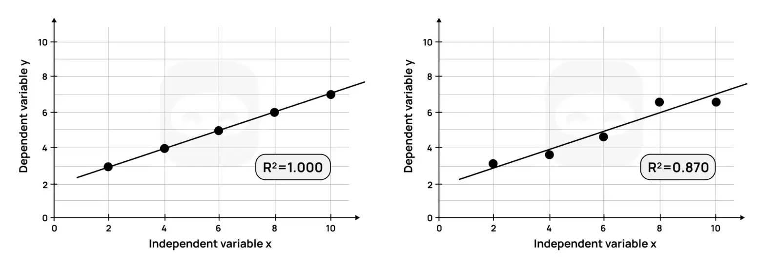
Consider the two graphs shown and their R² values.
Figure 8: Graphs with R squared values
The graph on the left, with an R² of 1.0, indicates that all (100%) of the variation in the dependent variable is explained by the independent variable.
The linear model used perfectly predicts the dependent variable.
The graph on the right, with an R² of 0.83, indicates that 83% of the variation in the dependent variable is explained by the independent variable.
In other words, all the variance in the data cannot be accounted for by the linear model.
In the scientific investigation, the $R^{2}$ value can be used to determine the strength of the relationship between the independent and dependent variables.
For example, it can show how concentration affects the rate of reaction.
If the calculated $R^{2}$ value is high, this indicates a strong relationship between the independent variable (concentration) and the dependent variable (rate of reaction).
In other words, the model used explains most, but not all, of the variance in the dependent variable.
Percentage Error
Some investigations may result in the calculation of an experimental value, which is often different from the theoretical or literature value.
Percentage error (also known as experimental error) is a measure of how close the experimental value is to the theoretical or accepted value.
The greater the percentage error, the less accurate the experimental value is.
If the experimental value is less than the theoretical value, the percentage error will be negative, but it is usually reported as a positive value.
If it is greater than the theoretical value, the percentage error will be positive.
The percentage error should always be compared to the total uncertainty.
If the percentage error is outside the range of the total uncertainty, this indicates the presence of systematic errors in the experimental procedure, in addition to random errors.
Example
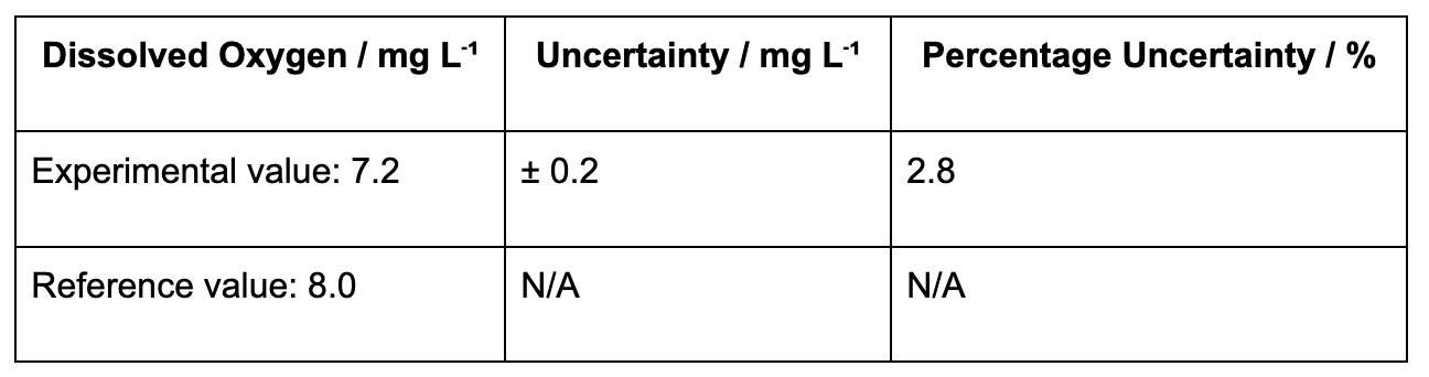
Consider dissolvedoxygen (DO) measurements in a river compared with the reference standard value:
The percentage error is normally expressed as a positive value → 10.0%.
The final result can therefore be reported as:
7.2 mg L⁻¹ ± 3%
Comparing the percentage uncertainty (≈3%) with the percentage error (10%) suggests that systematic error is present.
In this case, it could be due to poor calibration of the DO probe or environmental interference (e.g., water temperature affecting probe response).
Improved calibration and repeated sampling at different times could reduce this error.
Dealing with Outliers
An outlier is a data point that differs significantly from the other data points in a dataset.
Outliers can be either higher or lower than other data points.
They usually occur as a result of flaws in the methodology, human error, or faulty measuring equipment.
Outliers should not be removed from the calculations during data processing.
The justification for this is that outliers are measured values, and removing or ignoring them can be considered data manipulation.
If a student has outliers in their collected data, it is recommended that they:
Present their data processing both with and without the outlier(s) to demonstrate their impact.
Alternatively, identify the flaw or error in the methodology, take steps to remedy it, and repeat the measurement.
Tip
In this case, the modification(s) made should be described in the report.
Key points
All measured data has an uncertainty or error associated with it, known as its random error or random uncertainty.
Raw data must be presented with its absolute uncertainty using the symbol ±, such as 2.50 ± 0.01 g.
The precision of the measured value and the absolute uncertainty should be the same.
Random errors cause values to be either higher or lower than the actual value.
Random errors cannot be eliminated, but can be reduced by conducting repeat trials (and taking an average) and by using more precise apparatus.
Systematic errors are caused by flaws in the experimental design.
They produce results which are consistently higher or lower than the actual value.
They cannot be reduced or eliminated by taking repeat measurements.
They can be reduced or eliminated by making changes or modifications to the design of the experiment.
Graphs should include error bars and R² value, if the graph requires a trend line.
Outliers should be dealt with appropriately and not ignored. In case the candidate decides not to include them in the calculations, this decision should be clearly supported.
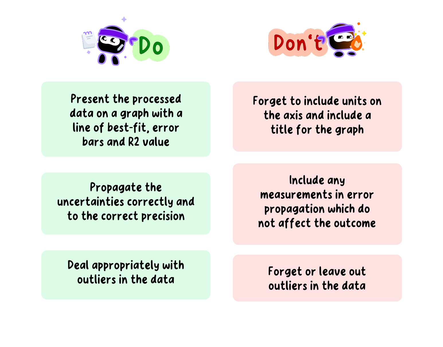
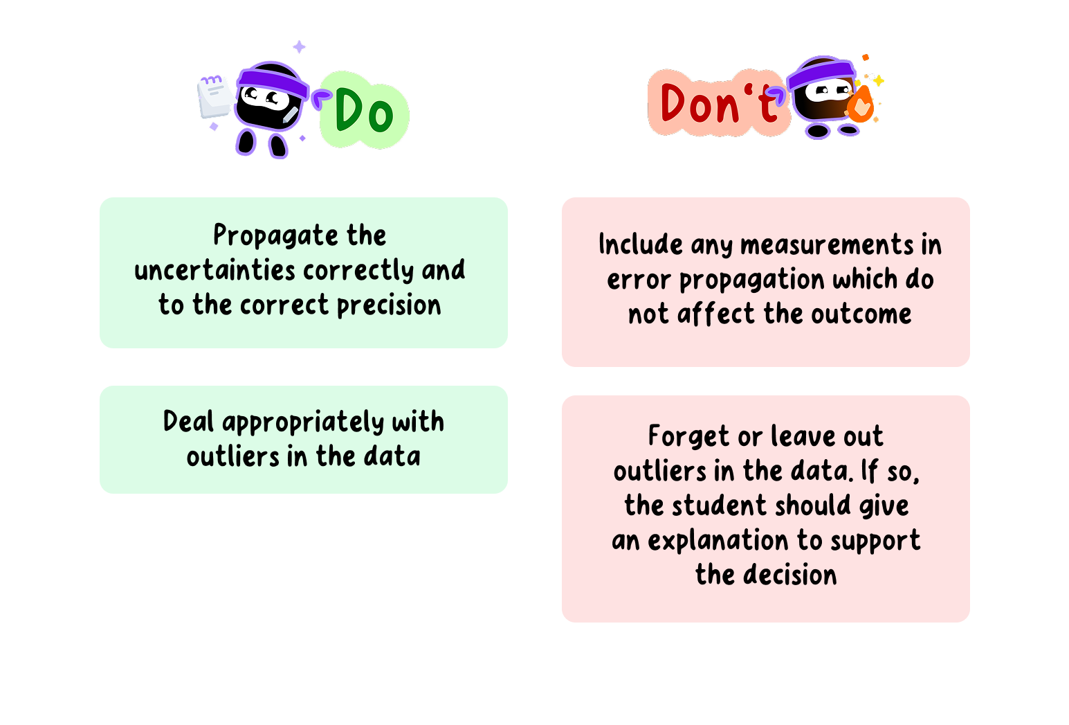
Do's and Don'ts when dealing with uncertainties in your ESS EE
View Environmental systems and societies (ESS) EE Exemplars
And thousands of other examples from high-scoring students.